What is the Difference Between container and container-fluid in Bootstrap 5 ?
Last Updated :
21 Feb, 2024
In Bootstrap 5, the “container” class creates a responsive container with a fixed width, adjusting to different screen sizes while maintaining margins. On the other hand, the “container-fluid” class generates a full-width container that spans the entire viewport without any margins, providing a seamless layout across various devices. “Container” is suitable for centered content with a defined width, while “container-fluid” is ideal for edge-to-edge content without constraints.
Syntax
// Syntax for Bootstrap container
<div class="container">
 <!-- Content here -->
</div>

// Syntax for Bootstrap container
<div class="container-fluid">
<!-- Content here -->
</div>
Container
Bootstrap 5’s container class creates a container that adjusts to different screen sizes. On big screens, it’s 1140px wide and centered. On smaller screens, it stretches to fit the whole width. This setup makes it easy to center content and keeps things looking neat. It’s great for making websites that look good on all devices with content that stays centered.
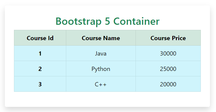
Example: Illustration of a container with a fixed width of 1140px on large screens, fully responsive on smaller screens.
HTML
<!DOCTYPE html>
<html lang="en">
<head>
<meta charset="UTF-8">
<meta name="viewport" content=
"width=device-width, initial-scale=1.0">
<link href=
rel="stylesheet" integrity=
"sha384-EVSTQN3/azprG1Anm3QDgpJLIm9Nao0Yz1ztcQTwFspd3yD65VohhpuuCOmLASjC"
crossorigin="anonymous">
<title>Bootstrap 5 Containers</title>
</head>
<body>
<div class="container mt-5 p-4 rounded text-center shadow">
<h2 class="text-success">Bootstrap 5 Container</h2>
<table class="table table-bordered">
<thead class="table-success">
<tr>
<th scope="col">Course Id</th>
<th scope="col">Course Name</th>
<th scope="col">Course Price</th>
</tr>
</thead>
<tbody>
<tr class="table-info">
<th scope="row">1</th>
<td>Java</td>
<td>30000</td>
</tr>
<tr class="table-info">
<th scope="row">2</th>
<td>Python</td>
<td>25000</td>
</tr>
<tr class="table-info">
<th scope="row">3</th>
<td>C++</td>
<td>20000</td>
</tr>
</tbody>
</table>
</div>
</body>
</html>
|
Output:
Container-Fluid
The “container-fluid” class in Bootstrap 5 creates a container that spans the entire width of the viewport, adjusting to different screen sizes without margins or gutters. It’s ideal for full-width elements like headers, footers, or hero sections, providing a seamless transition across devices. With no predefined maximum width or centering, it’s perfect for full-bleed layouts where content should extend from edge to edge without any constraints.
Example: Illustration of container-fluid div will take up 100% width of the parent element on all screen sizes.
HTML
<!DOCTYPE html>
<html lang="en">
<head>
<meta charset="UTF-8">
<meta name="viewport" content=
"width=device-width, initial-scale=1.0">
<link href=
rel="stylesheet" integrity=
"sha384-EVSTQN3/azprG1Anm3QDgpJLIm9Nao0Yz1ztcQTwFspd3yD65VohhpuuCOmLASjC"
crossorigin="anonymous">
<title>Bootstrap 5 Container-fluid</title>
</head>
<body class="bg-light">
<div class="container-fluid mt-5 p-4 rounded text-center shadow">
<h2 class="text-success">Bootstrap 5 Container-fluid</h2>
<table class="table table-bordered">
<thead class="table-danger">
<tr>
<th scope="col">Course Id</th>
<th scope="col">Course Name</th>
<th scope="col">Course Price</th>
</tr>
</thead>
<tbody>
<tr class="table-info">
<th scope="row">1</th>
<td>Java</td>
<td>30000</td>
</tr>
<tr class="table-info">
<th scope="row">2</th>
<td>Python</td>
<td>25000</td>
</tr>
<tr class="table-info">
<th scope="row">3</th>
<td>C++</td>
<td>20000</td>
</tr>
</tbody>
</table>
</div>
</body>
</html>
|
Output:

Difference between container & container-fluid
The table below illustrates the difference between Bootstrap5 container and container-fluid utilities.
|
Feature
|
Container
|
Container-Fluid
|
|
Width
|
Fixed max-width of 1140px on large screens. Responsive and fluid on smaller screens.
|
Takes up 100% width of the parent element on all screen sizes.
|
|
Centering
|
Content is centered within the container.
|
The content is not centered and stretches full width.
|
|
Responsive
|
Adjusts its width based on the viewport size with breakpoints.
|
Always spans the entire viewport, regardless of size.
|
|
Common Use Cases
|
Ideal for responsive designs that need centered layouts with fixed max-widths.
|
Suitable for full-bleed layouts like headers, footers that need to stretch full width.
|
Share your thoughts in the comments
Please Login to comment...