This article describes how to integrate event management functionality into a Flutter project. We will focus on adding and displaying events in a calendar interface. We will use the GetX package for routing and other utilities, but other solutions are also possible. We will use the get_cli tool to create a well-structured Flutter project. This tool helps us to generate complex project hierarchies, such as views, controllers, and pages.
The main focus of this article is on dynamically rendering events in the Flutter calendar. We will implement a demonstration program that displays events and allows users to create new events directly in the calendar interface. To do this, we will use the table_calendar package, which integrates seamlessly with Flutter and provides a comprehensive solution for managing events in a calendar environment.
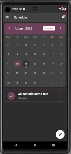
Event Calander App
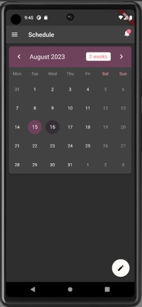
This is what we will be building in this article:
Use Case Or Why Integrate Event Calander In a Flutter App
There are many use cases for integrating an event calendar in a Flutter app. One of the most common is to allow users to view and manage their upcoming events, such as appointments, meetings, and social engagements. This can be helpful for users who need to stay organized and on top of their schedules. Another common use case is to display events that are relevant to the app’s content or purpose. For example, a news app could use an event calendar to display upcoming events in the local area, or a social media app could use an event calendar to display upcoming events that users are interested in.
Integrating an event calendar in a Flutter app can also be used to create new and innovative features. For example, a fitness app could use an event calendar to track users’ workouts and fitness goals. Or, a travel app could use an event calendar to display upcoming flights and hotel reservations.
What are the benefits of using the GetX package and the get_cli tool?
Benefits of using the GetX package:
- Easy to learn and use: GetX is a relatively new state management library for Flutter, but it has quickly become popular due to its simplicity and ease of use. GetX provides a set of intuitive APIs that make it easy to manage state in your Flutter apps.
- Powerful and flexible: GetX is a powerful and flexible state management library that can be used to build a wide variety of Flutter apps. GetX provides support for features such as dependency injection, reactive programming, and navigation management.
- Lightweight and efficient: GetX is a lightweight and efficient state management library that has a minimal impact on the performance of your Flutter apps. GetX is also highly scalable, making it a good choice for both small and large-scale Flutter apps.
Benefits of using the get_cli tool:
- Scaffolds new Flutter projects with GetX: get_cli can be used to scaffold new Flutter projects with GetX pre-integrated. This can save you a lot of time and effort, as you won’t need to manually configure GetX in your project.
- Generates code for GetX components: get_cli can be used to generate code for GetX components, such as pages, controllers, and bindings. This can save you even more time and effort, as you won’t need to write this code yourself.
- Provides a variety of other helpful commands: get_cli provides a variety of other helpful commands, such as commands for managing dependencies, running tests, and generating documentation. This can make your development workflow more efficient and productive.
What is the table_calendar package?
The table_calendar package is a Flutter package that provides a highly customizable, feature-packed calendar widget. It is easy to use and provides a preconfigured UI with customizable styling. It also supports custom selective builders for unlimited UI design, locale support, range selection support, multiple selection support, dynamic events and holidays, vertical autosizing, and multiple calendar formats (month, two weeks, week).
In simple words, the table_calendar package is a great way to add a calendar to your Flutter app. It is easy to use and provides a lot of features and customization options.
- Here are some examples of how you can use the table_calendar package in your Flutter app:
- Display a calendar of upcoming events, such as appointments, meetings, and social engagements.
- Display a calendar of upcoming events that are relevant to your app’s content or purpose, such as upcoming news stories or upcoming social media events.
- Use a calendar to track users’ progress towards a goal, such as a fitness goal or a learning goal.
- Use a calendar to allow users to select dates and times for appointments or reservations.
Getting Started
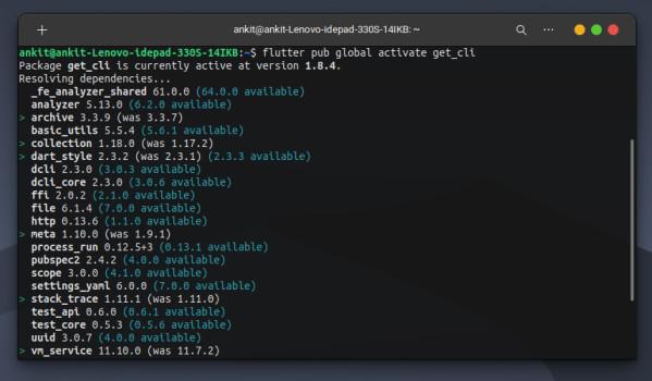
Install get_cli globally:
To install get_cli globally we need to run this command from the root:
pub global activate get_cli
or
flutter pub global activate get_cli
If you are running one of these commands successfuly then you have get_cli installed on your system and now we can start using it.
For more detailed instruction search get_cli on pub.dev.
Create Flutter Project
Create a flutter project, give it a name of your choice. And once done, open the root of the project in a terminal, and run the following command to start creating folder structure as per get_cli.
get init
Choose the default opetions like kotline, swift and else. Once you come to choose architecure you will choose Getx Cli and not clean architecutre.
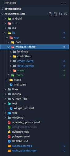
Once done your project structure would look like this, but you won’t be having create_event and detail_screen directory as of now.
Those will be created once you run the following command:
get create page:create_event
and
get create page:detail_screen
Project Structure:
Below is the entire project structure you would have by now.
├── app
│   ├── data
│   ├── modules
│   │   └── home
│   │       ├── bindings
│   │       │   └── home_binding.dart
│   │       ├── controllers
│   │       │   └── home_controller.dart
│   │       ├── create_event
│   │       │   ├── bindings
│   │       │   │   └── create_event_binding.dart
│   │       │   ├── controllers
│   │       │   │   └── create_event_controller.dart
│   │       │   └── views
│   │       │       └── create_event_view.dart
│   │       ├── detail_screen
│   │       │   ├── bindings
│   │       │   │   └── detail_screen_binding.dart
│   │       │   ├── controllers
│   │       │   │   └── detail_screen_controller.dart
│   │       │   └── views
│   │       │       └── detail_screen_view.dart
│   │       └── views
│   │           └── home_view.dart
│   └── routes
│       ├── app_pages.dart
│       └── app_routes.dart
├── main.dart
└── static
    └── utils.dart
Now we are going to start the actual coding part.
main.dart
Dart
import 'package:flutter/material.dart';
import 'package:get/get.dart';
import 'app/routes/app_pages.dart';
void main() {
runApp(
GetMaterialApp(
title: "Application",
initialRoute: AppPages.INITIAL,
getPages: AppPages.routes,
theme: ThemeData(
brightness: Brightness.dark,
primarySwatch: Colors.grey),
),
);
}
|
In this main.dart code above, a Flutter application is being initialized using the runApp method. The application is built using the GetX library, as indicated by the GetMaterialApp widget. Key attributes are set, such as the app’s title, initial route, navigation routes, and theme configuration. Notably, the theme is defined as a dark theme with a grey primary swatch. This code serves as the entry point for the Flutter application, defining its structure and initial configuration for navigation and theming.
Now lets see how we have initialied the routes in this app.
app_pages.dart
Dart
import 'package:get/get.dart';
import '../modules/home/create_event/bindings/create_event_binding.dart';
import '../modules/home/create_event/views/create_event_view.dart';
import '../modules/home/detail_screen/bindings/detail_screen_binding.dart';
import '../modules/home/detail_screen/views/detail_screen_view.dart';
import '../modules/home/bindings/home_binding.dart';
import '../modules/home/views/home_view.dart';
part 'app_routes.dart';
class AppPages {
AppPages._();
static const INITIAL = Routes.HOME;
static final routes = [
GetPage(
name: _Paths.HOME,
page: () => const CustomTableCalendar(),
binding: HomeBinding(),
),
GetPage(
name: _Paths.CREATE_EVENT,
page: () => SecondScreen(),
binding: CreateEventBinding(),
),
];
}
|
In this file we have defined routing configurations for a Flutter application using the GetX library. It starts by importing necessary modules and widgets. The code also imports specific bindings and views for different screens, like the home screen, create event screen, and detail screen, ensuring that data dependencies are resolved correctly when these screens are accessed.
The AppPages class centralizes routing information, specifying the initial route as the home screen. The routes list contains definitions for various routes, associating each route name with a corresponding view and binding. For instance, the ‘HOME‘ route is linked to the CustomTableCalendar view and the HomeBinding binding, while the ‘CREATE_EVENT‘ route corresponds to the SecondScreen view and the CreateEventBinding binding. This code helps manage navigation and data binding within the Flutter application efficiently.
home_binding.dart
Dart
import 'package:get/get.dart';
import '../controllers/home_controller.dart';
class HomeBinding extends Bindings {
@override
void dependencies() {
Get.lazyPut<HomeController>(
() => HomeController(),
);
}
}
|
This Dart code, used in a Flutter app with GetX, manages and injects dependencies into the HomeController class. It extends the Bindings class, indicating that an instance of HomeController is lazily created and associated with GetX, ensuring efficient dependency management in the app. This enhances organization and efficiency in handling dependencies within the Flutter application.
One good thing about git_cli is that we don’t need to worry about the creation of these above boiler plate code for routing and binding.
Before getting on to the home page, let’s first make a class which will contain the colors used in our app.
Dart
import 'package:flutter/material.dart';
class AppColors {
AppColors._();
static const Color blackCoffee = Color(0xFF352d39);
static const Color eggPlant = Color(0xFF6d435a);
static const Color celeste = Color(0xFFb1ede8);
static const Color babyPowder = Color(0xFFFFFcF9);
static const Color ultraRed = Color(0xFFFF6978);
}
|
In this code, the AppColors class serves as a convenient way to access and reuse color values throughout your Flutter application. These color constants are defined as static const members of the class, making it easy to reference them in different parts of your code to ensure consistent and maintainable color theming.
Now we will start coding the home page of our app.
home_view.dart
Dart
Scaffold(
appBar: AppBar(
title: const Text('Schedule'),
leading: Builder(
builder: (context) => IconButton(
icon: const Icon(Icons.menu),
onPressed: () => Scaffold.of(context).openDrawer(),
),
),
actions: [
Stack(
children: [
IconButton(
onPressed: () {},
icon: const Icon(Icons.notifications),
),
Positioned(
right: 11,
top: 11,
child: Container(
padding: const EdgeInsets.all(1),
decoration: BoxDecoration(
color: AppColors.ultraRed,
borderRadius: BorderRadius.circular(6),
),
constraints: const BoxConstraints(
minWidth: 14,
minHeight: 14,
),
child: const Text(
'3',
style: TextStyle(
color: AppColors.babyPowder,
fontSize: 8,
),
textAlign: TextAlign.center,
),
),
)
],
),
],
),
drawer: Drawer(
child: ListView(
padding: EdgeInsets.zero,
children: [
const DrawerHeader(
decoration: BoxDecoration(
color: AppColors.eggPlant,
),
child: Text(
'Menu',
style: TextStyle(
color: AppColors.babyPowder,
fontSize: 24,
),
),
),
ListTile(
leading: const Icon(Icons.home),
title: const Text('Home'),
onTap: () {
Navigator.pop(context);
},
),
ListTile(
leading: const Icon(Icons.calendar_today),
title: const Text('Calendar'),
onTap: () {
Navigator.pop(context);
},
),
ListTile(
leading: const Icon(Icons.settings),
title: const Text('Settings'),
onTap: () {
Navigator.pop(context);
},
),
],
),
),
floatingActionButton: FloatingActionButton(
onPressed: () => _navigateToAddEventScreen(),
child: Icon(
Icons.edit,
color: Colors.black,
),
backgroundColor: AppColors.babyPowder,
),
body: SingleChildScrollView(
child: Column(
children: [
Card(
margin: const EdgeInsets.all(8.0),
elevation: 5.0,
shape: const RoundedRectangleBorder(
borderRadius: BorderRadius.all(
Radius.circular(10),
),
side: BorderSide(
color: AppColors.blackCoffee, width: 2.0),
),
child: TableCalendar(
calendarFormat: _calendarFormat,
focusedDay: _focusedCalendarDate,
firstDay: _initialCalendarDate,
lastDay: _lastCalendarDate,
selectedDayPredicate: (currentSelectedDate) {
return (isSameDay(selectedCalendarDate!, currentSelectedDate));
},
onDaySelected: (selectedDay, focusedDay) {
if (!isSameDay(selectedCalendarDate, selectedDay)) {
setState(() {
selectedCalendarDate = selectedDay;
_focusedCalendarDate = focusedDay;
});
}
},
),
),
..._listOfDayEvents(selectedCalendarDate!).map(
(myEvents) => GestureDetector(
onTap: () {
Navigator.push(
context,
MaterialPageRoute(
builder: (context) => DetailScreen(
eventTitle: myEvents.eventTitle,
eventDescp: myEvents.eventDescp,
eventDate: selectedCalendarDate!,
),
),
);
},
child: Padding(
padding: const EdgeInsets.symmetric(
horizontal: 12.0, vertical: 8.0),
child: ListTile(
shape: RoundedRectangleBorder(
side: BorderSide(color: AppColors.eggPlant, width: 2.0),
borderRadius: BorderRadius.circular(10.0),
),
leading: Container(
width: 50,
height: 50,
decoration: BoxDecoration(
color: AppColors.eggPlant,
shape: BoxShape.circle,
),
child: const Icon(
Icons.done,
color: AppColors.babyPowder,
),
),
trailing: const Icon(
Icons.arrow_forward_ios,
color: AppColors.eggPlant,
),
title: Padding(
padding: const EdgeInsets.only(bottom: 8.0),
child: Text(
'${myEvents.eventTitle}',
style: TextStyle(
fontSize: 20, fontWeight: FontWeight.bold),
),
),
subtitle: Text('${myEvents.eventDescp}'),
),
),
),
),
],
),
),
);
|
Here we will try to explain the flow of code from top to bottom:
AppBar Configuration:
- The Scaffold widget is used to create the app’s basic structure.
- Inside the Scaffold, the appBar property configures the top app bar.
- It sets the title of the app bar to ‘Schedule’ using const Text(‘Schedule’).
- The leading property adds a hamburger menu icon to the left of the app bar. When pressed, it opens the drawer. This is achieved using an IconButton with an onPressed function that calls Scaffold.of(context).openDrawer().
Drawer Configuration:
- Below the appBar, the drawer property configures the side navigation menu.
- Inside the Drawer, a ListView widget is used to list menu items.
- The DrawerHeader provides a header with the text ‘Menu’ and a specific background color (AppColors.eggPlant).
- ListTile widgets represent individual menu items, such as ‘Home’, ‘Calendar’, and ‘Settings’.
- Each ListTile has an onTap function to handle tap events, and Navigator.pop(context) is used to close the drawer when an item is tapped.
Floating Action Button Configuration:
- The floatingActionButton property configures a floating action button (FAB).
- The FAB has an onPressed function that calls _navigateToAddEventScreen().
- The FAB’s child is an icon (Icons.edit) with black color.
- The background color of the FAB is set to AppColors.babyPowder.
- The floatingActionButton property configures a floating action button (FAB).
- The FAB has an onPressed function that calls _navigateToAddEventScreen().
- The FAB’s child is an icon (Icons.edit) with black color.
- The background color of the FAB is set to AppColors.babyPowder.
Body Configuration:
- The body property defines the main content of the Scaffold.
- It uses a SingleChildScrollView widget to allow scrolling if the content exceeds the screen height.
- Inside the SingleChildScrollView, a Column widget is used to arrange multiple widgets vertically.
- A Card widget is used to display content with a card-like design. It includes a TableCalendar widget for displaying a calendar.
- Additional calendar settings and styles are configured within the TableCalendar.
List of Events:
- Below the Card, there’s a section for displaying a list of events.
- A map function is used to iterate over a list of events and display them as GestureDetector widgets.
- Each event item is displayed as a ListTile with specific styling.
- Tapping an event item navigates to a DetailScreen with details of the selected event.
The above code represents the structure and layout of a Flutter app screen, including an app bar, navigation drawer, calendar, and a list of events. Below we will write the function that will add on to the functionality of the app.
Dart
void _navigateToAddEventScreen() async {
final result = await Navigator.push(
context,
MaterialPageRoute(builder: (context) => SecondScreen()),
);
if (result != null && result is MyEvents) {
final selectedDateEvents = mySelectedEvents[selectedCalendarDate] ?? [];
setState(() {
selectedDateEvents.add(result);
mySelectedEvents[selectedCalendarDate!] = selectedDateEvents;
});
}
}
|
This code defines a function _navigateToAddEventScreen that handles navigation to the ‘SecondScreen’ and manages the result returned from that screen. It checks if a result is received and if it’s of type ‘MyEvents’. If so, it updates the list of events for the selected calendar date.
Dart
_showAddEventDialog() async {
await showDialog(
context: context,
builder: (context) => AlertDialog(
title: const Text('New Event'),
content: Column(
crossAxisAlignment: CrossAxisAlignment.stretch,
mainAxisSize: MainAxisSize.min,
children: [
buildTextField(
controller: titleController,
hint: 'Enter Title'
),
const SizedBox(
height: 20.0,
),
buildTextField(
controller: descpController,
hint: 'Enter Description'
),
],
),
actions: [
TextButton(
onPressed: () => Navigator.pop(context),
child: const Text('Cancel'),
),
TextButton(
onPressed: () {
if (titleController.text.isEmpty && descpController.text.isEmpty) {
ScaffoldMessenger.of(context).showSnackBar(
const SnackBar(
content: Text('Please enter title & description'),
duration: Duration(seconds: 3),
),
);
return;
} else {
setState(() {
if (mySelectedEvents[selectedCalendarDate] != null) {
mySelectedEvents[selectedCalendarDate]?.add(MyEvents(
eventTitle: titleController.text,
eventDescp: descpController.text,
));
} else {
mySelectedEvents[selectedCalendarDate!] = [
MyEvents(
eventTitle: titleController.text,
eventDescp: descpController.text,
),
];
}
print('Added event on date: $selectedCalendarDate');
});
titleController.clear();
descpController.clear();
Navigator.pop(context);
return;
}
},
child: const Text('Add'),
),
],
),
);
}
|
This function creates an AlertDialog for adding a new event, including fields for entering the event title and description. It also handles validation and adds the event to the appropriate list when the “Add” button is pressed.
Dart
Widget buildTextField({String? hint, required TextEditingController controller}) {
return TextField(
controller: controller,
textCapitalization: TextCapitalization.words,
decoration: InputDecoration(
labelText: hint ?? '',
focusedBorder: OutlineInputBorder(
borderSide: const BorderSide(color: AppColors.eggPlant, width: 1.5),
borderRadius: BorderRadius.circular(10.0),
),
enabledBorder: OutlineInputBorder(
borderSide: const BorderSide(color: AppColors.eggPlant, width: 1.5),
borderRadius: BorderRadius.circular(10.0),
),
),
);
}
|
This function creates a reusable TextField widget with specific properties. It can be used to build text input fields throughout the application. The function allows you to customize the hint text, controller, and text capitalization while providing consistent border styling for focused and non-focused states.
This concludes our apps home page. Now we will work on the screen from where we can add events.
create_event_view.dart
Import Statements:
Dart
import 'package:assignment_one/app/modules/home/views/home_view.dart';
import 'package:flutter/material.dart';
import 'package:get/get.dart';
import '../controllers/create_event_controller.dart';
|
In this section, you import necessary packages and modules required for this Dart file. This includes Flutter’s material.dart for UI components and get.dart for state management. You also import home_view.dart and a custom controller (create_event_controller.dart) that appear to be used elsewhere in the code.
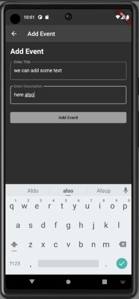
SecondScreen Class Definition:
Dart
class SecondScreen extends StatefulWidget {
@override
_SecondScreenState createState() => _SecondScreenState();
}
|
Here, you define a SecondScreen class that extends StatefulWidget. This class represents the screen where users can add events.
_SecondScreenState Class Definition:
Dart
class _SecondScreenState extends State<SecondScreen> {
final TextEditingController titleController = TextEditingController();
final TextEditingController descpController = TextEditingController();
|
This section defines the _SecondScreenState class, which extends State<_SecondScreenState>. In this class, you create two TextEditingController instances named titleController and descpController. These controllers are used to manage the text input fields for event title and description.
dispose() Method:
Dart
@override
void dispose() {
titleController.dispose();
descpController.dispose();
super.dispose();
}
|
The dispose() method is an overridden method that gets called when the state object is no longer needed. In this case, it disposes of the text controllers to release resources and prevent memory leaks.
Widget build(BuildContext context) Method:
Dart
@override
Widget build(BuildContext context) {
return Scaffold(
appBar: AppBar(
title: Text('Add Event'),
),
|
This is the core of your widget, the build method. It returns a Scaffold widget, which provides the basic structure for your screen. The AppBar widget is used to display a navigation bar with the title “Add Event.”
Body of the Screen:
Dart
body: Padding(
padding: const EdgeInsets.all(16.0),
child: Column(
crossAxisAlignment: CrossAxisAlignment.stretch,
children: [
Text(
'Add Event',
style: TextStyle(fontSize: 24.0, fontWeight: FontWeight.bold),
),
|
Inside the Scaffold, you have the screen’s body. This includes a Padding widget to provide space around the content. Within the padding, you have a Column widget, which arranges its children vertically.
Text Widget – “Add Event” Title:
Dart
Text(
'Add Event',
style: TextStyle(fontSize: 24.0, fontWeight: FontWeight.bold),
),
|
Here, you display the text “Add Event” as a title for this screen. You set the text style with a larger font size and bold weight.
Text Input Fields:
Dart
buildTextField(controller: titleController, hint: 'Enter Title'),
SizedBox(height: 20.0),
buildTextField(controller: descpController, hint: 'Enter Description'),
|
These lines create and display two text input fields for entering the event title and description. The buildTextField function is called to create these input fields. The titleController and descpController are provided as controllers for managing the text input.
Add Event Button:
Dart
ElevatedButton(
onPressed: () {
if (titleController.text.isEmpty || descpController.text.isEmpty) {
ScaffoldMessenger.of(context).showSnackBar(
SnackBar(
content: Text('Please enter title and description'),
duration: Duration(seconds: 3),
),
);
} else {
final event = MyEvents(
eventTitle: titleController.text,
eventDescp: descpController.text,
);
Navigator.pop(context, event);
}
},
child: Text('Add Event'),
),
],
),
),
);
}
|
In this section, you create an “Add Event” button as an ElevatedButton. When pressed, it checks if either the title or description fields are empty. If they are empty, it shows a snackbar with an error message. Otherwise, it creates an event object with the entered title and description, and then it pops (closes) the current screen and passes the event object back to the previous screen as the result.
buildTextField() Function:
Dart
Widget buildTextField(
{required TextEditingController controller, String? hint}) {
return TextField(
controller: controller,
decoration: InputDecoration(
labelText: hint ?? '',
border: OutlineInputBorder(),
),
);
}
|
This is a separate function, buildTextField(), used to create and return a text input field. It takes a TextEditingController and an optional hint as parameters and returns a TextField widget with the provided controller and decoration.
How we can add events on the from this screen which will get reflected on the home of the app.
Now, lets quickly code the deail screen, which will show the detail of the events which are tapped.
detail_screen_view.dart
Import Statements:
Dart
import 'package:intl/intl.dart';
import '../controllers/detail_screen_controller.dart';
|
- This section includes import statements to bring in external libraries and controllers needed for this Dart file.
- intl is imported from the intl package, which is used for date formatting.
- detail_screen_controller.dart is imported, which likely contains additional logic for this screen.
Class Definition:
Dart
class DetailScreen extends StatelessWidget {
final String eventTitle;
final String eventDescp;
final DateTime eventDate;
DetailScreen({
required this.eventTitle,
required this.eventDescp,
required this.eventDate,
});
|
- This defines a class named DetailScreen, which extends StatelessWidget. It’s used to create the detail view of an event.
- It has three properties: eventTitle, eventDescp, and eventDate, which are required when creating an instance of this class. These properties hold information about the event to be displayed.
Build Method:
Dart
@override
Widget build(BuildContext context) {
return Scaffold(
appBar: AppBar(
title: Text('Event Details'),
),
body: Column(
mainAxisAlignment: MainAxisAlignment.start,
crossAxisAlignment: CrossAxisAlignment.center,
children: [
],
),
);
}
|
- This is the build method, required for all widgets in Flutter. It defines the layout and structure of the screen.
- The Scaffold widget is used to create the overall screen structure with an app bar and body.
- Inside the body, there’s a Column widget, which arranges its children vertically.
Event Image:
Dart
Padding(
padding: const EdgeInsets.only(top: 12, bottom: 5, right: 12, left: 12),
child: Container(
height: 200.0,
width: double.infinity,
decoration: const BoxDecoration(
color: AppColors.eggPlant,
borderRadius: BorderRadius.only(
topLeft: Radius.circular(10),
topRight: Radius.circular(10),
bottomLeft: Radius.circular(10),
bottomRight: Radius.circular(10),
),
image: DecorationImage(
image: AssetImage('assets/event.jpg'),
fit: BoxFit.cover,
),
),
),
),
|
- This part creates a container displaying an event image.
- It uses the Padding widget to add spacing around the container.
- The Container has a fixed height and width, and it’s decorated with a purple background color and rounded corners.
- The event image is set as the background using DecorationImage.
Event Details:
Dart
Container(
decoration: BoxDecoration(
color: const Color.fromARGB(255, 53, 53, 53),
borderRadius: BorderRadius.circular(10),
),
padding: EdgeInsets.all(20),
margin: EdgeInsets.symmetric(horizontal: 12, vertical: 5),
child: Column(
children: [
],
),
),
|
- This section creates a container for displaying event details with a dark grey background.
- It has padding and margin to control spacing.
- Inside the container, there’s a Column widget to arrange details vertically.
Event Title:
Dart
RichText(
text: TextSpan(
text: 'Event: ',
style: TextStyle(
fontSize: 22,
fontWeight: FontWeight.bold,
color: AppColors.eggPlant,
),
children: <TextSpan>[
TextSpan(
text: '$eventTitle',
style: TextStyle(
fontSize: 22,
fontWeight: FontWeight.bold,
color: Colors.white,
),
),
],
),
),
|
- This part uses RichText to display the event title with custom styling.
- It combines “Event: ” in purple and the actual event title in white.
Location and Date:
Dart
Row(
mainAxisAlignment: MainAxisAlignment.spaceBetween,
children: [
Row(
children: [
Icon(
Icons.location_on,
color: AppColors.eggPlant,
),
Text(' Johansi Berline'),
],
),
Row(
children: [
Icon(
Icons.access_time,
color: AppColors.eggPlant,
),
Text(' ${DateFormat('yyyy-MM-dd').format(eventDate)}'),
],
),
],
),
|
- This section displays the event location and date.
- It uses two Row widgets to create two separate rows, one for location and one for the date.
- Icons are used for location and time, and they are styled with a purple color.
Event Description:
Dart
SizedBox(
child: Row(
children: [
SizedBox(
width: 320,
child: Text(
'Description: $eventDescp',
style: TextStyle(fontSize: 18, color: Colors.grey),
),
),
],
),
),
|
- This part displays the event description.
- It uses a Text widget with custom styling, including a grey color for the description text.
Action Button:
Dart
Row(
mainAxisAlignment: MainAxisAlignment.spaceEvenly,
children: [
OutlinedButton(
onPressed: () {},
child: Text(
'Cancel',
style: TextStyle(color: Colors.grey, fontSize: 20),
),
),
OutlinedButton(
onPressed: () {},
child: Text(
'Join',
style: TextStyle(color: AppColors.eggPlant, fontSize: 20),
),
),
],
),
|
This section creates two action buttons: “Cancel” and “Join.”
- The buttons use OutlinedButton with custom styling for appearance.
- Both buttons have onPressed handlers, but they are currently empty and need to be implemented for functionality.
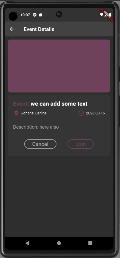
This marks the completeness of the event detail screen. So this concluded the flutter event table calander.
Output:
Share your thoughts in the comments
Please Login to comment...