Filled area chart using plotly in Python
Last Updated :
29 Dec, 2023
Plotly is a Python library that is used to design graphs, especially interactive graphs. It can plot various graphs and charts like histograms, bar plots, box plots, spread plots, and many more. It is mainly used in data analysis as well as financial analysis. Plotly is an interactive visualization library.
Filled Area Chart Syntax
Syntax: plotly.express.area(data_frame=None, x=None, y=None, line_group=None, color=None, hover_name=None, hover_data=None, custom_data=None, text=None, facet_row=None, facet_col=None, facet_col_wrap=0, animation_frame=None, animation_group=None, category_orders={}, labels={}, color_discrete_sequence=None, color_discrete_map={}, orientation=None, groupnorm=None, log_x=False, log_y=False, range_x=None, range_y=None, line_shape=None, title=None, template=None, width=None, height=None)
Parameters
- data_frame: This argument needs to be passed for column names (and not keyword names) to be used. Array-like and dict are transformed internally to a pandas DataFrame.
- x, y: Either a name of a column in data_frame, or a pandas Series or array_like object. Values from this column or array_like are used to position marks along the x and y axis in cartesian coordinates.
- color: Either a name of a column in data_frame, or a pandas Series or array_like object. Values from this column or array_like are used to assign color to marks.
Filled area plot is the easy-to-use, high-level articulation to plotly which completes a variety of types of data and produces easy-to-style figures. Each filled area harmonizes with one value of the column given by the line_group parameter. Filled area charts are most commonly used to show trends, rather than convey specific values. Two popular variations of Area Graphs are: grouped and Stacked Area Graphs.
What is Filled Area Chart in Python?
A Filled Area Chart in Python is a type of data visualization that represents data trends by filling the area between a line plot and a baseline, often the x-axis. This chart is created using libraries such as Matplotlib or Seaborn. The filled area visually emphasizes the magnitude of variation in the data and is particularly useful for showcasing patterns or fluctuations over time. By shading the region between the line and the baseline, users can easily perceive the extent of the data’s values and observe trends or irregularities in the plotted series.
Area Plots in Python Examples
There are various examples of Area Plots in Python . here we are discussing some generally used examples of Area Plots in Python those are following.
- Interactive Area Plot of Iris Sepals
- Visualize Random Data with Plotly Express
- Area Plot with Plotly Express
- Customizing Area Charts
- Stacked Area Chart
- Plotly Express Filled Area Chart with Range
Interactive Area Plot of Iris Sepals
In this example code uses the Plotly Express library to create an area plot from the Iris dataset, with sepal width on the x-axis, sepal length on the y-axis, and different species differentiated by color. The hover information includes petal width. The resulting plot is displayed using fig.show().
Python3
import plotly.express as px
df = px.data.iris()
fig = px.area(df, x="sepal_width", y="sepal_length",
color="species",
hover_data=['petal_width'],)
fig.show()
|
Output:

Visualize Random Data with Plotly Express
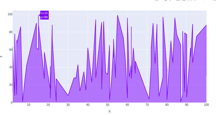
In this example The provided Python code utilizes the Plotly Express library to generate an area plot. It first imports the necessary modules, Plotly Express as px and NumPy as np. The code then sets a random seed for reproducibility, generates two arrays of 100 random integers each using NumPy’s random.randint function.
Python3
import plotly.express as px
import numpy as np
np.random.seed(42)
random_x= np.random.randint(1,101,100)
random_y= np.random.randint(1,101,100)
fig = px.area(x = random_x, y = random_y)
fig.show()
|
Output:
Area Plot with Plotly Express
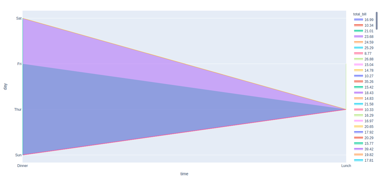
In this example Python code uses the Plotly Express library to create an area plot. It loads a sample dataset of restaurant tips using px.data.tips(), and then generates an area plot with time on the x-axis, day on the y-axis, and colors representing the total bill. The resulting plot is displayed using fig.show()
Python3
import plotly.express as px
df = px.data.tips()
fig = px.area(df, x ='time', y = 'day',
color="total_bill")
fig.show()
|
Output:
Customizing Area Charts
In this example code uses Plotly Express to create a customized filled area chart with two lines. It defines x and y data, creates a line chart with a filled area for the first line, adds a second line with a filled area between the two lines, and updates the layout with a title and axis labels. The resulting plot is displayed.
Python3
import plotly.express as px
x_data = [1, 2, 3, 4, 5]
y1_data = [10, 15, 13, 17, 10]
y2_data = [8, 13, 11, 15, 8]
fig = px.line(x=x_data, y=y1_data, line_shape='linear',
labels={'y':'Y-axis'})
fig.update_traces(fill='tozeroy', line_color='rgba(0,100,80,0.2)')
fig.add_trace(px.line(x=x_data, y=y2_data,
line_shape='linear').update_traces(fill='tonexty',
line_color='rgba(0,100,80,0.2)').data[0])
fig.update_layout(title='Customized Filled Area Chart', xaxis_title='X-axis')
fig.show()
|
Output :

Stacked Area Chart
In this example This code uses the Plotly library to create a stacked area chart. It defines sample data with x and two y series, creates the chart using Plotly Express, and customizes labels and titles. Finally, it displays the chart with x and y-axis labels using `fig.show()`.
Python3
import plotly.express as px
x_data = [1, 2, 3, 4, 5]
y1_data = [10, 15, 13, 17, 10]
y2_data = [8, 13, 11, 15, 8]
fig = px.area(x=x_data, y=[y1_data, y2_data], stackgroup='one',
labels={'y':'Y-axis'})
fig.update_layout(title='Stacked Area Chart',
xaxis_title='X-axis')
fig.show()
|
Output :

Plotly Express Filled Area Chart with Range
In this example code uses Plotly Express to create a filled area chart with a range. It defines sample data for x-axis and three sets of y-values representing mean, lower bound, and upper bound. The code then generates a scatter plot for the mean values and overlays two additional scatter plots for the lower and upper bounds. Finally, it updates the layout and traces to create a filled area between the upper and lower bounds with specified colors.
Python3
import plotly.express as px
x_data = [1, 2, 3, 4, 5]
y_mean = [10, 15, 13, 17, 10]
y_lower = [8, 12, 10, 14, 8]
y_upper = [12, 18, 15, 20, 12]
fig = px.scatter(x=x_data, y=y_mean, labels={'y':'Y-axis'})
fig.add_trace(px.scatter(x=x_data, y=y_lower).data[0])
fig.add_trace(px.scatter(x=x_data, y=y_upper).data[0])
fig.update_layout(title='Filled Area Chart with Range',
xaxis_title='X-axis')
fig.update_traces(fill='toself', fillcolor='rgba(0,100,80,0.2)',
line_color='rgba(255,255,255,0)')
fig.show()
|
Output

Share your thoughts in the comments
Please Login to comment...