Explain the use of nav nav-list in Bootstrap
Last Updated :
26 Nov, 2021
The nav-list class helps to create the list of navs in the webpage along with headers which are optional. It is available in Bootstrap version 2. In this article, we will understand the working of the nav-list class and see how can we create a List of Navs using the “nav-list” class in Bootstrap, along with understanding its implementation through the example.
In simple words, a Nav List can be called a sideway navbar which is divided into several sections using the headers. Below given is the example of a nav list which we can see on numerous websites.

Nav List example
The above example shows a list of navs showing important links about different pages which we can see on many college and universities websites.
Let’s see how to make one such nav list by using the bootstrap framework and the ‘nav-list’ class.
Creating a Nav-list using Bootstrap Framework:
Step 1: Download the Bootstrap framework from the official Bootstrap website.
Step 2: Link the bootstrap CSS to the Html file using the following code given below:
<link href=”/bootstrap/css/bootstrap.min.css” rel=”stylesheet” media=”screen”>
Note: The bootstrap folder and the Html file should be in the same folder.
Step 3: Link the bootstrap JS file to the Html file using the following command given below:
<script src="https://code.jquery.com/jquery.js"></script>
<script src="/bootstrap/js/bootstrap.min.js"></script>
Step 4: Now, create a <ul></ul> tag with the class names “nav” and ‘nav-list’.
Syntax:
<ul class="nav nav-list"></ul>
Step 5: Inside the <ul> tag add list items <li> with class name “nav-header” for the headers you want to mention. Below is given the syntax :
<ul class="nav nav-list">
    <li class="nav-header">List header</li>
    <li class="active"><a href="#">Home</a></li>
    <li><a href="#">Library</a></li>
    <li><a href="#">Notice Board</a></li>
</ul>
Example: This example describes the use of the nav-list class in Bootstrap.
HTML
<!DOCTYPE html>
<html>
<head>
<title>Bootstrap 101 Template</title>
<meta name="viewport"
content="width=device-width,
initial-scale=1.0">
<link href="/bootstrap/css/bootstrap.min.css"
rel="stylesheet"
media="screen">
<style>
.nav {
width: 15vw;
}
</style>
</head>
<body>
<h1>Nav list</h1>
<ul class="nav nav-list">
<li class="nav-header">College</li>
<li class="active"><a href="#">Home</a></li>
<li><a href="#">Library</a></li>
<li><a href="#">Notice Board</a></li>
<li class="nav-header">Addmissions</li>
<li><a href="#">UG Admissions</a></li>
<li><a href="#">PG Admissions</a></li>
<li><a href="#">B.ed Admissions</a></li>
</ul>
<script src="/bootstrap/js/bootstrap.min.js"></script>
</body>
</html>
|
Output: From the output, we can see the nav-list having the list of the items. The nav-list will only work with Bootstrap v2.
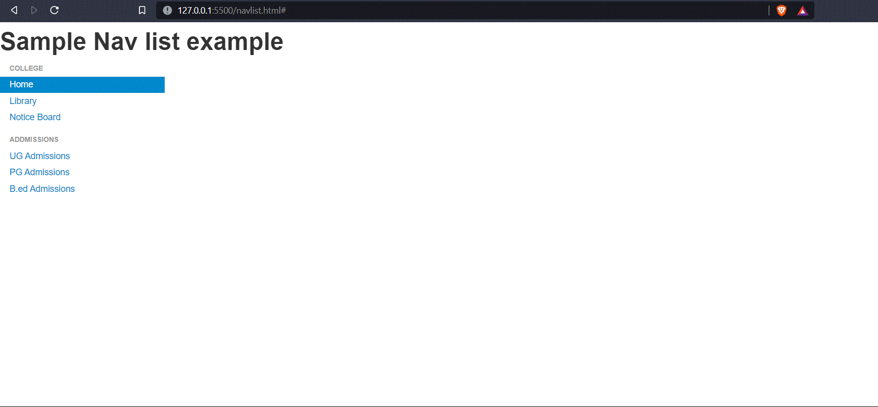
Bootstrap Nav List
The nav-list class can be useful to arrange the items in order and add some styles to them. The nav list component is very useful in websites that have a lot of different options and different users want to access the different sections of the website. The nav list makes it very easy for the user to navigate to their specific page very easily.
Note:
- The “nav-list” class supports Bootstrap v2. The v3, v4, and v5 do not support the nav-list class inside them.
- Here, in the above code example, we have added CSS style to the “nav” class by mentioning its width, if we have not mentioned the width, then the nav-list will take the full-screen width by default.
Share your thoughts in the comments
Please Login to comment...