Design a Virtual Credit Card Template using HTML and CSS
Last Updated :
20 Dec, 2023
In this article, we will design a Virtual Credit Card template using HTML and CSS for a modern and interactive user experience. This design includes spaces for the card number, name, and expiry date.
HTML will be used to structure the layout, while CSS will add styling for a visually pleasing and better look. The virtual credit card design aims to provide a pleasant and modern input experience when collecting user bank details.
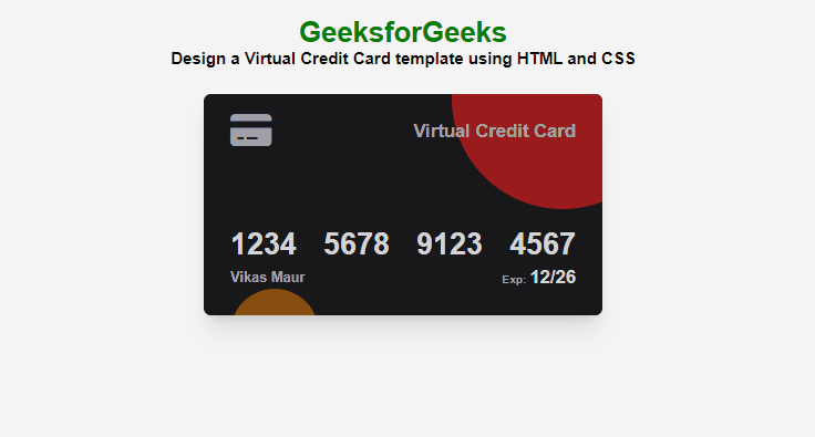
Preview

Approach
- Create an HTML file with a container div, including headers and a nested div for the Virtual Credit Card template.
- Now, integrate Font Awesome CSS and JavaScript CDNs for icons, and link an external styles.css file for additional styling.
- Design the Virtual Credit Card layout using HTML elements and Font Awesome icons for card details like number, name, and expiry date.
- Add styles in CSS, including resetting margin and padding, setting the body display, and styling the container for centering and spacing.
- Apply specific styling to the credit card div, creating a visually appealing design with rounded corners, shadows, and hover effect for scaling.
- At last add two positioned circles in CSS for decorative background elements, enhancing the overall design of the Virtual Credit Card template.
Example: In this example, we will design the virtual credit card template using HTML and CSS.
HTML
<!DOCTYPE html>
<html lang="en">
<head>
<title>
GeeksforGeeks Design a Virtual Credit
Card template using HTML and CSS
</title>
<link rel="stylesheet"
href=
integrity=
"sha512-DTOQO9RWCH3ppGqcWaEA1BIZOC6xxalwEsw9c2QQeAIftl+Vegovlnee1c9QX4TctnWMn13TZye+giMm8e2LwA=="
crossorigin="anonymous"
referrerpolicy="no-referrer" />
<link rel="stylesheet"
href="/style.css">
</head>
<body>
<div>
<h1>GeeksforGeeks</h1>
<h3>Design a Virtual Credit Card
template using HTML and CSS
</h3>
<div class="credit-card">
<div class="circle1"></div>
<div class="circle2"></div>
<div class="head">
<div>
<i class="fa-solid fa-credit-card fa-2xl"></i>
</div>
<div>Virtual Credit Card</div>
</div>
<div class="number">
<div>1234</div>
<div>5678</div>
<div>9123</div>
<div>4567</div>
</div>
<div class="tail">
<div>Vikas Maur</div>
<div class="exp">Exp:
<span class="exp-date">12/26</span>
</div>
</div>
</div>
</div>
</body>
</html>
|
CSS
* {
margin: 0;
padding: 0;
box-sizing: border-box;
}
body {
display: flex;
justify-content: center;
align-items: center;
font-family: sans-serif;
background-color: #f4f4f4;
}
body>div {
display: flex;
flex-direction: column;
justify-content: center;
align-items: center;
margin-top: 2rem;
}
h1 {
color: green;
}
h3 {
margin-bottom: 30px;
}
.credit-card {
background-color: #18181b;
color: #a1a1aa;
padding: 30px 30px;
border-radius: 0.5rem;
box-shadow: 0 20px 25px -5px rgb(0 0 0 / 0.1), 0 8px 10px -6px rgb(0 0 0 / 0.1);
width: 450px;
height: 250px;
display: flex;
flex-direction: column;
position: relative;
overflow: hidden;
transition: all 0.5s ease-in-out;
}
.credit-card:hover {
scale: 1.1;
}
.head,
.number,
.tail {
display: flex;
justify-content: space-between;
align-items: center;
font-weight: 600;
z-index: 10;
}
.head {
font-size: 1.3rem;
font-weight: bold;
}
.number {
margin-top: auto;
font-size: 2.1rem;
font-weight: bold;
margin-bottom: 0.3rem;
color: #d4d4d8;
}
.exp {
font-size: 0.8rem;
}
.exp-date {
color: #d4d4d8;
font-size: 1.3rem;
}
.circle1 {
position: absolute;
width: 250px;
height: 250px;
background-color: #991b1b;
border-radius: 100%;
transform: translateY(-60%) translateX(100%);
}
.circle2 {
position: absolute;
width: 100px;
height: 100px;
background-color: #854d0e;
border-radius: 100%;
transform: translateY(190%);
}
|
Output:
Share your thoughts in the comments
Please Login to comment...