Design a Traffic Light Animation using HTML and CSS
Last Updated :
17 Nov, 2023
In this article, we will explore how HTML and CSS can be utilized to create a Traffic signal animation with Red, Green, and Yellow colors. In this, we have written a code that produces a live traffic signal using HTML and CSS. The code is responsive and uses “Keyframes” for better animation control.
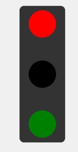
Preview
Approach
- First, create three divs inside the container div for three signal lights.
- Use CSS to define the colors for each light (red, yellow, green).
- Align the signals in the center of the webpage.
- Utilize CSS keyframe animations to create the blinking effect for lights.
Example: In this example, we will see the basic implementation to create a traffic signal static website by using HTML, and CSS.
HTML
<!DOCTYPE html>
<html lang="en">
<head>
<meta charset="UTF-8">
<meta name="viewport"
content="width=device-width, initial-scale=1.0">
<link rel="stylesheet" href="style.css">
<title>Traffic Light Animation</title>
<style>
body {
display: flex;
justify-content: center;
align-items: center;
height: 100vh;
margin: 0;
background-color: #f0f0f0;
}
.traffic-signal {
width: 100px;
height: 300px;
background-color: #333;
border-radius: 10px;
display: flex;
flex-direction: column;
justify-content: space-between;
align-items: center;
}
.light {
width: 60px;
height: 60px;
border-radius: 50%;
margin: 10px;
transition: background-color 0.9s;
}
@keyframes blinkRed {
0%,
49% {
background-color: red;
}
50%,
100% {
background-color: black;
}
}
@keyframes blinkYellow {
0%,
49% {
background-color: yellow;
}
50%,
100% {
background-color: black;
}
}
@keyframes blinkGreen {
0%,
49% {
background-color: green;
}
50%,
100% {
background-color: black;
}
}
.red {
background-color: red;
animation: blinkRed 9s infinite;
}
.yellow {
background-color: yellow;
animation: blinkYellow 9s infinite;
animation-delay: 3s;
}
.green {
background-color: green;
animation: blinkGreen 9s infinite;
animation-delay: 6s;
}
</style>
</head>
<body>
<div class="traffic-signal">
<div class="light red animate"></div>
<div class="light yellow"></div>
<div class="light green"></div>
</div>
</body>
</html>
|
Output:
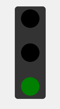
Output
Share your thoughts in the comments
Please Login to comment...