How to Create Gradient Background Animation using HTML and CSS ?
Last Updated :
12 Jun, 2020
Gradient animation can be added to the background of your websites by using simple HTML and CSS @keyframes rule that generate the desired animation.
HTML Code: In the following example, the basic structure of the HTML page is implemented.
<!DOCTYPE html>
<html lang="en">
<head>
<meta charset="UTF-8">
<meta name="viewport" content=
"width=device-width, initial-scale=1.0">
<title>Gradient Background Animation</title>
</head>
<body>
<section>
<div>
<h2>GeeksforGeeks</h2>
<p>Gradient background Animation</p>
</div>
</section>
</body>
</html>
|
CSS Code: In the following section, designing of the background is implemented using simple CSS @keyframes rule that provide the animation feature. Providing different gradient colors is done using linear-gradient() function.
<style>
body {
margin: 0;
padding: 0;
animation: effect 3s linear infinite;
}
section {
width: 100%;
height: 100vh;
}
div {
position: absolute;
top: 50%;
left: 50%;
transform: translate(-50%, -50%);
font-size: 3em;
}
h2 {
text-align: center;
}
@keyframes effect {
0% {
background: linear-gradient(#008000, #00FF00);
}
50% {
background: linear-gradient(#220080, #0084ff);
}
100% {
background: linear-gradient(#e78f3c, #ff4800);
}
}
</style>
|
Complete Code: It is the combination of the above two code sections.
<!DOCTYPE html>
<html lang="en">
<head>
<meta charset="UTF-8">
<meta name="viewport" content=
"width=device-width, initial-scale=1.0">
<title>Gradient Background Animation</title>
</head>
<style>
body {
margin: 0;
padding: 0;
animation: effect 3s linear infinite;
}
section {
width: 100%;
height: 100vh;
}
div {
position: absolute;
top: 50%;
left: 50%;
transform: translate(-50%, -50%);
font-size: 3em;
}
h2 {
text-align: center;
}
@keyframes effect {
0% {
background: linear-gradient(#008000, #00FF00);
}
50% {
background: linear-gradient(#220080, #0084ff);
}
100% {
background: linear-gradient(#e78f3c, #ff4800);
}
}
</style>
<body>
<section>
<div>
<h2>GeeksforGeeks</h2>
<p>Gradient background Animation</p>
</div>
</section>
</body>
</html>
|
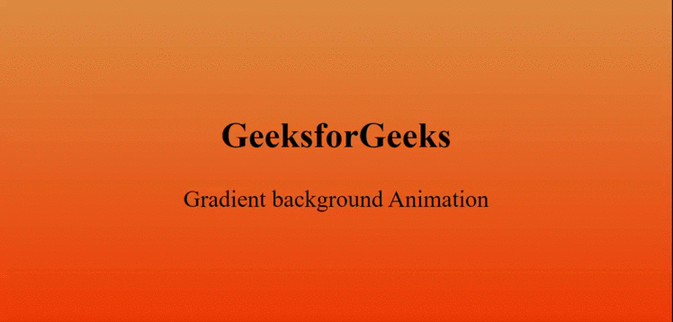
Output:
Like Article
Suggest improvement
Share your thoughts in the comments
Please Login to comment...