Data Visualization in UI
Last Updated :
13 May, 2024
Data visualization has become increasingly dominant in the user interface (UI), and this technique become even more effective in fulfilling these purposes. Through the encapsulation of raw data into visual forms, information even of complex type becomes intuitive to users and the quality of their experience is improved. Data visualization can be applied in the UI of digital products or applications through the visual forms of data that are used in UI. It refers to using data to understand and tell the story of different datasets using visualizations like graphs, charts, maps, and diagrams. Through these visualizations, these insights, patterns and trends hidden within the data come out as easily comprehensible to the users who in turn possess the required knowledge to make crucial decisions.
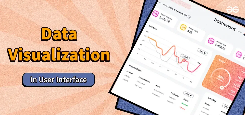
Data Visualization in UI
Steps of Data Visualization
1. Data Collection and Preparation:
Get the right information in order and process it for visualization by reducing outliers, sorting, and selecting only needed information.
2. Choosing the Right Visualization:
Choose the best type of visualization according to the nature of the data and the things you want to inform the audience about.
3. Designing the UI:
Incorporate the chosen visualization into the interface in a way so it will fit into the design elegantly while considered its usability.
4. Testing and Iteration:
Have users test the visualization to improve its usability and repeat the iterations if need be, utilizing their input to enhance the graphs.
Different Types of Data Visualization
- Line Charts: It serves the purpose of showcasing the trends and patterns over the time.
- Bar Charts: Suitable for statistical comparison of categorical data.
- Pie Charts: Show the part-to-whole ratio.
- Scatter Plots: Illustrate the interchange between the two variables.
- Heatmaps: Visualize the data distribution or density in a given area, where it can be for instance a breakdown across a geographic or grid-based map.
- Infographics: Mix different visual attributes to show a story or create some narrative with your data.
Uses
- Data Analysis: Allows to search deeper into trends and correlations.
- Decision Making: Offers decision-makers with data ignited conclusions obtained from data analysis.
- Communication: Increase the effectiveness of knowledge transmission of a complicated matter to a multilingual audience.
- Monitoring and Reporting: Aids in measuring the main parameters, monitoring the activities, and the development and reporting of them.
- Enhancing User Experience: Adds an element of relatability and attraction in the digital products by means of a visual and easily readable format of the information.
Benefits
- Improved Understanding: Visualization turns data in comprehensible and manageable fashion not only for technical users, but also for average consumers.
- Faster Insights: Visualization allows users to follow trend, spot patterns and outliers very easily out of the given data.
- Enhanced Decision Making: The use of data visualization promotes knowledge sharring while at the same time allowing individuals to make intelligent decisions.
- Increased Engagement: Designs of UIs make the best use of visual elements which are powerful tools in ensuring that users stay engaged and cueing them to interact.
- Storytelling with Data: Visualizations forms a storyline from the data converts plot of data in a memorable and influential way.
Limitations
- Misinterpretation: The construction of the wrong visualizations or misrepresentation of data will inevitably lead to false conclusions and misinterpretation.
- Over-simplification: A completely simple chart may led to the omission of essential details and illustrate complex outcomes.
- Data Limitations: Any visualization that is only as good as the underlying data may become useless even if the data is incomplete or even fake.
- Visual Clutter: Presentations of a dominating visual information or interfaces that are overly cluttered are likely to confuse the consumers and in fact, hinder them from understanding.
- Accessibility: The fact that several varieties of graphical manifestations might be dealt with in a difficult manner on the part of people with disabilities, underline the stage of making the UIs inclusive.
Example
- Weather App: A weather app that shows the temperature graph(s) at all the close-by and remote locations using a line chart or temperature maps.
- Financial Dashboard: A financial dashboard which visualizes trends in the stock market, and performance of the assets and household spending in the form of various charts and graphs.
- E-commerce Platform: A shopping platform which embraces bar charts and is used to visually exhibit price differences, ratings and sales examples.
- Healthcare Analytics Tool: A healthcare analytics tool described by heat maps that display geographic-wise distribution of patients’ demographics and registered diseases.
Conclusion
In conclusion, data visualization in UI demonstrates significance by complementing the user experience and developing the ability to make data-driven decisions. As clear illustrations increasingly replace complicated information, users are able to draw conclusions and identify trends and issues, which is pivotal for decision making. While data visualization in many ways contributes to good but we should be aware of all its limitations that we are supposed to have products which include proper design and interpretation. With the advancement of technology, the utility of data visualization in user interfaces (UI) is bound to increase and is shaping the future of the exploration and interplay of data with the interfaces in a virtual environment.
Share your thoughts in the comments
Please Login to comment...