CSS Masking
Last Updated :
31 Dec, 2023
CSS Masking facilitates the various layers for masking over an HTML element, in order to partially or fully hide portions of the element. The CSS gradient, SVG image, PNG image, or SVG <mask> element can be used to define the mask layer image. To support the standard property by most browsers, the -webkit- prefix can be used.
The CSS gradient, SVG image, PNG image, or SVG <mask> element can be used to define the mask layer image.
Note: Use -webkit-mask-image property for WebKit-based browsers such as Chrome and Safari.
Features
- In the CSS Masking, SVG elements or images can be used as masks, for achieving flexibility in the creation of complex shapes.
- Developers have control over the position of the mask using the mask-position property and can easily adjust the size of the mask using the mask-size property.
- Masks can be changed dynamically using JavaScript to make interactive and animated effects.
- Apply gradients as masks for smooth transitions between visible and hidden areas.
Table: The description of different components for Creating a Masking Layer in CSS are shown in tabular form below:
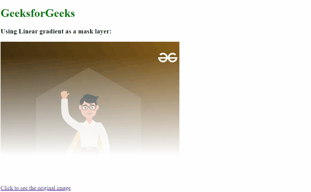
Example 1: The below example shows the use of Gradients as the Mask Layer with the property mask-image.
HTML
<!DOCTYPE html>
<html lang="en">
<head>
<meta charset="UTF-8">
<meta name="viewport"
content="width=device-width,
initial-scale=1.0">
<title>CSS Gradient</title>
<style>
.imgbox {
background-image:
url(
mask-image:
linear-gradient(to top, transparent 20%, black 90%);
-webkit-mask-image:
linear-gradient(to top, transparent 20%, black 90%);
height: 400px;
width: 500px;
background-size: cover;
background-position: center;
}
.gfg {
color: green;
}
</style>
</head>
<body>
<h1 class="gfg">GeeksforGeeks</h1>
<h3>Using Linear gradient as a mask layer:</h3>
<div class="imgbox"></div>
<a href=
Click to see the original image
</a>
</body>
</html>
|
Output:
Example 2: The below example shows the Use SVG as the Mask Layer with the property mask-image.
HTML
<!DOCTYPE html>
<html>
<body>
<svg width="500" height="500">
<defs>
<mask id="mask"
x="0"
y="0"
width="300"
height="300">
<rect x="0"
y="0"
width="350"
height="150"
fill="lightgreen" />
<rect x="0"
y="50"
width="450"
height="150"
fill="green" />
</mask>
</defs>
<text x="25"
y="55"
style="stroke: none; fill: #000000;">
GeeksForGeeks
</text>
<rect x="1"
y="1"
width="150"
height="200"
style="stroke: none; fill: rgb(171, 188, 19);
mask: url(#mask)" />
</svg>
</body>
</html>
|
Output:

Advantages and Disadvantages
Advantages
- CSS Masking can be animated, and provide smooth transitions for revealing or hiding content.
- CSS Masks can be dynamically manipulated by using JavaScript to provide more interactive features.
Disadvantages
- Working with large images and complex masking structures may have a performance impact.
- Most of the new browsers support CSS Masking but still, there is a lack of support in older browsers.
Browser Support
- Chrome: 4.0 -webkit-
- Firefox: 53.0
- Opera: 15.0 -webkit-
- Edge: 79.0 -webkit-
Share your thoughts in the comments
Please Login to comment...