How to apply gradient as the mask using CSS ?
Last Updated :
20 Dec, 2023
In this article, we will learn how to include the gradient as the mask layer in CSS, along with understanding their basic implementation with the help of suitable examples. The Mask Property with a Gradient is used to create a mask layer, that can be utilized for rendering or hiding the area of the content of an element. There are mainly 2 types of Gradient that can be used as the mask layer in CSS:
We will explore the above topics to include the gradient as the mask layer in CSS.
Linear Gradient
The property mask image with the linear-gradient is used to create a transition between the transparent area and the opaque area.
Syntax
// For Linear Gradient
mask-image: linear-gradient(rgb(24, 23, 23), transparent);
Example: The following example illustrates the linear gradient as the mask layer.
HTML
<!DOCTYPE html>
<html lang="en">
<head>
<meta charset="UTF-8">
<meta name="viewport"
content="width=device-width,
initial-scale=1.0">
<title>CSS Gradient</title>
<style>
img {
height: 300px;
width: 300px;
}
.imgbox {
background-image: url(
mask-image:
linear-gradient(rgb(24, 23, 23), transparent);
-webkit-mask-image:
linear-gradient(rgb(24, 23, 23), transparent);
height: 500px;
width: 600px;
background-size: cover;
}
.gfg{
color: green;
}
</style>
</head>
<body>
<h1 class="gfg">GeeksforGeeks</h1>
<p>Using Linear gradient as a mask layer:</p>
<div class="imgbox"></div>
<a href=
Click to see the original image
</a>
</body>
</html>
|
Output:
Linear Gradient with Text Masking
The property mask-image with linear-gradient is used for masking the text to create a transition between the transparent area and the opaque area.
Example: The following example illustrates the linear gradient with text as the mask layer.
HTML
<!DOCTYPE html>
<html lang="en">
<head>
<meta charset="UTF-8">
<meta name="viewport"
content="width=device-width,
initial-scale=1.0">
<title>CSS Gradient</title>
<style>
.tbox {
background-color: aquamarine;
mask-image:
linear-gradient(rgb(27, 22, 22), transparent);
-webkit-mask-image:
linear-gradient(rgb(27, 22, 22), transparent);
}
.gfg {
color: green;
}
.ptext {
width: 500px;
font-size: 30px;
padding: 10px;
}
.texttitle {
font-size: 20px;
}
</style>
</head>
<body>
<h1 class="gfg">GeeksforGeeks</h1>
<p class="texttitle">
Linear gradient as a mask layer:
</p>
<div class="tbox">
<p class="ptext">
Competitive Programming is a mental sport
which enables you to code a given problem
under provided constraints. The purpose of
this article is to guide every individual
possessing a desire to excel in this sport.
This article provides a detailed syllabus
for Competitive Programming designed by
industry experts to boost the preparation
of the readers.
</p>
</div>
</body>
</html>
|
Output:

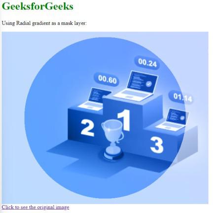
Radial Gradient
The property mask-image with radial-gradient is used to create a beautiful effect between transparent and opaque areas. The radial-gradient makes the effect of the circle or circle-like structure.
Syntax
// For Radial Gradient
mask-image: radial-gradient(circle at center, black 60%, rgba(0, 0, 0, 0.4) 40%);
Example: The following example illustrates the Radial gradient as the mask layer with the shape circle.
HTML
<!DOCTYPE html>
<html lang="en">
<head>
<meta charset="UTF-8">
<meta name="viewport"
content="width=device-width,
initial-scale=1.0">
<title>CSS Gradient</title>
<style>
img {
height: 300px;
width: 300px;
}
.imgbox {
background-image: url(
-webkit-mask-image:
radial-gradient(circle at center,
black 60%,
rgba(0, 0, 0, 0.4) 40%);
mask-image:
radial-gradient(circle at center,
black 60%,
rgba(0, 0, 0, 0.4) 40%);
height: 500px;
width: 600px;
background-size: cover;
}
.gfg {
color: green;
}
</style>
</head>
<body>
<h1 class="gfg">GeeksforGeeks</h1>
<p>Using Radial gradient as a mask layer:</p>
<div class="imgbox">
</div>
<a href=
alt="img">
Click to see the original image
</a>
</body>
</html>
|
Output:
Share your thoughts in the comments
Please Login to comment...