CSS Masking Property
Last Updated :
29 Dec, 2023
CSS Masking property is used to set the mask of an image. It creates a mask layer for the specified elements in CSS. The table below shows CSS masking properties along with syntax and their description.
With CSS masking, you can use a mask to cover parts of an element and make them partially or completely invisible. It’s like putting a special layer on top of something to show only certain areas. The table below shows CSS masking properties along with syntax and their description.
CSS Masking Properties
The following table contains a detailed list of CSS masking properties utilized in CSS masking.
|
mask-image
|
This property defines an image or gradient as a masking layer for the specified element.
|
|
mask-mode
|
The property determines whether the mask layer image is used as a luminance mask or an alpha mask.
|
|
mask-origin: content-box
|
The property is used to define the mask origin. The property determines the origin position of the masking image.
|
|
mask-position
|
This property is used for defining the initial position related to the mask position layer as defined by the mask origin property.
|
|
mask-repeat
|
The property is used to define if the mask image is repeated or not. The default value is repeat.
|
|
mask-size
|
It sets the size of the mask image to a specified element. It accepts five values including auto, size, contain, cover, and global values.
|
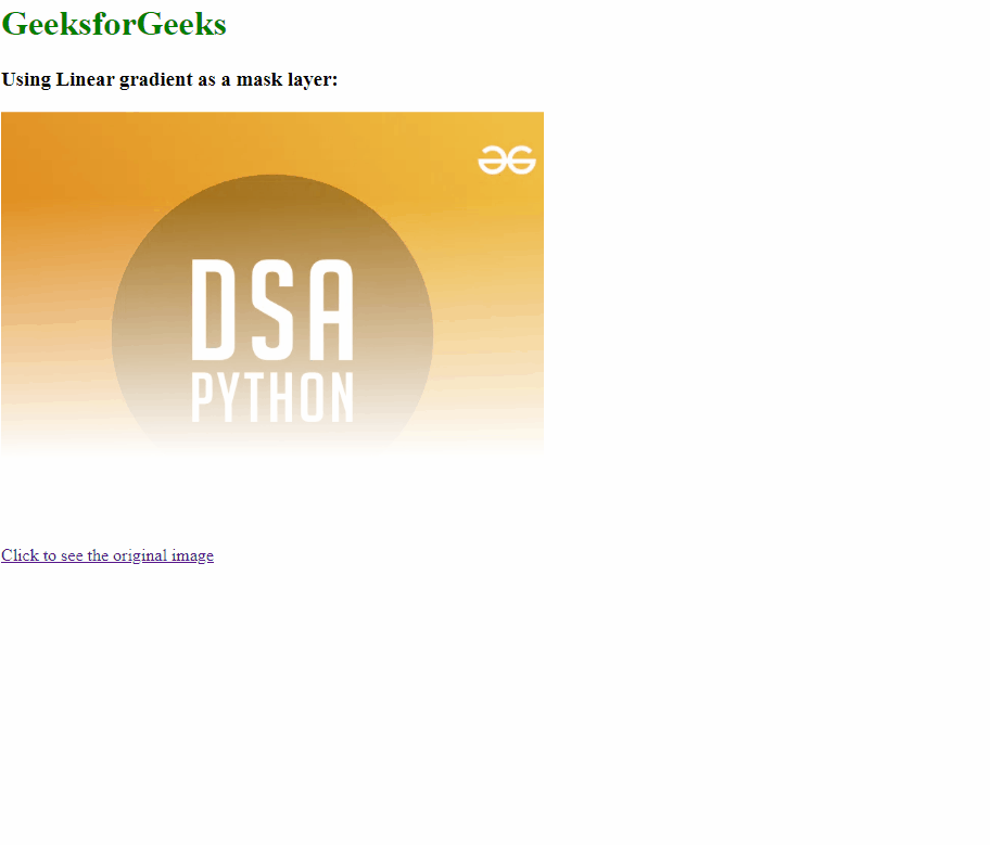
Example 1: The below example illustrates the CSS masking property.
HTML
<!DOCTYPE html>
<html lang="en">
<head>
<meta charset="UTF-8">
<meta name="viewport"
content="width=device-width,
initial-scale=1.0">
<title>CSS Gradient</title>
<style>
.imgbox {
background-image:
url(
mask-image:
linear-gradient(to top, transparent 20%, black 80%);
-webkit-mask-image:
linear-gradient(to top, transparent 20%, black 80%);
height: 400px;
width: 500px;
background-size: cover;
background-position: center;
}
.gfg {
color: green;
}
</style>
</head>
<body>
<h1 class="gfg">GeeksforGeeks</h1>
<h3>Using Linear gradient as a mask layer:</h3>
<div class="imgbox"></div>
<a
href=
Click to see the original image
</a>
</body>
</html>
|
Output:
Example 2: In this example, we will see the implementation of other masking properties with ane example.
HTML
<!DOCTYPE html>
<html lang="en">
<head>
<meta charset="UTF-8">
<meta name="viewport"
content="width=device-width, initial-scale=1.0">
<title>CSS Gradient</title>
<style>
.imgbox {
-webkit-mask-image:
linear-gradient(to top, transparent 20%, black 80%);
background-image:
url(
mask-position: center top;
/* Adjust as needed */
mask-repeat: no-repeat;
height: 400px;
width: 500px;
background-size: cover;
background-position: center;
}
.gfg {
color: green;
}
</style>
</head>
<body>
<h1 class="gfg">GeeksforGeeks</h1>
<h3>Using Linear gradient as a mask layer:</h3>
<div class="imgbox"></div>
<a
href="
Click to see the original image
</a>
</body>
</html>
|
Output:

Supported Browsers
- Chrome: 4
- Edge: 79
- Firefox: 53
- Opera: 15
Share your thoughts in the comments
Please Login to comment...