Correlation and Regression with R
Last Updated :
26 Oct, 2023
Correlation and regression analysis are two fundamental statistical techniques used to examine the relationships between variables. R Programming Language is a powerful programming language and environment for statistical computing and graphics, making it an excellent choice for conducting these analyses. In this response, I’ll provide an overview of how to perform correlation and regression analysis in R.
Correlation Analysis
Correlation analysis is a statistical technique used to measure the strength and direction of the relationship between two continuous variables. The most common measure of correlation is the Pearson correlation coefficient. It quantifies the linear relationship between two variables. The Pearson correlation coefficient, denoted as “r,” :

where,
- r: Correlation coefficient
 : i^th value first dataset X
 : Mean of first dataset X
 : i^th value second dataset Y
 : Mean of second dataset Y
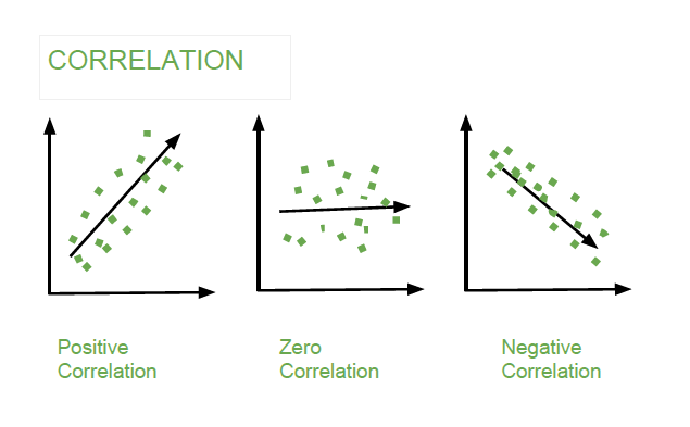
It can take values between -1 (perfect negative correlation) and 1 (perfect positive correlation), with 0 indicating no linear correlation.
Correaltion
Correlation using R
R
study_hours <- c(5, 7, 3, 8, 6, 9)
exam_scores <- c(80, 85, 60, 90, 75, 95)
correlation <- cor(study_hours, exam_scores)
correlation
|
Output:
[1] 0.9569094
Visualize the data and correlation
R
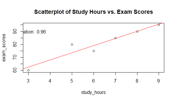
plot(study_hours, exam_scores, main = "Scatterplot of Study Hours vs. Exam Scores")
abline(lm(exam_scores ~ study_hours), col = "red")
text(3, 90, paste("Correlation: ", round(correlation, 2)))
|
Output:
Correaltion
Sample Data: We start with two vectors, study_hours and exam_scores, which represent some hypothetical data. study_hours contains the number of hours students spent studying, and exam_scores contains their corresponding exam scores. This data is used for correlation and regression analysis.
- Calculate Pearson Correlation: The cor() function is used to calculate the Pearson correlation coefficient between study_hours and exam_scores. This coefficient quantifies the linear relationship between the two variables. It’s stored in the correlation variable.
- Visualize the Data and Correlation: plot(study_hours, exam_scores, main = “Scatterplot of Study Hours vs. Exam Scores”): This line creates a scatterplot with study_hours on the x-axis and exam_scores on the y-axis. The main argument sets the plot title.
- abline(lm(exam_scores ~ study_hours), col = “red”): This adds a red regression line to the scatterplot. The lm() function fits a linear regression model of exam_scores on study_hours, and abline() plots this regression line on the scatterplot.
- text(3, 90, paste(“Correlation: “, round(correlation, 2))): This line adds text to the plot, indicating the value of the correlation coefficient. The round() function is used to round the correlation coefficient to two decimal places.
- The scatterplot visually shows the relationship between study hours and exam scores. The red regression line represents the best-fit linear model that predicts exam scores based on study hours. The text in the plot displays the calculated correlation coefficient.
- Interpretation: In the scatterplot, you can see a positive linear trend, which means that as the number of study hours increases, exam scores tend to increase.
The red regression line provides a quantitative estimate of this relationship. The steeper the slope of the line, the stronger the correlation. Here, the positive slope indicates a positive correlation.
Regression Analysis
Regression analysis is used to model the relationship between one or more independent variables and a dependent variable. In simple linear regression, there is one independent variable, while in multiple regression, there are multiple independent variables. The goal is to find a linear equation that best fits the data.
There are two types of Regression analysis.
- Simple Linear Regression
- Multiple Linear Regression
Simple Linear Regression in R
Suppose we want to perform a simple linear regression to predict exam scores (exam_scores) based on the number of study hours (study_hours).
R
study_hours <- c(5, 7, 3, 8, 6, 9)
exam_scores <- c(80, 85, 60, 90, 75, 95)
regression_model <- lm(exam_scores ~ study_hours)
summary(regression_model)
|
Output:
Call:
lm(formula = exam_scores ~ study_hours)
Residuals:
        1         2         3         4         5         6
 6.50e+00  5.00e-01 -2.50e+00 -1.11e-15 -4.00e+00 -5.00e-01
Coefficients:
            Estimate Std. Error t value Pr(>|t|)
(Intercept)  46.0000     5.5356   8.310  0.00115 **
study_hours   5.5000     0.8345   6.591  0.00275 **
---
Signif. codes:  0 ‘***’ 0.001 ‘**’ 0.01 ‘*’ 0.05 ‘.’ 0.1 ‘ ’ 1
Residual standard error: 4.031 on 4 degrees of freedom
Multiple R-squared:  0.9157,    Adjusted R-squared:  0.8946
F-statistic: 43.44 on 1 and 4 DF,  p-value: 0.002745
Visualize the data and regression line
R
plot(study_hours, exam_scores, main = "Simple Linear Regression",
xlab = "Study Hours", ylab = "Exam Scores")
abline(regression_model, col = "Green")
|
Output:

Correlation and Regression Analysis with R
In this example, a simple linear regression is performed to predict exam scores based on study hours. The lm() function creates a regression model, and summary() provides statistics. The scatterplot visually represents the relationship, with the red line indicating the best-fit linear model. The results in the summary reveal details about the intercept, slope, and model fit. This analysis helps us understand how study hours influence exam scores and provides a quantitative model for prediction.
Multiple Linear Regression Example in R
We’ll use a dataset that contains information about the price of cars based on various attributes like engine size, horsepower, and the number of cylinders. Our goal is to build a multiple linear regression model to predict car prices based on these attributes. We’ll use the mtcars dataset, which is built into R.
R
data(mtcars)
regression_model <- lm(mpg ~ wt + hp + qsec + am, data = mtcars)
summary(regression_model)
|
Output:
Call:
lm(formula = mpg ~ wt + hp + qsec + am, data = mtcars)
Residuals:
    Min      1Q  Median      3Q     Max
-3.4975 -1.5902 -0.1122  1.1795  4.5404
Coefficients:
            Estimate Std. Error t value Pr(>|t|)
(Intercept) 17.44019    9.31887   1.871  0.07215 .
wt          -3.23810    0.88990  -3.639  0.00114 **
hp          -0.01765    0.01415  -1.247  0.22309
qsec         0.81060    0.43887   1.847  0.07573 .
am           2.92550    1.39715   2.094  0.04579 *
---
Signif. codes:  0 ‘***’ 0.001 ‘**’ 0.01 ‘*’ 0.05 ‘.’ 0.1 ‘ ’ 1
Residual standard error: 2.435 on 27 degrees of freedom
Multiple R-squared:  0.8579,    Adjusted R-squared:  0.8368
F-statistic: 40.74 on 4 and 27 DF,  p-value: 4.589e-11
Visualize the data and regression line
R
par(mfrow = c(1, 2))
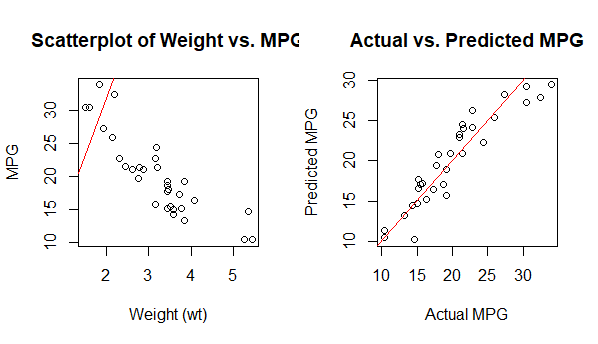
plot(mtcars$wt, mtcars$mpg, main = "Scatterplot of Weight vs. MPG",
xlab = "Weight (wt)", ylab = "MPG")
abline(regression_model$coefficients["wt"], regression_model$coefficients["(Intercept)"],
col = "red")
predicted_mpg <- predict(regression_model, newdata = mtcars)
plot(mtcars$mpg, predicted_mpg, main = "Actual vs. Predicted MPG",
xlab = "Actual MPG", ylab = "Predicted MPG")
abline(0, 1, col = "red")
|
Output:
Regression Line
We load the mtcars dataset, which contains data on various car attributes, including miles per gallon (mpg), weight (wt), horsepower (hp), quarter mile time (qsec), and transmission type (am).
- We perform a multiple linear regression using the lm() function. In this example, we predict mpg based on weight (wt), horsepower (hp), quarter mile time (qsec), and transmission type (am) as independent variables.
- We view the summary of the regression results to analyze the model coefficients, including the intercept and coefficients for each independent variable. This summary provides information about the strength and significance of each variable in predicting mpg.
We create two plots:
- Plot 1: A scatterplot of weight (wt) vs. MPG, along with the regression line. This shows the relationship between weight and MPG. The red line represents the linear relationship found by the regression model.
- Plot 2: A scatterplot of actual MPG vs. predicted MPG. This plot helps us assess how well our model’s predictions align with the actual data. The red line represents a perfect fit (actual equals predicted).
In this example, we’ve used multiple linear regression to predict car MPG based on several attributes. We’ve also included visualizations to better understand the relationships and the model’s predictive accuracy. The interpretation of coefficients and visualizations is crucial in understanding the impact of each variable on the dependent variable (MPG).
Difference between Correlation and Regression Analysis
Correlation and regression analysis are both statistical techniques used to explore relationships between variables, but they serve different purposes and provide distinct types of information in R.
|
It is used to measure and quantify the strength and direction of the association between two or more variables.
| Regression is used for prediction and understanding the causal relationships between variables.
|
The primary output is a correlation coefficient that quantifies the strength and direction of the relationship between variables.
| The output includes regression coefficients, which provide information about the intercept and the slopes of the independent variables
|
It is often used when you want to understand the degree of association between variables and explore patterns in data.
| It is employed when you want to make predictions, understand how one variable affects another, and control for the influence of other variables.
|
In summary, correlation analysis helps identify associations between variables without making predictions, while regression analysis builds predictive models to understand how one variable influences another. Both techniques are essential for different types of analyses and research questions.
Share your thoughts in the comments
Please Login to comment...