Spearman Correlation Heatmap in R
Last Updated :
25 Sep, 2023
In R Programming Language it is an effective visual tool for examining the connections between variables in a dataset is a Spearman correlation heatmap. In this post, we’ll delve deeper into the theory underlying Spearman correlation and show how to construct and read Spearman correlation heatmaps in R using a number of examples and explanations.
Understanding Spearman Correlation
The Spearman correlation coefficient (ρ) is a non-parametric measure of association between two continuous or ordinal variables. Unlike Pearson correlation, which measures linear relationships, Spearman correlation assesses the monotonic relationship between variables. Monotonic relationships are those where one variable increases as the other decreases, or vice versa, without adhering to a specific linear pattern.
Spearman correlation is beneficial when:
- The relationship between variables is not linear.
- The data is ordinal (e.g., survey ratings, Likert scale data).
- The data is not normally distributed.
- The Spearman correlation coefficient can take values between -1 and 1:
- ρ=1: Perfect positive monotonic relationship.
- ρ=−1: Perfect negative monotonic relationship.
- ρ=0: No monotonic relationship.
Example 1: Correlation Heatmap for Ordinal Data
R
library(corrplot)
data <- data.frame(
ProductQuality = c(4, 5, 3, 2, 4),
Price = c(2, 3, 1, 4, 2),
CustomerSupport = c(3, 4, 2, 1, 3),
DeliverySpeed = c(4, 5, 3, 2, 4)
)
cor_matrix <- cor(data, method = "spearman")
corrplot(
cor_matrix,
method = "color",
type = "upper",
tl.cex = 0.8,
tl.col = "black",
tl.srt = 45,
addCoef.col = "black",
title = "Spearman Correlation Heatmap"
)
|
Output:
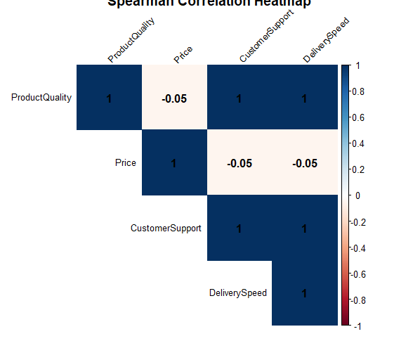
Spearman Correlation Heatmap in R
- cor_matrix: This is the matrix of Spearman correlation coefficients calculated earlier.
- method = “color”: We specify that we want to use color to represent the correlation values in the heatmap.
- type = “upper”: This parameter indicates that we want to display only the upper triangle of the correlation matrix since the lower triangle is a mirror image and contains redundant information.
- tl.cex = 0.8: This sets the size of the text labels on the heatmap to 80% of the default size.
- tl.col = “black”: It sets the color of the text labels to black.
- tl.srt = 45: This parameter rotates the text labels by 45 degrees for better readability.
- addCoef.col = “black”: It sets the color of the correlation coefficient values to black.
- title = “Spearman Correlation Heatmap”: This provides a title for the heatmap.
Example 2: Correlation Heatmap with Large Dataset
R
library(corrplot)
library(datasets)
data(mtcars)
cor_matrix <- cor(mtcars, method = "spearman")
corrplot(
cor_matrix,
method = "color",
type = "upper",
tl.cex = 0.7,
tl.col = "black",
tl.srt = 45,
addCoef.col = "black",
title = "Spearman Correlation Heatmap (mtcars)"
)
|
Output:
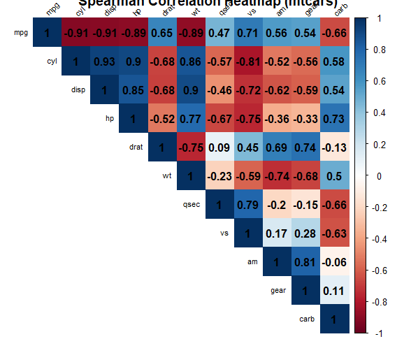
Spearman Correlation Heatmap in R
First we loads the mtcars dataset from the datasets package. The mtcars dataset contains information about various car models, including attributes such as miles per gallon (mpg), horsepower (hp), and weight (wt).
- we calculate the Spearman correlation coefficients for the mtcars dataset. The cor function is used with the method = “spearman” argument to specify that we want to compute Spearman correlations.
- cor_matrix: This is the matrix of Spearman correlation coefficients calculated earlier for the mtcars dataset.
- method = “color”: We specify that we want to use color to represent the correlation values in the heatmap.
- type = “upper”: This parameter indicates that we want to display only the upper triangle of the correlation matrix since the lower triangle is a mirror image and contains redundant information.
- tl.cex = 0.7: This sets the size of the text labels on the heatmap to 70% of the default size.
- tl.col = “black”: It sets the color of the text labels to black.
- tl.srt = 45: This parameter rotates the text labels by 45 degrees for better readability.
- addCoef.col = “black”: It sets the color of the correlation coefficient values to black.
- title = “Spearman Correlation Heatmap (mtcars)”: This provides a title for the heatmap, indicating that it’s a Spearman correlation heatmap for the mtcars dataset.
Example 3: Correlation Heatmap with Color Gradients
R
library(corrplot)
library(datasets)
data(mtcars)
cor_matrix <- cor(mtcars, method = "spearman")
corrplot(
cor_matrix,
method = "color",
type = "upper",
col = colorRampPalette(c("blue", "white", "red"))(100),
tl.cex = 0.7,
tl.col = "black",
tl.srt = 45,
addCoef.col = "black",
title = "Spearman Correlation Heatmap (mtcars)"
)
|
Output:
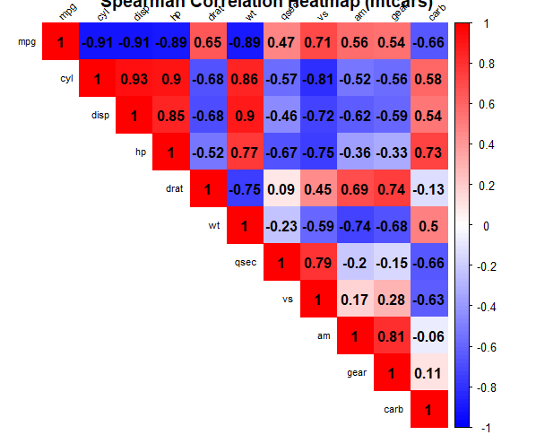
Spearman Correlation Heatmap in R
In this enhanced version, we use a color gradient that transitions from blue (negative correlations) to white (no correlations) to red (positive correlations). This creates a visually appealing and informative heatmap.
Example 4: Interactive Correlation Heatmap
R
library(corrplot)
library(datasets)
library(heatmaply)
data(mtcars)
cor_matrix <- cor(mtcars, method = "spearman")
heatmaply(cor_matrix,
colors = colorRampPalette(c("blue", "white", "red"))(100),
width = 800,
height = 800,
fontsize_row = 12,
fontsize_col = 12,
main = "Spearman Correlation Heatmap (mtcars)"
)
|
Output:
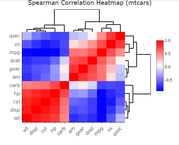
Spearman Correlation Heatmap in R
- Load Required Packages: We load three packages: corrplot for correlation plotting, datasets to access the mtcars dataset, and heatmaply for interactive heatmaps.
- Load the mtcars Dataset: We load the mtcars dataset from the datasets package. This dataset contains information about various car models.
- Calculate Spearman Correlation Coefficients: We compute the Spearman correlation coefficients for the mtcars dataset using the cor function with method = “spearman”.
- Create a Correlation Heatmap with heatmaply: Here’s where the interactive Spearman correlation heatmap is generated. We use the heatmaply function with the following parameters:
- cor_matrix: The matrix of Spearman correlation coefficients calculated earlier.
- colors: We specify a color gradient using colorRampPalette to go from blue (negative correlations) through white (no correlations) to red (positive correlations).
- width and height: These parameters determine the dimensions of the heatmap.
- fontsize_row and fontsize_col: We set the font sizes for the row and column labels.
- main: This is the title of the heatmap.
Conclusion:
Creating a Spearman correlation heatmap in R is a useful way to visualize the relationships between variables in your dataset. By examining the color patterns and values in the heatmap, you can gain insights into the strength and direction of the associations between variables, helping you make informed decisions in your data analysis and research.
Share your thoughts in the comments
Please Login to comment...