Contour Plots using Plotly in Python
Last Updated :
12 Feb, 2021
A Plotly is a Python library that is used to design graphs, especially interactive graphs. It can plot various graphs and charts like histogram, barplot, boxplot, spreadplot, and many more. It is mainly used in data analysis as well as financial analysis. plotly is an interactive visualization library.
Contour Plots in Plotly
A contour plot has a function of two variables of curves along which the function has constant values so that these curves join the points with equal values. In contour plot, a 2d contour plot presents contour lines of a 2D numerical array z, i.e. interpolated lines of iso values of z.
Syntax: plotly.graph_objects.Contour(arg=None,colorbar=None, hoverinfo=None, x=None,y=None,**kwargs)
Parameters:
arg: dict of properties compatible with this constructor or an instance of plotly.graph_objects.Contour
colorbar: plotly.graph_objects.contour.ColorBar instance or dict with compatible properties
x: Sets the x coordinates.
y: Sets the y coordinates.
z: Sets the z coordinates.
hoverinfo: Determines which trace information appear on hover. If none or skip are set, no information is displayed upon hovering. But, if none is set, click and hover events are still fired.
Example 1: Creating a simple contour plot
Python3
import plotly.graph_objects as go
import numpy as np
data = [[1,2,3,4,5],
[3,4,5,6,7],
[7,8,9,6,4],
[3,7,2,4,2]]
fig = go.Figure(data =
go.Contour(z = data))
fig.show()
|
Output:
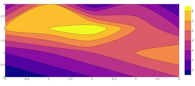
Example 2: Creating contour plot with X and Y coordinates.
Python3
import plotly.graph_objects as go
feature_x = np.arange(0, 50, 2)
feature_y = np.arange(0, 50, 3)
[X, Y] = np.meshgrid(feature_x, feature_y)
Z = np.cos(X / 2) + np.sin(Y / 4)
fig = go.Figure(data =
go.Contour(x = feature_x, y = feature_y, z = Z))
fig.show()
|
Output:
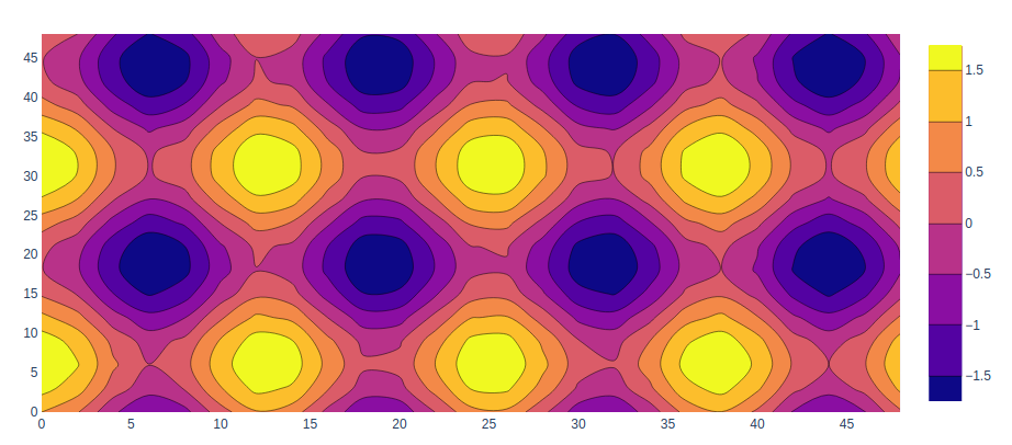
Adding Colorscale
In plotly, the colorscale for the contour plot is used to add different colors and can be set using the colorscale parameter.
Example:
Python3
import plotly.graph_objects as go
feature_x = np.arange(0, 50, 2)
feature_y = np.arange(0, 50, 3)
[X, Y] = np.meshgrid(feature_x, feature_y)
Z = np.cos(X / 2) + np.sin(Y / 4)
fig = go.Figure(data =
go.Contour(x = feature_x, y = feature_y, z = Z,
colorscale='rainbow'
))
fig.show()
|
Output:
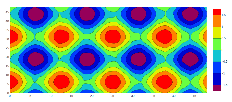
Custom Contour Plot Colorscale
Here we can customize our contour plot using colorscale. A list of colors that will be spaced evenly to create the colorscale. Many predefined colorscale lists are included in the sequential, diverging.
The following color set is available on colorscale.
‘aggrnyl’, ‘agsunset’, ‘algae’, ‘amp’, ‘armyrose’, ‘balance’, ‘blackbody’, ‘bluered’, ‘blues’, ‘blugrn’, ‘bluyl’, ‘brbg’,’brwnyl’, ‘bugn’, ‘bupu’, ‘burg’, ‘burgyl’, ‘cividis’, ‘curl’, ‘darkmint’, ‘deep’, ‘delta’, ‘dense’, ‘earth’, ‘edge’, ‘electric’, ’emrld’, ‘fall’, ‘geyser’, ‘gnbu’, ‘gray’, ‘greens’, ‘greys’,’haline’, ‘hot’, ‘hsv’, ‘ice’, ‘icefire’, ‘inferno’, ‘jet’, ‘magenta’, ‘magma’, ‘matter’, ‘mint’, ‘mrybm’, ‘mygbm’, ‘oranges’, ‘orrd’, ‘oryel’, ‘oxy’, ‘peach’, ‘phase’, ‘picnic’, ‘pinkyl’, ‘piyg’, ‘plasma’, ‘plotly3’, ‘portland’, ‘prgn’, ‘pubu’, ‘pubugn’,’puor’, ‘purd’, ‘purp’, ‘purples’, ‘purpor’, ‘rainbow’, ‘rdbu’, ‘rdgy’, ‘rdpu’, ‘rdylbu’, ‘rdylgn’, ‘redor’, ‘reds’, ‘solar’, ‘spectral’, ‘speed’, ‘sunset’, ‘sunsetdark’, ‘teal’, ‘tealgrn’, ‘tealrose’, ‘tempo’, ‘temps’, ‘thermal’, ‘tropic’, ‘turbid’, ‘turbo’, ‘twilight’, ‘viridis’, ‘ylgn’, ‘ylgnbu’, ‘ylorbr’, ‘ylorrd’].
Example:
Python3
import plotly.graph_objects as go
feature_x = np.arange(0, 50, 2)
feature_y = np.arange(0, 50, 3)
colorscale = colorscale = [[0, 'green'], [0.5, 'red'],
[1.0, 'rgb(0, 0, 255)']]
[X, Y] = np.meshgrid(feature_x, feature_y)
Z = np.cos(X / 2) + np.sin(Y / 4)
fig = go.Figure(data =
go.Contour(x = feature_x, y = feature_y, z = Z,
colorscale = colorscale))
fig.show()
|
Output:
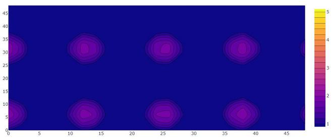
Customizing Size and Range
We can customize size and range of our contour plot using contours attributes. contours accept dict object that contains the range and size of the coordinates.
Python3
import plotly.graph_objects as go
feature_x = np.arange(0, 50, 2)
feature_y = np.arange(0, 50, 3)
[X, Y] = np.meshgrid(feature_x, feature_y)
Z = np.cos(X / 2) + np.sin(Y / 4)
fig = go.Figure(data =
go.Contour(x = feature_x,
y = feature_y, z = Z,
contours=dict(
start=1,
end=5,
size=.2)
)
)
fig.show()
|
Output:
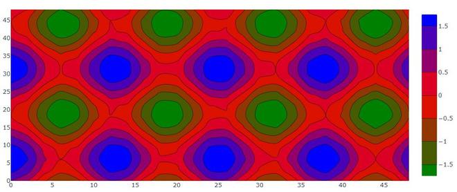
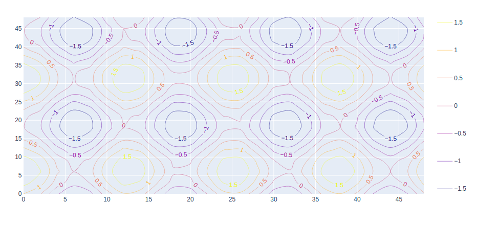
Adding Labels on Contour Line
Labels can be added using the contours parameter that has a property called showlabels. It determines whether to label the contour lines with their values.
Example:
Python3
import plotly.graph_objects as go
feature_x = np.arange(0, 50, 2)
feature_y = np.arange(0, 50, 3)
[X, Y] = np.meshgrid(feature_x, feature_y)
Z = np.cos(X / 2) + np.sin(Y / 4)
fig = go.Figure(data=go.Contour(
x=feature_x, y=feature_y, z=Z,
contours=dict(
coloring='lines',
showlabels=True,)
))
fig.show()
|
Output:
Share your thoughts in the comments
Please Login to comment...