Clustered Bar Plot in R
Last Updated :
26 Sep, 2023
One of the most popular packages for data visualisation is ggplot2, which can be used to create a clustered bar plot in R.
Clustered Bar Plot
A clustered bar chart is a horizontal chart, which could present multiple bars in the form of a cluster. The horizontal bars basically group together, as they are under the same, y values. We have various options to format clustered bar charts, we can change the value of the x-axis, y-axis, its title, etc. In this article, we will learn how to format a clustered bar chart in Power BI and explore its various options.
The ggplot2 package is used in the example below to demonstrate how to make a clustered bar plot in R.
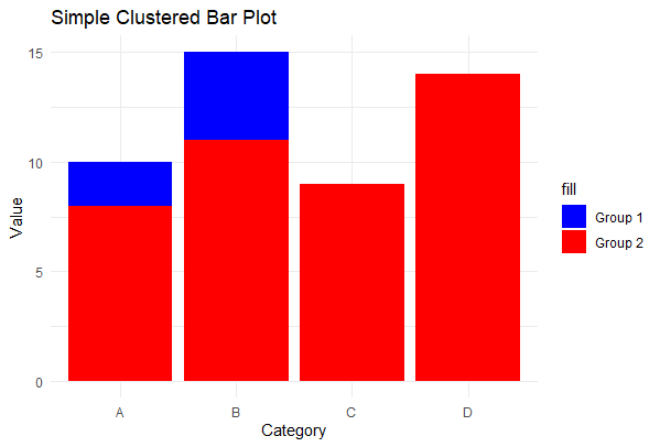
Simple Clustered Bar Plot
R
library(ggplot2)
data <- data.frame(
Category = c("A", "B", "C", "D"),
Group1 = c(10, 15, 7, 12),
Group2 = c(8, 11, 9, 14)
)
ggplot(data, aes(x = Category)) +
geom_bar(aes(y = Group1, fill = "Group 1"), stat = "identity", position = "dodge") +
geom_bar(aes(y = Group2, fill = "Group 2"), stat = "identity", position = "dodge") +
labs(title = "Simple Clustered Bar Plot", y = "Value") +
scale_fill_manual(values = c("Group 1" = "blue", "Group 2" = "red")) +
theme_minimal()
|
Output:
Clustered Bar Plot in R
In this example, we create a basic clustered bar plot using ggplot2. We have two groups (Group 1 and Group 2) with four categories (A, B, C, and D). The geom_bar function is used to plot bars for each group, and position = “dodge” ensures that bars for the same category are clustered together. We specify colors for the two groups using scale_fill_manual, and add labels and a title to the plot.
Grouped Stacked Bar Plot
R
library(ggplot2)
sales_data <- data.frame(
Category = c("Electronics", "Clothing", "Books", "Furniture"),
North = c(250, 180, 90, 450),
South = c(220, 150, 140, 310),
West = c(280, 100, 100, 380)
)
ggplot(sales_data, aes(x = Category)) +
geom_bar(aes(y = North, fill = "North"), stat = "identity") +
geom_bar(aes(y = South, fill = "South"), stat = "identity") +
geom_bar(aes(y = West, fill = "West"), stat = "identity") +
labs(
title = "Sales by Product Category and Region",
y = "Total Sales",
fill = "Region"
) +
scale_fill_manual(
values = c("North" = "#1f77b4", "South" = "#ff7f0e", "West" = "#2ca02c"),
labels = c("North Region", "South Region", "West Region")
) +
theme_minimal() +
theme(legend.position = "top")
|
Output:
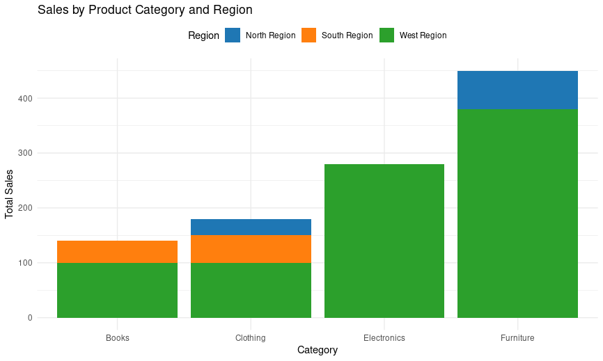
Sales by Product Category and Region
- In this example, we use sales data for four product categories (Electronics, Clothing, Books, Furniture) across three regions (North, South, West). We create a grouped stacked bar plot to visualize how sales are divided within each category and region.
- Different fill colors (blue, orange, green) are used to represent the three regions (North, South, West).
- The bars are stacked for each product category, showing the total sales for each category.
- The legend is positioned at the top for better readability.
- Custom fill colors and labels are specified using scale_fill_manual for improved aesthetics.
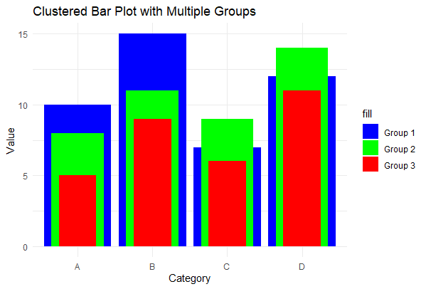
Clustered Bar Plot with Multiple Groups
R
library(ggplot2)
data <- data.frame(
Category = c("A", "B", "C", "D"),
Group1 = c(10, 15, 7, 12),
Group2 = c(8, 11, 9, 14),
Group3 = c(5, 9, 6, 11)
)
ggplot(data, aes(x = Category)) +
geom_bar(aes(y = Group1, fill = "Group 1"), stat = "identity", position = "dodge") +
geom_bar(aes(y = Group2, fill = "Group 2"), stat = "identity", position = "dodge",
width = 0.7) +
geom_bar(aes(y = Group3, fill = "Group 3"), stat = "identity", position = "dodge",
width = 0.5) +
labs(title = "Clustered Bar Plot with Multiple Groups", y = "Value") +
scale_fill_manual(values = c("Group 1" = "blue", "Group 2" = "green",
"Group 3" = "red")) +
theme_minimal()
|
Output:
Clustered Bar Plot in R
In this example, we create a clustered bar plot with three groups (Group 1, Group 2, and Group 3) for each category. The bars for each group are clustered together using position = “dodge”, and we adjust the width of the bars for better visibility. Different fill colors are used to distinguish the groups.
Clustered Bar Plot in R using Plotly
R
library(plotly)
data <- data.frame(
Month = c("January", "February", "March", "April"),
ProductA = c(100, 120, 90, 110),
ProductB = c(80, 110, 85, 100)
)
plot_ly(data, x = ~Month) %>%
add_bars(y = ~ProductA, name = "Product A", marker = list(color = "pink")) %>%
add_bars(y = ~ProductB, name = "Product B", marker = list(color = "yellow")) %>%
layout(
title = "Sales Comparison of Product A and Product B",
xaxis = list(title = "Month"),
yaxis = list(title = "Sales")
)
|
Output:
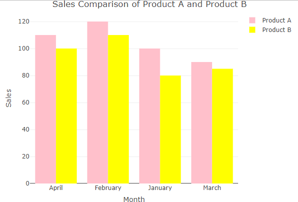
Clustered Bar Plot in R
- The plot_ly function initializes a plotly plot, specifying the data frame (data) and mapping the x-axis to the Month variable.
- The add_bars function is used twice to add bars for Product A and Product B, with different colors.
- The layout function sets the title, x-axis label, and y-axis label for the plot.
- This code will generate an interactive clustered bar plot comparing the sales of Product A and Product B across different months, with the specified title and axis labels. we can hover over the bars to see the exact sales values for each product in each month, making it an interactive and informative visualization.
Conclusion
This article delves into the realm of visualizations, specifically focusing on creating clustered bar plots in R with ggplot2. Clustered bar charts offer a powerful means of comparing data across multiple categories and groups. The provided examples illustrate the versatility of these plots, ranging from straightforward comparisons to in-depth data exploration. Whether through ggplot2, Power BI, or Plotly, leveraging these tools empowers users to craft customized and interactive visualizations, making clustered bar plots valuable for a wide range of data analysis and presentation needs.
Share your thoughts in the comments
Please Login to comment...