Chart.js Styling Axes
Last Updated :
11 Dec, 2023
Chart.js Styling Axes allows us to represent the data in a visually appealing and more informative way. The customization of axis elements, ticks, labels, and grid lines is styled here to make the data representation clearer and more engaging.
Syntax:
const config = {
    type: 'your_chart_type',
    data:,
    options: {
        scales: {
            x: { title: {
                display: true,
                text: 'X-Axis Title',
                color: 'your_color'
            }, ticks: {
                color: 'your_color'
            } },
            y: { title: {
                display: true,
                text: 'Y-Axis Title',
                color: 'your_color'
            }, ticks: {
                color: 'your_color'
            } },
        },
    },
};
Grid Line Configuration
- circular: This option is used to determine whether gridlines are circular, specifically for radar and polar area charts.
- color: This option is used to define the color of the grid lines, allowing customization for each grid line if specified as an array.
- display: This option is used to control the visibility of grid lines for this axis.
- drawnOnChartArea: This option is used to control whether lines are drawn on the chart area inside the axis lines.
- drawTicks: This option is used to specify whether lines are drawn beside the ticks in the axis area beside the chart.
- lineWidth: This option is used to set the stroke width of grid lines.
- offset: This option is used to shift grid lines to be between labels if true.
- tickBorderDash: This option is used to define the length and spacing of the tick mark line.
- tickBorderDashOffset: This option is used to set the offset for the line dash of the tick mark.
- tickColor: This option is used to determine the color of the tick line.
- tickLength: This option is used to set the length in pixels that the grid lines will draw into the axis area.
- tickWidth: This option is used to specify the width of the tick mark in pixels.
- z: This option is used to control the z-index of the gridline layer.
Tick Configuration
- backdropColor: This option is used to define the color of label backdrops.
- backdropPadding: This option is used to set the padding of label backdrops.
- callback: This option is used to provide a function that returns the string representation of the tick value for display.
- display: This option is used to control the visibility of tick labels.
- color: This option is used to set the color of ticks.
- font: This option is used to specify font settings for ticks.
- major: This option is used to configure major ticks.
- padding: This option is used to set the offset of the tick labels from the axis.
- showLabelBackdrop: This option is used to determine whether a background is drawn behind the tick labels.
- textStrokeColor: This option is used to define the color of the stroke around the text.
- textStrokeWidth: This option is used to set the stroke width around the text.
- z: This option is used to control the z-index of the tick layer.
Major Tick Configuration
- enabled: This option is used to determine whether major ticks are generated.
Border Configuration
- display: This option is used to control the visibility of a border at the edge between the axis and the chart area.
- color: This option is used for color: set the color of the border line.
- width: This option is used to specify the width of the border line.
- dash: This option is used to define the length and spacing of dashes on grid lines.
- dashOffset: This option is used to set the offset for line dashes.
- z: This option is used to control the z-index of the border.
CDN link
<script src="https://ajax.googleapis.com/ajax/libs/jquery/3.6.1/jquery.min.js"></script>
<script src="https://cdnjs.cloudflare.com/ajax/libs/Chart.js/4.1.2/chart.umd.js"></script>
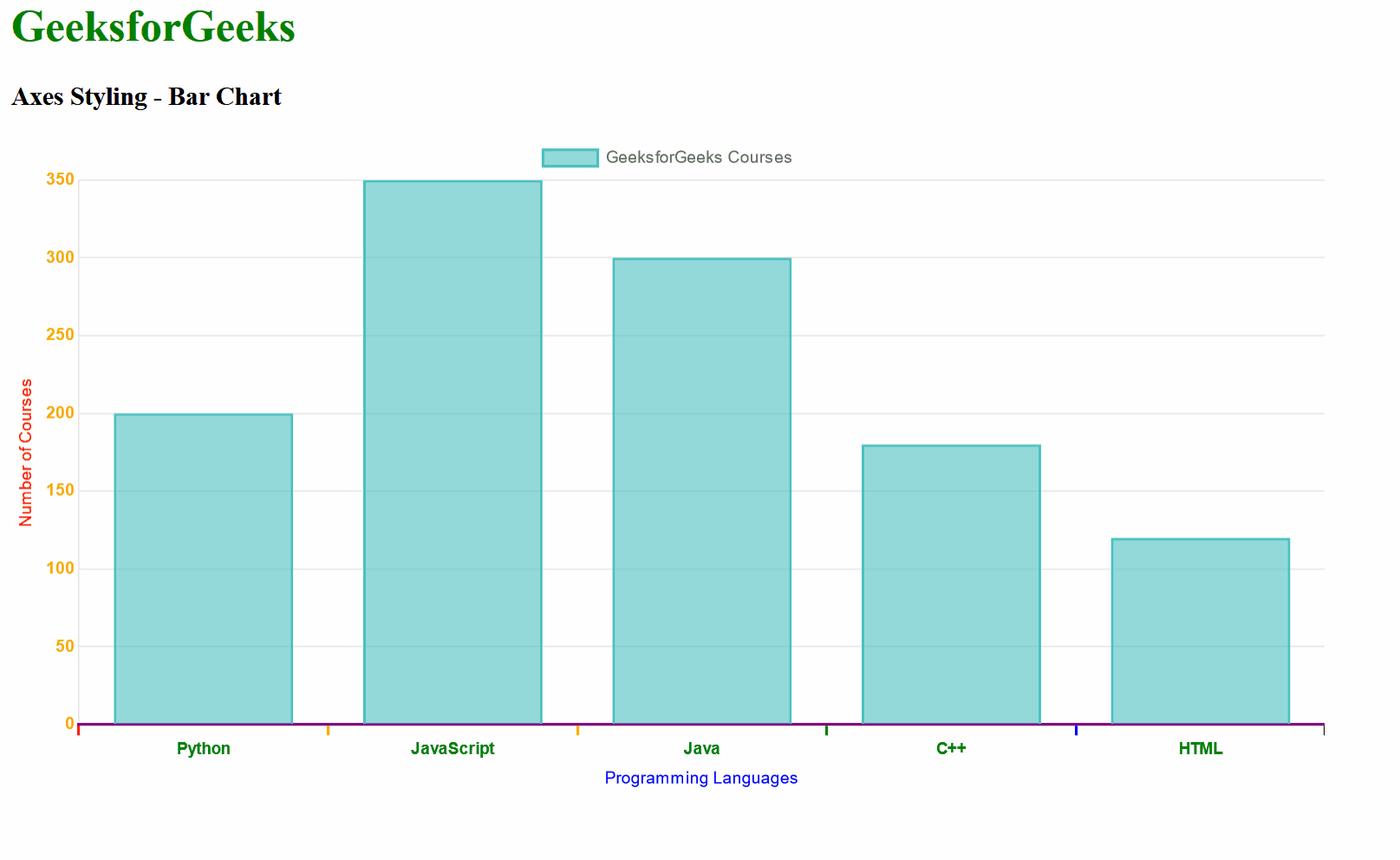
Example 1: In the below example, we have used the Chart.js Bar chart to present the data related to GeeksforGeeks. We have used the styling axe configuration options like ticks, grid, and border to style the x and y axes of the Bar Chart with various colors and other options.
HTML
<!DOCTYPE html>
<html lang="en">
<head>
<meta charset="UTF-8">
<meta name="viewport" content=
"width=device-width, initial-scale=1.0">
<script src=
</script>
<script src=
</script>
<title>Bar Chart - Axes Styling</title>
</head>
<body>
<div>
<h1 style="color:green;">
GeeksforGeeks
</h1>
<h3>Axes Styling - Bar Chart </h3>
<div style="width:80%;">
<canvas id="barChart"></canvas>
</div>
</div>
<script>
const data = {
labels: ['Python', 'JavaScript', 'Java', 'C++', 'HTML'],
datasets: [{
label: 'GeeksforGeeks Courses',
data: [200, 350, 300, 180, 120],
backgroundColor: 'rgba(75, 192, 192, 0.6)',
borderColor: 'rgba(75, 192, 192, 1)',
borderWidth: 2,
}],
};
const config = {
type: 'bar',
data: data,
options: {
scales: {
x: {
display: true,
title: {
display: true,
text: 'Programming Languages',
color: 'blue',
},
ticks: {
color: 'green',
font: { size: 12, weight: 'bold' },
},
grid: {
color: ['red', 'orange',
'yellow', 'green', 'blue'],
display: true,
lineWidth: 2,
drawOnChartArea: false,
},
border: {
display: true,
color: 'purple',
width: 2,
},
},
y: {
display: true,
title: {
display: true,
text: 'Number of Courses',
color: 'red',
},
ticks: {
color: 'orange',
font: { size: 12, weight: 'bold' },
},
grid: {
display: true,
drawTicks: false,
},
},
},
},
};
const myChart =
new Chart(document.getElementById('barChart'), config);
</script>
</body>
</html>
|
Output:
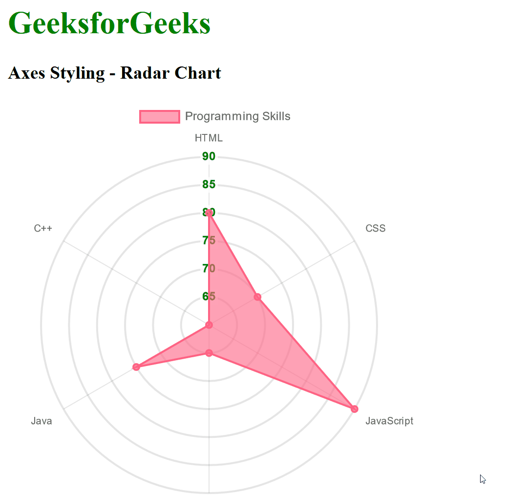
Example 2: In the below example, we have used the Radar Chart in which we have various Styling Axes options like ticks, grid, and border. As in the Radar Chart, there is only 1 axis, so we have used this option for only one axis.
HTML
<!DOCTYPE html>
<html lang="en">
<head>
<meta charset="UTF-8">
<meta name="viewport" content=
"width=device-width, initial-scale=1.0">
<script src=
</script>
<script src=
</script>
<title>Radar Chart - Axes Styling</title>
</head>
<body>
<div>
<h1 style="color:green;">
GeeksforGeeks
</h1>
<h3>Axes Styling - Radar Chart </h3>
<div style="width:80%;">
<canvas id="radarChart"></canvas>
</div>
</div>
<script>
const data = {
labels: ['HTML', 'CSS',
'JavaScript', 'Python', 'Java', 'C++'],
datasets: [{
label: 'Programming Skills',
data: [80, 70, 90, 65, 75, 60],
backgroundColor: 'rgba(255, 99, 132, 0.6)',
borderColor: 'rgba(255, 99, 132, 1)',
borderWidth: 2,
}],
};
const config = {
type: 'radar',
data: data,
options: {
scales: {
r: {
display: true,
title: {
display: true,
text: 'Skill Level',
color: 'blue',
},
ticks: {
color: 'green',
font: { size: 12, weight: 'bold' },
},
grid: {
circular: true,
display: true,
lineWidth: 2,
},
border: {
display: true,
color: 'purple',
width: 2,
},
},
},
},
};
const myChart = new Chart(
document.getElementById('radarChart'), config);
</script>
</body>
</html>
|
Output:
Share your thoughts in the comments
Please Login to comment...