Bootstrap 5 Ratios
Last Updated :
10 Jan, 2023
Bootstrap 5 provides ratios, which can be used to create fixed-ratio containers. These containers maintain a specific aspect ratio, regardless of the size of the screen or the content within them.
Bootstrap 5 Ratios:
- Aspect ratio: The proportionality between an element’s height and breadth is known as an aspect ratio. Aspect ratios are useful when we use videos, images, etc. The height-width relationship stays the same, as defined, regardless of the width. By default, the four aspect ratios are set in Bootstrap 5.
- Custom Ratio: We can use bootstrap 5 custom ratios to set the aspect ratio using a CSS custom property. Components can have unique aspect ratios by simply substituting CSS variables for modifier classes. A CSS custom property or variable is present in the selector for each ratio-* class.
- SASS map: Syntactically awesome stylesheet is used to customize the aspect ratio values. $aspect-ratios is used to customize the aspect ratio values.
Example 1: In this example, we will demonstrate bootstrap 5 aspect ratios.
HTML
<!DOCTYPE html>
<html>
<head>
<meta charset="utf-8">
<meta name="viewport" content=
"width=device-width, initial-scale=1">
<link href=
rel="stylesheet">
<link href=
rel="stylesheet">
<script src=
</script>
</head>
<body class="p-3 m-2 mt-4 text-center shadow
bd-example bd-example-ratios">
<h1 class="text-success">
GeeksforGeeks
</h1>
<h3>Bootstrap 5 Ratios</h3>
<div class="ratio ratio-1x1 bg-primary">
<h1 class="text-success">GFG</h1>
</div>
<div class="ratio ratio-4x3 bg-info">
<h1 class="text-success">GFG</h1>
</div>
<div class="ratio ratio-16x9 bg-secondary">
<h1 class="text-success">GFG</h1>
</div>
</body>
</html>
|
Output:
.png)
bootstrap 5 ratios
Example 2: In this example, we will demonstrate bootstrap 5 Custom ratios.
HTML
<!DOCTYPE html>
<html>
<head>
<meta charset="utf-8">
<meta name="viewport" content=
"width=device-width, initial-scale=1">
<link href=
rel="stylesheet" integrity=
"sha384-EVSTQN3/azprG1Anm3QDgpJLIm9Nao0Yz1ztcQTwFspd3yD65VohhpuuCOmLASjC"
crossorigin="anonymous">
<script src=
integrity=
"sha384-MrcW6ZMFYlzcLA8Nl+NtUVF0sA7MsXsP1UyJoMp4YLEuNSfAP+JcXn/tWtIaxVXM"
crossorigin="anonymous">
</script>
</head>
<body class="m-3" style="width:540px">
<center>
<div>
<h1 class="text-success">GeeksforGeeks</h1>
<h2>Bootstrap 5 ratios</h2>
</div>
<br>
<div class="ratio" style="--bs-aspect-ratio:30%;">
<div class="bg-info">
<h1>GFG</h1>
<p>30%</p>
</div>
</div>
<div class="ratio" style="--bs-aspect-ratio:50%;">
<div class="bg-primary">
<h1>GFG</h1>
<p>50%</p>
</div>
</div>
</center>
</body>
</html>
|
Output:
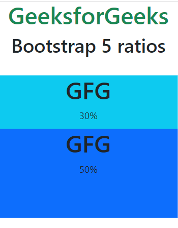
bootstrap 5 ratios
Reference: https://getbootstrap.com/docs/5.0/helpers/ratio/
Share your thoughts in the comments
Please Login to comment...