Bootstrap 5 Approach
Last Updated :
15 Apr, 2024
Bootstrap 5 Approach simplifies customization and extension, providing principles and strategies for tailored development. It manages viewport behavior, ensuring optimal rendering on diverse devices. By setting viewport width and scale, enables responsive design, adjusting content for optimal viewing.
Bootstrap 5 facilitates the different approaches to customizing the design of the webpage which are described below:
| Concept | Description |
|---|
| Responsive | Bootstrap’s styles apply progressively with min-width queries for mobile-first responsiveness. |
| Classes | Bootstrap primarily uses classes for selectors, simplifying overrides and variations. |
| Z-index Scale | Utilizes two z-index scales for component elements and overlays like modals and tooltips. |
| Utilities | Utility classes combat CSS bloat, optimize performance, and reduce the need for custom CSS. |
| Flexible HTML | Focuses on single classes, avoids immediate children selectors for flexible component implementation. |
Example 1: In this example, we use a responsive navbar and a section with introductory text. It utilizes Bootstrap 5 classes for styling and responsiveness.
HTML
<!DOCTYPE html>
<html lang="en">
    <head>
        <meta charset="UTF-8" />
        <meta
            name="viewport"
            content="width=device-width,
                   initial-scale=1.0"
        />
        <link
            rel="stylesheet"
            href=
"https://cdn.jsdelivr.net/npm/bootstrap@5.3.0/dist/css/bootstrap.min.css"
        />
        <title>Responsive Navbar</title>
    </head>

    <body>
        <nav
            class="navbar navbar-expand-lg
                   navbar-light bg-light"
        >
            <div class="container">
                <a class="navbar-brand" href="#">
                    My Website
                </a>
                <button
                    class="navbar-toggler"
                    type="button"
                    data-bs-toggle="collapse"
                    data-bs-target="#navbarNav"
                    aria-controls="navbarNav"
                    aria-expanded="false"
                    aria-label="Toggle navigation"
                >
                    <span
                        class="navbar-toggler-icon"
                    ></span>
                </button>
                <div
                    class="collapse navbar-collapse"
                    id="navbarNav"
                >
                    <ul
                        class="navbar-nav ml-auto"
                    >
                        <li class="nav-item">
                            <a
                                class="nav-link"
                                href="#"
                            >
                                Home
                            </a>
                        </li>
                        <li class="nav-item">
                            <a
                                class="nav-link"
                                href="#"
                            >
                                About
                            </a>
                        </li>
                        <li class="nav-item">
                            <a
                                class="nav-link"
                                href="#"
                            >
                                Services
                            </a>
                        </li>
                        <li class="nav-item">
                            <a
                                class="nav-link"
                                href="#"
                            >
                                Contact
                            </a>
                        </li>
                    </ul>
                </div>
            </div>
        </nav>
        <header
            class="bg-secondary text-white text-center py-3"
        >
            <h2>Bootstrap 5 Example</h2>
        </header>

        <section class="container mt-5">
            <div class="row">
                <div class="col-md-6">
                    <h2>Introduction</h2>
                    <p>
                        Bootstrap is a free and
                        open-source collection of
                        CSS and JavaScript/jQuery
                        code used for creating
                        dynamic websites layout
                        and web applications.
                        Bootstrap is one of the
                        most popular front-end
                        frameworks which has
                        really a nice set of
                        predefined CSS codes.
                        Bootstrap uses different
                        types of classes to make
                        responsive websites.
                        Bootstrap 5 was officially
                        released on 16 June 2020
                        after several months of
                        redefining its features.
                    </p>
                </div>
            </div>
        </section>
        <script src=
"https://cdn.jsdelivr.net/npm/bootstrap@5.3.0/dist/js/bootstrap.bundle.min.js">

        </script>
    </body>
</html>
Output:

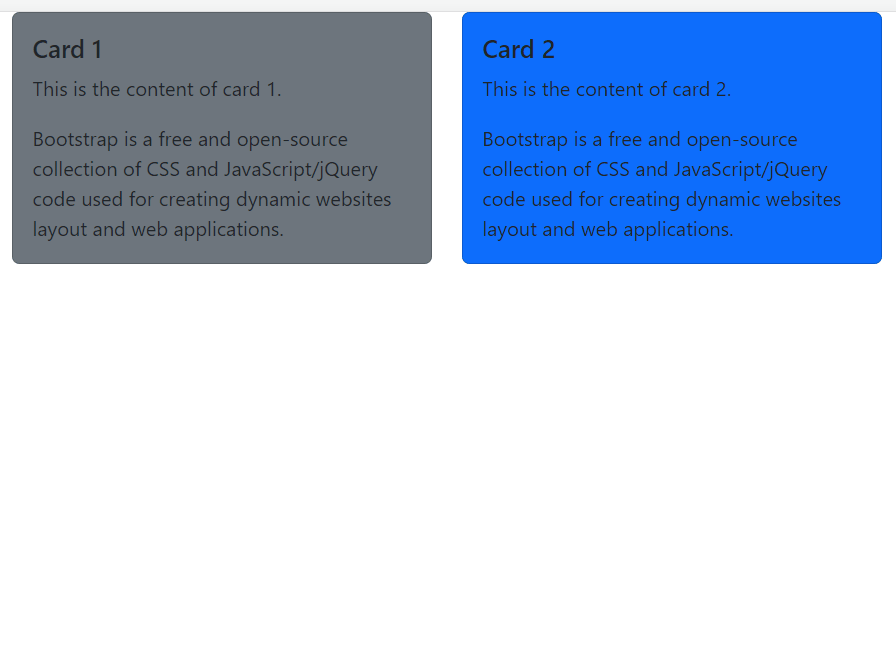
Example 2: In this example, we are demonstrates a responsive grid layout using Bootstrap 5. It divides the page into two columns on medium screens and larger, displaying two cards side by side, each containing title and content.
HTML
<!DOCTYPE html>
<html lang="en">
    <head>
        <meta charset="UTF-8" />
        <meta
            name="viewport"
            content="width=device-width,
                     initial-scale=1.0"
        />
        <link
            rel="stylesheet"
            href=
"https://cdn.jsdelivr.net/npm/bootstrap@5.3.0/dist/css/bootstrap.min.css"
        />
        <title>Responsive Grid Layout</title>
    </head>

    <body>
        <div class="container">
            <div class="row">
                <div class="col-md-6">
                    <div
                        class="card bg-secondary"
                    >
                        <div class="card-body">
                            <h5
                                class="card-title"
                            >
                                Card 1
                            </h5>
                            <p class="card-text">
                                This is the
                                content of card 1.
                            </p>
                            <p class="card-text">
                                Bootstrap is a
                                free and
                                open-source
                                collection of CSS
                                and
                                JavaScript/jQuery
                                code used for
                                creating dynamic
                                websites layout
                                and web
                                applications.
                            </p>
                        </div>
                    </div>
                </div>
                <div class="col-md-6">
                    <div class="card bg-primary">
                        <div class="card-body">
                            <h5
                                class="card-title"
                            >
                                Card 2
                            </h5>
                            <p class="card-text">
                                This is the
                                content of card 2.
                            </p>
                            <p class="card-text">
                                Bootstrap is a
                                free and
                                open-source
                                collection of CSS
                                and
                                JavaScript/jQuery
                                code used for
                                creating dynamic
                                websites layout
                                and web
                                applications.
                            </p>
                        </div>
                    </div>
                </div>
            </div>
        </div>
    </body>
</html>
Output:
Share your thoughts in the comments
Please Login to comment...