Bootstrap 5 Ratio Custom Ratios
Last Updated :
29 Nov, 2022
Bootstrap 5 Custom ratios allow us to set the aspect ratio using a CSS custom property. You can create custom aspect ratios for HTML elements by simply replacing modifier classes with CSS variables. Each ratio-* class contains a CSS custom property or variable in the selector.
- ratio-1×1: 1080×1080 pixels
- ratio-4×3: 1024×768 pixels
- ratio-16×9: 1920×1080 pixels
- ratio-21×9: 2560×1080 pixels
Bootstrap 5 Ratio Custom Ratios Class: There is no class for custom ratio, it depends on the developer how he/she wants the ratio.
Syntax:
<div class="ratio" style="--bs-aspect-ratio: 50%;">
  <div>. . .</div>
</div>
<div class="ratio ratio-4x3">
  <div>. . .</div>
</div>
Below example illustrate the Bootstrap 5 Ratio Custom Ratios:
Example 1: Set –bs-aspect-ratio: 50% on the ratio to produce a 2×1 aspect ratio.
HTML
<!DOCTYPE html>
<html lang="en">
<head>
<meta charset="UTF-8">
<meta http-equiv="X-UA-Compatible" content="IE=edge">
<meta name="viewport"
content="width=device-width, initial-scale=1.0">
<link href=
rel="stylesheet"
integrity=
"sha384-EVSTQN3/azprG1Anm3QDgpJLIm9Nao0Yz1ztcQTwFspd3yD65VohhpuuCOmLASjC"
crossorigin="anonymous">
<script src=
integrity=
"sha384-MrcW6ZMFYlzcLA8Nl+NtUVF0sA7MsXsP1UyJoMp4YLEuNSfAP+JcXn/tWtIaxVXM"
crossorigin="anonymous">
</script>
</head>
<body>
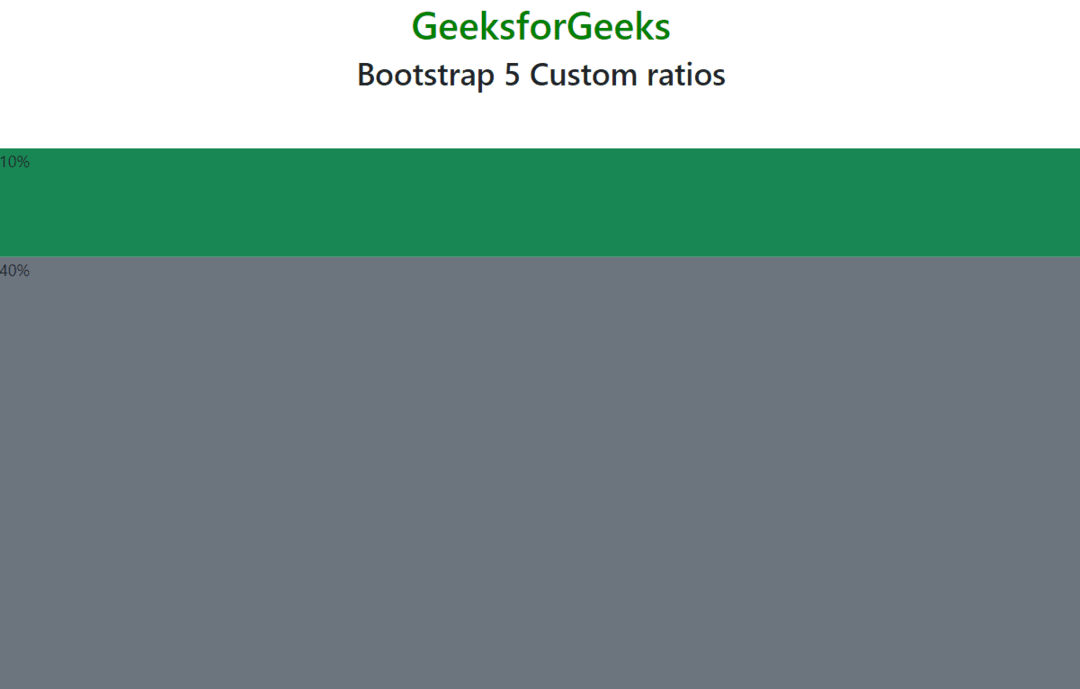
<div class="text-center">
<h1 class="text-success">GeeksforGeeks</h1>
<h2>Bootstrap 5 Custom ratios</h2>
</div>
<br>
<div class="ratio"
style="--bs-aspect-ratio: 10%;">
<div class="bg-success">10%</div>
</div>
<div class="ratio"
style="--bs-aspect-ratio: 40%;">
<div class="bg-secondary">40%</div>
</div>
</body>
</html>
|
Output:
Bootstrap 5 Ratio Custom Ratios
Example 2: The aspect ratio can be easily changed between breakpoints thanks to this CSS variable. The following starts out as 4×3, but at the medium breakpoint, it switches to 2×1.
HTML
<!DOCTYPE html>
<html lang="en">
<head>
<meta charset="UTF-8">
<meta http-equiv="X-UA-Compatible" content="IE=edge">
<meta name="viewport" content="width=device-width, initial-scale=1.0">
<link href=
rel="stylesheet"
integrity=
"sha384-EVSTQN3/azprG1Anm3QDgpJLIm9Nao0Yz1ztcQTwFspd3yD65VohhpuuCOmLASjC"
crossorigin="anonymous">
<script src=
integrity=
"sha384-MrcW6ZMFYlzcLA8Nl+NtUVF0sA7MsXsP1UyJoMp4YLEuNSfAP+JcXn/tWtIaxVXM"
crossorigin="anonymous">
</script>
</head>
<body>
<div class="text-center">
<h1 class="text-success">GeeksforGeeks</h1>
<h2>Bootstrap 5 Custom ratios</h2>
</div>
<br>
<div class="ratio ratio-4x3">
<div class="bg-success">4x3, then 2x1</div>
</div>
</body>
</html>
|
Output:

Bootstrap 5 Ratio Custom Ratios
Like Article
Suggest improvement
Share your thoughts in the comments
Please Login to comment...