Angular PrimeNG Menu Styling
Last Updated :
13 Jan, 2023
A responsive website may be easily created using the open-source Angular PrimeNG framework, which has a wide range of native Angular UI components for superb style. In this article, we will learn how to style the Menu Component in Angular PrimeNG.
A component that holds information and allows both static and dynamic positioning is called a menu component. We can add some menu style classes to change the style of menu items and elements.
Angular PrimeNG Menu Styling Classes:
- p-menu: This class will be used to style a container element.
- p-menu-list: This class will be used to style a list element.
- p-menuitem: This class will be used to style a menuitem element.
- p-menuitem-text: This class will be used to style a label of a menuitem.
- p-menuitem-icon: This class will be used to style an icon of a menuitem.
Syntax:
<p-menu
    [model]="...">
</p-menu>
Creating Angular application and Installing the modules:
Step 1: Use the command below to create an Angular application.
ng new appname
Step 2: Use the following command to move to our project folder, appname, after creating it.
cd appname
Step 3: Install PrimeNG in the specified location.
npm install primeng --save
npm install primeicons --save
Project Structure: The project structure will look like this once the installation is finished:
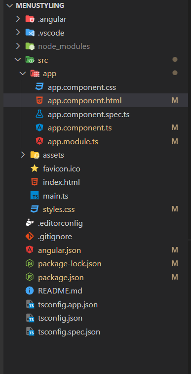
Project Structure
Steps to run the application: Run the below command to see the output
ng serve --open
Example 1: Below is the example code that illustrates the use of Angular PrimeNG Menu Styling. In this example, we are styling the normal class of the p-menu component.
HTML
<h1>
<span>
<img src=
class="gfg-logo" alt="icon">
</span>
<span style="color: green;font-size:40px">
GeeksforGeeks
</span>
</h1>
<h3>PrimeNG Menu Styling</h3>
<p-menu [model]="gfg"></p-menu>
|
Javascript
import { Component } from "@angular/core";
import { MenuItem } from "primeng/api";
@Component({
selector: "app-root",
templateUrl: "./app.component.html",
styleUrls: ["./app.component.css"]
})
export class AppComponent {
title = "menuStyling";
gfg: MenuItem[] = [];
ngOnInit() {
this.gfg = [
{
label: "GFG User",
icon: "pi pi-fw pi-users",
items: [
{
label: "Edit User",
icon: "pi pi-fw pi-user-plus"
},
{
label: "Delete User",
icon: "pi pi-fw pi-user-minus"
}
]
},
{
label: "Documents",
items: [
{
label: "Add New",
icon: "pi pi-fw pi-plus"
},
{
label: "Download",
icon: "pi pi-fw pi-download"
}
]
}
];
}
}
|
Javascript
import { NgModule } from "@angular/core";
import { BrowserModule } from "@angular/platform-browser";
import { BrowserAnimationsModule }
from "@angular/platform-browser/animations";
import { MenuModule } from "primeng/menu";
import { AppComponent } from "./app.component";
@NgModule({
declarations: [AppComponent],
imports: [
BrowserModule,
BrowserAnimationsModule,
MenuModule
],
providers: [],
bootstrap: [AppComponent]
})
export class AppModule {}
|
CSS
:host ::ng-deep .p-menu .p-menuitem-link .p-menuitem-text {
color: #000 !important;
}
:host ::ng-deep .p-menu .p-menuitem-link .p-menuitem-icon {
color: #000 !important;
}
:host ::ng-deep .p-menu .p-submenu-header{
color: #000 !important;
background: #0da350 !important;
}
:host ::ng-deep .p-menu{
background: #0da350 !important;
}
|
Output:
Example 2: Below is the example code that illustrates the use of Angular PrimeNG Menu Styling. In this example, we are styling the focus and hover for the p-menu component.
HTML
<h1>
<span>
<img src=
class="gfg-logo" alt="icon">
</span>
<span style="color: green;font-size:40px">
GeeksforGeeks
</span>
</h1>
<h3>PrimeNG Menu Styling</h3>
<p-menu [model]="gfg"></p-menu>
|
Javascript
import { Component } from "@angular/core";
import { MenuItem } from "primeng/api";
@Component({
selector: "app-root",
templateUrl: "./app.component.html",
styleUrls: ["./app.component.css"]
})
export class AppComponent {
title = "menuStyling";
gfg: MenuItem[] = [];
constructor() {}
ngOnInit() {
this.gfg = [
{
label: "GFG User",
icon: "pi pi-fw pi-users",
items: [
{
label: "Edit User",
icon: "pi pi-fw pi-user-plus"
},
{
label: "Delete User",
icon: "pi pi-fw pi-user-minus"
}
]
},
{
label: "Documents",
items: [
{
label: "Add New",
icon: "pi pi-fw pi-plus"
},
{
label: "Download",
icon: "pi pi-fw pi-download"
}
]
}
];
}
}
|
Javascript
import { NgModule } from "@angular/core";
import { BrowserModule } from "@angular/platform-browser";
import { BrowserAnimationsModule }
from "@angular/platform-browser/animations";
import { MenuModule } from "primeng/menu";
import { AppComponent } from "./app.component";
@NgModule({
declarations: [AppComponent],
imports: [
BrowserModule,
BrowserAnimationsModule,
MenuModule
],
providers: [],
bootstrap: [AppComponent]
})
export class AppModule {}
|
CSS
:host ::ng-deep .p-menu .p-menuitem-link .p-menuitem-text {
color: #000 !important;
}
:host ::ng-deep .p-menu .p-menuitem-link .p-menuitem-icon {
color: #000 !important;
}
:host ::ng-deep .p-menu .p-submenu-header{
color: #000 !important;
background: #0da350 !important;
}
:host ::ng-deep .p-menu{
background: #0da350 !important;
}
:host ::ng-deep .p-menu .p-menuitem-link:focus,
.p-menu .p-menuitem-link:hover{
background: white !important;
}
:host ::ng-deep .p-menu .p-menuitem-link:focus{
box-shadow: 0 0 0 0.1rem white !important;
}
|
Output:
Reference: https://primefaces.org/primeng/menu
Share your thoughts in the comments
Please Login to comment...