Angular PrimeNG Ripple Styling
Last Updated :
17 Jan, 2023
Angular PrimeNG is a UI component library for Angular Applications. It offers many pre-built themes and UI components for a variety of tasks like inputs, menus, charts, Buttons, etc. In this article, we will see Angular PrimeNG Ripple Styling.
The Ripple Component is used to apply a ripple effect animation to the host element. The color of the ripple effect can be customized by changing the background property of the “p-ink” class.
Syntax:
<div pRipple class="green">....</div>

// In CSS
.p-ripple.green .p-ink {
    background: rgba(0, 255, 0, .3);
}
Creating Angular Application and Installing the Module:
Step 1: Create an Angular application using the following command.
ng new appname
Step 2: After creating your project folder i.e. appname, move to it using the following command.
cd appname
Step 3: Finally, Install PrimeNG in your given directory.
npm install primeng --save
npm install primeicons --save
Project Structure: The project Structure will look like this after following the above steps:
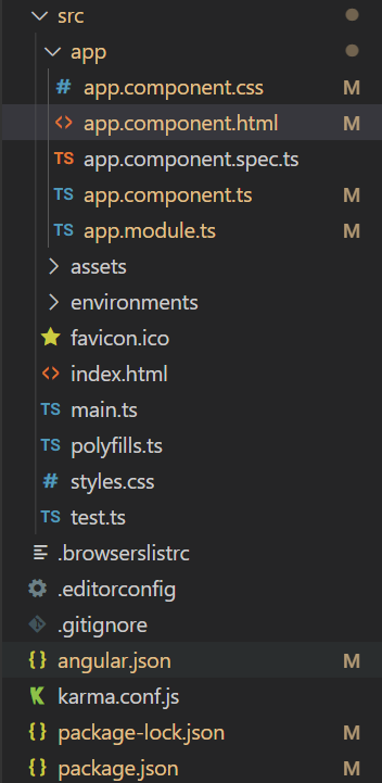
Project Structure
Run the below command:
ng serve --open
Example 1: In this example, we showed to default and red color of the ripple.
app.component.html
<div style="text-align: center">
<h2 style="color: green">GeeksforGeeks</h2>
<h4>Angular PrimeNG Ripple Styling</h4>
<div class="cards flex justify-content-center mt-5">
<p-card
pRipple
class="default"
header="Default Ripple"
[style]="{'width': '300px', 'margin-right': '20px'}">
<p>Ripple Component Demo</p>
</p-card>
<p-card
pRipple
class="red"
header="Red Ripple"
[style]="{'width': '300px'}">
<p>Ripple Component Demo</p>
</p-card>
</div>
</div>
|
app.component.ts
import { Component, OnInit } from '@angular/core';
import { PrimeNGConfig } from 'primeng/api';
@Component({
selector: 'app-root',
templateUrl: './app.component.html',
styles: [
`
.cards{
user-select: none;
}
`
]
})
export class AppComponent implements OnInit{
constructor(private primengConfig: PrimeNGConfig) { }
ngOnInit() {
this.primengConfig.ripple = true;
}
}
|
app.module.ts
import { NgModule } from '@angular/core';
import { BrowserModule }
from '@angular/platform-browser';
import { BrowserAnimationsModule }
from '@angular/platform-browser/animations';
import { AppComponent } from './app.component';
import { CardModule } from 'primeng/card';
import { RippleModule } from 'primeng/ripple';
@NgModule({
imports: [
BrowserModule,
BrowserAnimationsModule,
CardModule,
RippleModule
],
declarations: [AppComponent],
bootstrap: [AppComponent],
})
export class AppModule { }
|
styles.css
.default .p-card-body{
background-color: green;
padding: 0;
color: white;
}
.p-ripple.red .p-ink {
background: rgba(255, 0, 0, .3);
}
|
Output:
Example 2: In this example, we changed the color of the ripple to green and blue.
app.component.html
<div style="text-align: center">
<h2 style="color: green">GeeksforGeeks</h2>
<h4>Angular PrimeNG Ripple Styling</h4>
<div class="cards flex justify-content-center mt-5">
<p-card
pRipple
class="green"
header="Green Ripple"
[style]="{'width': '300px', 'margin-right': '20px'}">
<p>Ripple Component Demo</p>
</p-card>
<p-card
pRipple
class="blue"
header="Blue Ripple"
[style]="{'width': '300px'}">
<p>Ripple Component Demo</p>
</p-card>
</div>
</div>
|
app.component.ts
import { Component, OnInit } from '@angular/core';
import { PrimeNGConfig } from 'primeng/api';
@Component({
selector: 'app-root',
templateUrl: './app.component.html',
styles: [
`
.cards{
user-select: none;
}
`
]
})
export class AppComponent implements OnInit{
constructor(private primengConfig: PrimeNGConfig) { }
ngOnInit() {
this.primengConfig.ripple = true;
}
}
|
app.module.ts
import { NgModule } from '@angular/core';
import { BrowserModule }
from '@angular/platform-browser';
import { BrowserAnimationsModule }
from '@angular/platform-browser/animations';
import { AppComponent } from './app.component';
import { CardModule } from 'primeng/card';
import { RippleModule } from 'primeng/ripple';
@NgModule({
imports: [
BrowserModule,
BrowserAnimationsModule,
CardModule,
RippleModule
],
declarations: [AppComponent],
bootstrap: [AppComponent],
})
export class AppModule { }
|
CSS
.p-ripple.green .p-ink {
background: rgba(0, 255, 0, .3);
}
.p-ripple.blue .p-ink {
background: rgba(0, 0, 255, .3);
}
|
Output:
Reference: http://primefaces.org/primeng/ripple
Share your thoughts in the comments
Please Login to comment...