Visualization a Linear Model on a Scatterplot with ggvis
Last Updated :
12 Jun, 2023
It is a statistical model used to describe the relationship between a dependent variable and one or more independent variables. The linear model is used in data analysis. We can say that a linear model assumes a linear relationship between the dependent variable and each independent variable. Linear models are represented in straight-line form.
Linear model on a Scatterplot means fitting a straight line to the data points on the plot and, that line represents the “Best Fit” to the data. It maximizes the distance between the bar and the data points.
- If the slope of the straight line is positive, then the two variables are positively correlated, which means if one variable increases, another variable tends to increase.
- if the slope of the straight line is negative then the two variables have negatively correlated which means if one variable increases another variable tends to decrease.
Note: Linear model may not always be the best way to represent the relationship between two variables, it depends upon the nature of the data.
ggvis Package in R
The ggvis package in R Programming Language creates interactive and dynamic visualizations for exploring and presenting data. To create a liner model on a scatterplot with ggvis, we will use the “layer_smooth()” function. This function adds a regression line to the plot, and we can specify the type of smoothing function to use. Some standard smoothing methods in “layer_smooth()”. We can customize our scatterplot using different parameters in the “layer_smooth()” function.
Parameters in layer_smooth()
| Parameter |
Uses Case |
Default |
| tension |
The smoothing method to use |
loess |
| se |
Whether to add error bars representing the standard error of the estimate |
TRUE |
| span |
The smoothing span controls the degree of smoothing. The value of smoothing must be from 0 to 1. |
0.75 |
| stroke |
The color of the line |
black |
| formula |
A formula specifying the model to fit. This is only used if method = “lm”. |
‘y ~ x’ |
R
x <- c(10, 20, 30, 40, 50, 60, 70, 80, 90, 100)
y <- c(5, 15, 25, 35, 45, 55, 65, 75, 85, 95)
sampleData <- data.frame(x = x, y = y)
sampleData %>% ggvis(x = ~x, y = ~y) %>%
layer_points() %>%
layer_smooths(tension = "lm",
span = 1, se = FALSE,
stroke := "red")
|
Output:
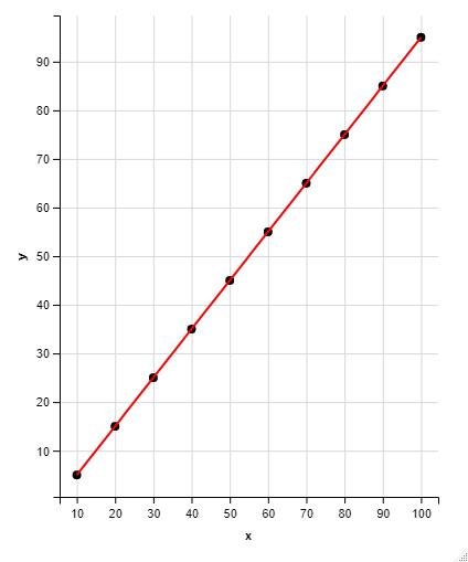
Linear model on a scatter plot
The previous case was that of a perfectly linear model. Now let’s look at an example of a non-linear example using the iris dataset and then plot the results obtained using this dataset.
R
install.packages("ggvis")
library(ggvis)
install.packages("iris")
iris %>% ggvis(x = ~Sepal.Length, y = ~Petal.Length) %>%
layer_points() %>%
layer_smooths(tension = "loess",
span = 0.75,
stroke := "green")
|
Output:

Scatter plot along with the non-linear model using ggvis
Now let’s try to change some of the parameters and look at the changes in the model which is obtained after the changes.
R
iris %>% ggvis(x = ~Sepal.Length,
y = ~Petal.Length) %>%
layer_points() %>%
layer_smooths(tension = "lm",
span = 1.5,
stroke := "green")
|
Output:
Scatter Plot with the Linear model using ggvis
Share your thoughts in the comments
Please Login to comment...