Word-wrap in an HTML Table
Last Updated :
21 Feb, 2024
To enable word-wrap in an HTML table, apply the CSS property word-wrap: break-word; to the table cells (<td> or <th> elements). This ensures that long words or strings are broken into multiple lines within the table cell, preventing them from overflowing and maintaining readability.
Using CSS word-wrap property
To enable word-wrap in an HTML table using the CSS word-wrap property, simply apply word-wrap: break-word; to the table cells (<td> or <th> elements). This allows long words or strings to wrap onto the next line within the cell, preventing overflow and maintaining readability.
Syntax:
<style>
    td {
        word-wrap: break-word;
    }
</style>
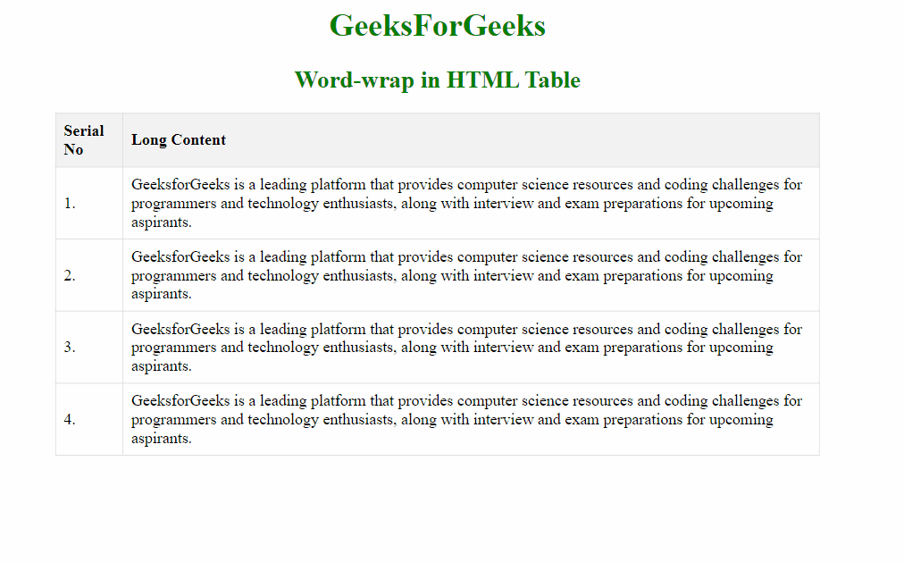
Exmaple: Implementation to show word-wrap in an HTML table using word wrap property.
HTML
<!DOCTYPE html>
<html lang="en">
<head>
<meta charset="UTF-8">
<meta name="viewport" content=
"width=device-width, initial-scale=1.0">
<title>Word-wrap in HTML Table</title>
<style>
h1,
h2 {
color: green;
text-align: center;
}
table {
width: 60%;
border-collapse: collapse;
margin: 20px auto;
}
th,
td {
padding: 8px;
border: 1px solid #ddd;
text-align: left;
word-wrap: break-word;
}
th {
background-color: #f2f2f2;
}
</style>
</head>
<body>
<h1>GeeksForGeeks</h1>
<h2>Word-wrap in HTML Table</h2>
<table>
<tr>
<th>Serial No</th>
<th>Long Content</th>
</tr>
<tr>
<td>1.</td>
<td>
GeeksforGeeks is a leading platform that
provides computer science resources and
coding challenges for programmers and technology
enthusiasts, along with interview and exam
preparations for upcoming
aspirants.
</td>
</tr>
<tr>
<td>2.</td>
<td>
GeeksforGeeks is a leading platform that
provides computer science resources and
coding challenges for programmers and technology
enthusiasts, along with interview and exam
preparations for upcoming
aspirants.
</td>
</tr>
<tr>
<td>3.</td>
<td>
GeeksforGeeks is a leading platform that
provides computer science resources and
coding challenges for programmers and technology
enthusiasts, along with interview and exam
preparations for upcoming
aspirants.
</td>
</tr>
<tr>
<td>4.</td>
<td>
GeeksforGeeks is a leading platform that
provides computer science resources and
coding challenges for programmers and technology
enthusiasts, along with interview and exam
preparations for upcoming
aspirants.
</td>
</tr>
</table>
</body>
</html>
|
Output:
Using Inline CSS
This approach demonstrates utilizing the CSS word-wrap property within an HTML document to facilitate wrapping long content within table cells. By setting word-wrap: break-word; for both headers and data cells, it ensures that lengthy words and phrases wrap within cells, preventing overflow and maintaining readability in a neat manner.
Syntax:
<table>
    <tr>
        <th>Header 1</th>
        <th>Header 2</th>
    </tr>
    <tr>
        <td style="word-wrap: break-word;">Content 1</td>
        <td style="word-wrap: break-word;">Content 2</td>
    </tr>
</table>
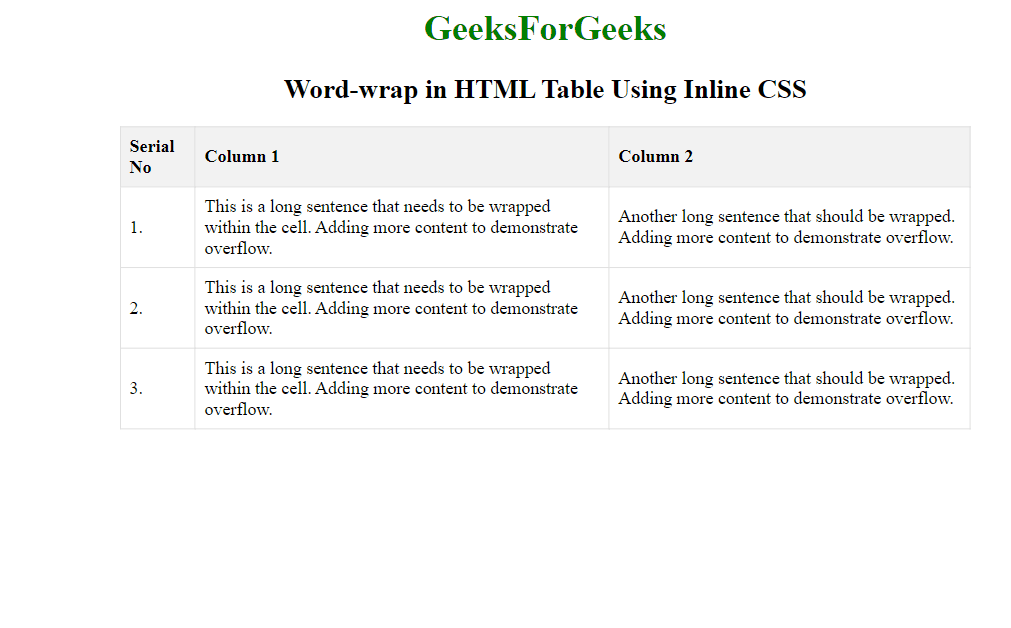
Example: Implementation to show word-wrap in an HTML table using word wrap property as inline css.
HTML
<!DOCTYPE html>
<html lang="en">
<head>
<meta charset="UTF-8">
<meta name="viewport" content=
"width=device-width, initial-scale=1.0">
<title>Word-wrap in HTML Table</title>
<style>
body {
text-align: center;
}
h1 {
color: green;
}
table {
width: 60%;
border-collapse: collapse;
margin: 20px auto;
}
th,
td {
padding: 8px;
border: 1px solid #ddd;
text-align: left;
}
.approach th {
background-color: #f2f2f2;
}
</style>
</head>
<body>
<h1>GeeksForGeeks</h1>
<h2>Word-wrap in HTML Table Using Inline CSS</h2>
<table class="approach">
<tr>
<th>Serial No</th>
<th>Column 1</th>
<th>Column 2</th>
</tr>
<tr>
<td>1.</td>
<td style="word-wrap: break-word;">
This is a long sentence that needs
to be wrapped within the cell. Adding
more content to demonstrate overflow.
</td>
<td style="word-wrap: break-word;">
Another long sentence that should be wrapped.
Adding more content to
demonstrate overflow.
</td>
</tr>
<tr>
<td>2.</td>
<td style="word-wrap: break-word;">
This is a long sentence that needs
to be wrapped within the cell. Adding
more content to demonstrate overflow.
</td>
<td style="word-wrap: break-word;">
Another long sentence that should be wrapped.
Adding more content to
demonstrate overflow.
</td>
</tr>
<tr>
<td>3.</td>
<td style="word-wrap: break-word;">
This is a long sentence that needs
to be wrapped within the cell. Adding
more content to demonstrate overflow.
</td>
<td style="word-wrap: break-word;">
Another long sentence that should be wrapped.
Adding more content to
demonstrate overflow.
</td>
</tr>
</table>
</body>
</html>
|
Output:
Using the CSS white-space Property
This approach utilizes the CSS white-space property to manage text behavior within HTML table cells. Setting white-space to nowrap prevents text from wrapping onto the next line, keeping it on a single line within the cell. Additionally, combining white-space: nowrap; with overflow: hidden; and text-overflow: ellipsis; hides any text exceeding the cell width and replaces it with an ellipsis (…), ensuring a neat and consistent appearance for the table, particularly with lengthy or overflowing text
Syntax:
selector {
    white-space: value;
}
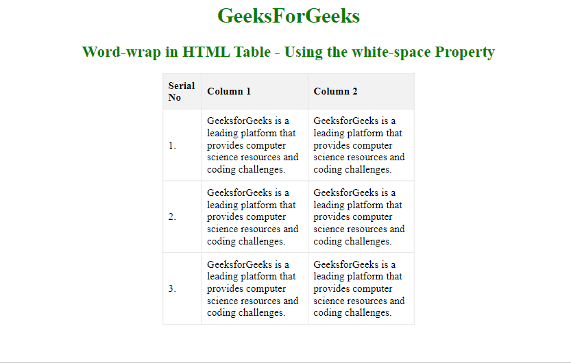
Example: Implementation to show word-wrap in an HTML table using white-space property.
HTML
<!DOCTYPE html>
<html lang="en">
<head>
<meta charset="UTF-8">
<meta name="viewport" content=
"width=device-width, initial-scale=1.0">
<title>Word-wrap in HTML Table</title>
<style>
body {
text-align: center;
}
h1,
h2 {
color: green;
}
table {
width: 30%;
border-collapse: collapse;
margin: 20px auto;
}
th,
td {
padding: 8px;
border: 1px solid #ddd;
text-align: left;
white-space: normal;
/* Allow text wrapping */
overflow: hidden;
/* Hides overflow */
text-overflow: ellipsis;
/* Adds ellipsis for overflow */
}
.approach th {
background-color: #f2f2f2;
}
</style>
</head>
<body>
<h1>GeeksForGeeks</h1>
<h2>
Word-wrap in HTML Table -
Using the white-space Property
</h2>
<table class="approach">
<tr>
<th>Serial No</th>
<th>Column 1</th>
<th>Column 2</th>
</tr>
<tr>
<td>1.</td>
<td>
GeeksforGeeks is a leading platform that
provides computer science resources and
coding challenges.
</td>
<td>
GeeksforGeeks is a leading platform that
provides computer science resources and
coding challenges.
</td>
</tr>
<tr>
<td>2.</td>
<td>
GeeksforGeeks is a leading platform that
provides computer science resources and
coding challenges.
</td>
<td>
GeeksforGeeks is a leading platform that
provides computer science resources and
coding challenges.
</td>
</tr>
<tr>
<td>3.</td>
<td>
GeeksforGeeks is a leading platform that
provides computer science resources and
coding challenges.
</td>
<td>
GeeksforGeeks is a leading platform that
provides computer science resources and
coding challenges.
</td>
</tr>
</table>
</body>
</html>
|
Output:
Share your thoughts in the comments
Please Login to comment...