Understanding LitElement for Comprehensive Web Component Development
Last Updated :
28 Mar, 2024
Delve into LitElement’s capabilities for modern web component development. From its streamlined process for building lightweight and interoperable UI elements to its support for reactive data binding, discover how LitElement empowers developers to create encapsulated and reusable components for web applications. Learn about its usage, including steps for installation, component creation, properties and events handling, and styling.
Explore the benefits it offers, such as simplicity, reusability, encapsulation, performance optimization, interoperability, and developer experience. By understanding LitElement’s features and lifecycle methods, developers can efficiently utilize it to build scalable and maintainable web applications.
What is lit-element?
LitElement is a JavaScript class designed to facilitate the creation of web components adhering to modern Web Components standards. It serves as a foundational framework for building lightweight and interoperable UI elements. By providing a concise API and leveraging the power of HTML templates and reactive data binding, LitElement empowers developers to create encapsulated and reusable components for web applications.
Why is it used?
LitElement is widely used for several reasons:
- Facilitates Web Component Development: LitElement streamlines the process of building web components adhering to modern Web Components standards. Its intuitive API and features simplify the creation of encapsulated UI elements.
- Promotes Reusability: With LitElement, developers can create reusable components that can be easily integrated into various projects. This reusability helps in maintaining consistency across applications and reduces development time.
- Encourages Componentization: By breaking down user interfaces into smaller, manageable components, LitElement promotes component-based architecture. This approach enhances code organization, readability, and maintainability.
- Enhances Performance: LitElement’s lightweight nature and efficient rendering mechanism contribute to better performance of web applications. It optimizes DOM manipulation and ensures smooth user experiences even in complex UIs.
- Supports Reactive Data Binding: LitElement supports reactive data binding, allowing components to automatically update when their underlying data changes. This declarative approach simplifies state management and reduces the risk of bugs caused by manual data manipulation.
- Interoperability and Compatibility: LitElement works seamlessly with other web technologies and frameworks. It can be used alongside existing JavaScript libraries or frameworks, making it a versatile choice for developers.
- Community and Ecosystem: LitElement benefits from a vibrant community and ecosystem. It is backed by Google and has extensive documentation, tutorials, and community support, which accelerates the learning curve and fosters innovation.
Overall, LitElement is used because it offers a modern, efficient, and developer-friendly approach to web component development, making it an ideal choice for building scalable and maintainable web applications.
How do we use lit-element?
Step 1: Installation
Begin by installing LitElement and its dependencies using npm or yarn:
npm install lit
Step 2: Create a Component
Define your custom component by extending the LitElement base class. Here’s a basic example:
import { LitElement, html } from 'lit';

class MyComponent extends LitElement {
  render() {
    return html`
      <p>Hello, LitElement!</p>
    `;
  }
}

customElements.define('my-component', MyComponent);
Step 3: Usage
Once your component is defined, include it in your HTML files as you would with any other HTML element:
<html>
  <head>
    <script type="module" src="path/to/my-component.js"></script>
  </head>
  <body>
    <my-component></my-component>
  </body>
</html>
Step 4: Properties and Events
LitElement supports properties and events for communication between components. Define properties using static properties and dispatch events using this.dispatchEvent():
import { LitElement, html, property } from 'lit';

class MyComponent extends LitElement {
  @property({ type: String }) message = 'Hello';

  handleClick() {
    this.message = 'Clicked!';
    this.dispatchEvent(new CustomEvent('my-event', { detail: 'Data' }));
  }

  render() {
    return html`
      <button @click="${this.handleClick}">${this.message}</button>
    `;
  }
}
Step 5: Styling
LitElement supports scoped CSS via styles template tag. Define styles within your component to encapsulate CSS:
import { LitElement, html, css } from 'lit';

class MyComponent extends LitElement {
  static styles = css`
    button {
      background-color: blue;
      color: white;
      border: none;
      padding: 10px 20px;
      cursor: pointer;
    }
  `;

  render() {
    return html`
      <button @click="${this.handleClick}">${this.message}</button>
    `;
  }
}
Step 6: Lifecycle Methods
Utilize lifecycle methods like connectedCallback(), disconnectedCallback(), firstUpdated(), etc., for handling component lifecycle events. Here’s a tabular representation of supported lifecycle hooks:
Lifecycle Hook
| Purpose
| Invocation
|
|---|
constructor()
| Initializes the component instance
| When the component is created
|
|---|
connectedCallback()
| Invoked when the component is added to the DOM
| After the component is appended to the DOM
|
|---|
disconnectedCallback()
| Invoked when the component is removed from the DOM
| Before the component is removed from the DOM
|
|---|
firstUpdated()
| Invoked after the component’s first update/render
| After the first render or update of the component
|
|---|
updated()
| Invoked whenever the component is updated/rendered
| After each render or update of the component
|
|---|
shouldUpdate()
| Controls whether the component should update/render
| Before each render or update of the component
|
|---|
render()
| Returns the component’s template
| Whenever the component needs to be rendered
|
|---|
By following these steps and understanding the lifecycle of a LitElement component, you can efficiently utilize LitElement to build reusable and encapsulated web components for your applications.
Benefits of using lit-element
- Simplicity: LitElement simplifies the process of creating web components by providing a lightweight and intuitive API. Developers can focus on building encapsulated UI elements without dealing with the complexities of low-level APIs.
- Reusability: LitElement promotes component-based architecture, allowing developers to create reusable components that can be easily integrated into different projects. This reusability enhances code maintainability and accelerates development workflows.
- Encapsulation: LitElement encourages encapsulation by providing a clear separation of concerns between components and their templates, styles, and behaviors. This ensures that components remain independent and can be easily managed and modified without affecting other parts of the application.
- Performance: LitElement is designed for performance, with optimized rendering and efficient DOM updates. Its reactive data binding mechanism ensures that only the necessary parts of the UI are updated when the underlying data changes, resulting in faster and smoother user experiences.
- Interoperability: LitElement seamlessly integrates with other web technologies and frameworks, allowing developers to leverage existing libraries and tools. It can be used alongside frameworks like Angular, React, or Vue.js, enabling developers to adopt it incrementally in their projects.
- Developer Experience: LitElement offers a superior developer experience with features like scoped CSS, TypeScript support, and a rich ecosystem of tools and extensions. Its comprehensive documentation and active community support further enhance the development experience.
- Standards Compliance: LitElement adheres to modern Web Components standards, ensuring compatibility with web standards and browser APIs. This ensures that components built with LitElement are future-proof and can be used across different platforms and environments.
Overall, LitElement empowers developers to build modern and scalable web applications with reusable, encapsulated, and high-performance components, making it a valuable tool for comprehensive web component development.
Example: In this example, the component’s render() method returns the text “Hello, LitElement!”, which is then converted to a string and logged to the console using the renderToString() function. This illustrates how LitElement simplifies component rendering and provides flexibility for dynamic content generation.
JavaScript
import('lit-element').then(({ LitElement,
    html }) => {

    class MyElement extends LitElement {
        render() {
            // Return the text directly
            // without HTML tags
            return 'Hello, LitElement!';
        }
    }

    customElements.define('my-element', MyElement);

    // Custom function to convert
    // LitElement template object to string
    function renderToString(template) {
        // Check if the template is a string,
        // return the template itself if it's a string
        if (typeof template === 'string') {
            return template;
        }
        // Otherwise, join the template
        // strings and trim whitespace
        return template.strings.join('').trim();
    }

    // Output the rendered HTML to the terminal
    console.log(renderToString(new MyElement().render()));
});
Output:
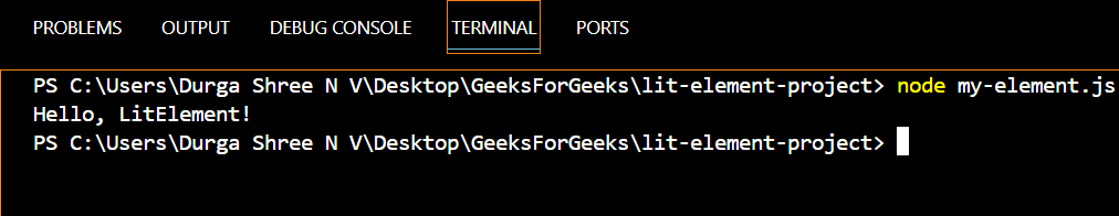
Demonstrates the rendered output of the MyElement component created using LitElement.
Share your thoughts in the comments
Please Login to comment...