The One Thumb, One Eyeball Test for Good Mobile Design
Last Updated :
05 Apr, 2024
What is the One Thumb, One Eyeball Test?
One-handed One-Eyed Test epitomizes a number of basic principles of Human Factors Engineering. It helps designers to intuitively create designs that are easy to use and accessible for elderly and disabled people. This instrument relies on the natural behavior of mere users and the touch-enabled devices’ interaction to solve the problem of those users accessing the website through mobile phones by limiting their navigation experience to a touch-based interaction with one thumb and the visual feedback provided by one eye.
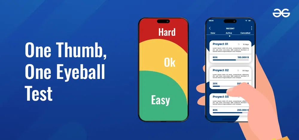
The One Thumb, One Eyeball Test
Why One Thumb and One Eyeball?
The rationale behind choosing “One Thumb” and “One Eyeball” is deeply rooted in the common usage patterns observed in everyday interactions with mobile devices and touch screens: The rationale behind choosing “One Thumb” and “One Eyeball” is deeply rooted in the common usage patterns observed in everyday interactions with mobile devices and touch screens:
One Thumb:
These devices use the thumb as the primary tool for navigation as we have definitely become a one-handed people most of the time. It behaves like a digital pointer with the sole purpose of navigating menus, content, and what is info on the screen. “One Thumb” is the highlight, which means that the interfaces coming next should arrange the input methods with the focus on efficiency and compatibility, thus concerning the users’ thumbs which in turn are naturally always underneath the fingers.
One Eyeball:
Visually it is crucial for displaying on-screen icons and signs that show users’ whereabouts when they are typing or working on digital interfaces. The functions that visual components are playing are not limited to guiding the users input and output, they also provide hints or direct the users to move on with the interaction. ” One Eyeball” principle is the main essence behind the importance of visual quality and clarity that serves for making the interfaces more useful and more transparent. A tidy, well-organized, and visually appealing user interface is also an excellent example of UI/UX enhancement, which leads to seamless navigation and profound decision-making.
What are the Uses?
Evaluate Usability:
Developers and testers mimic realistic scenarios through the test to recognize how user interface sensitivity to one eye and one thumb interacting could be ascertained. Developers are able to identify the user needs thanks to the reality of the end product they are working on, which, in its turn, gives him a chance to detect the pain points of the product and point out what needs to be improved.
Iterate Designs:
The One Thumb, One Eyeball Test feedback translates to action no other nations do, it is during the iterative design refinements. Through the incorporation of user experiences, designers will be able to modify the interface elements, layout and interactions to a maximum extent either to make easier user experiences or to make it more accessible to all users. In continuation, this process iteratively controls designs that make them better fit user needs and expectations.
Inform Decision Making:
Insights obtained at a usability test will certainly affect the designer’s decision. The designers use the feedback to make a decision about the location of the navigation route, correct size of interactive features and structure of the interface. Through the instance of the stylistic choice that is in line with user behavior and thoughts, developers could obtain more clear and user-friendly experiences..
Benefits of One Thumb, One Eyeball Test
Adhering to the One Thumb, One Eyeball Test offers numerous benefits:
Enhanced User Experience:
By following the guidelines of the One Finger, One Eyeball Test, we are able to reduce the negative effect of usability issues on designs. Easy to use interface, the designers follow the logic and are able to control interactive patterns that ensure that the users attach greatly and enjoy the entire process.
Accessibility:
Mobile device recognition leads to adequacy of all users, which is important because of different variations of mobile devices. With the consideration of multi-scenario operations, such as orientation towards single-handed operation, users are not frustrated but are upheld, together with promoting inclusivity and accessibility.
Efficiency:
Elimination of usability flaws minimizes the number of decisions required for efficient settling on the transition between different interface elements. Through proper editing of the content and organization, designers not only help to eliminate a user frustration but also improve efficiency which later leads to a user experience that becomes more pleasant and less complicated.
Competitive Advantage:
Mobile apps and websites that prioritize usability and accessibility gain a competitive edge in the market. By offering superior user experiences, these applications stand out among competitors, attracting and retaining users who value simplicity, efficiency, and accessibility.
Examples of One Thumb, One Eyeball Test
Several mobile applications exemplify the principles of the One Thumb, One Eyeball Test:
- Instagram: Instagram’s mobile app’s interface is optimized for one-handed use, so you can still effortlessly navigate the interface without requiring both hands. Accomplishing this, the development team made the user interface simple, so that even if someone is holding their device with one hand, their navigation would still be smooth.
- Google Maps: Google Maps facilitates on foot navigation through simpler means in its basic format that gives you neat user gestures. Users can zoom in, zoom out, search different locations and get through their routes successfully in an easy way which is main advantage for a user like him/her and audience.
- TikTok: TikTok’s feel specifically designed for mobile platforms that allows users to pass through content via horizontally scrolling feed and uses gesture-based controls, a tendency which make them easily accommodateable for a single thumb. The app’s accurate only usability, the viewers naturally represent the content the distraction.
- Snapchat: Snapchat’s interface prioritizes one-handed usage, enabling users to navigate through snaps and stories effortlessly with simple swipe gestures. Visual cues like icons and color-coded notifications ensure quick comprehension and response to incoming content.
- Spotify: Spotify’s mobile app focuses on ease of use, featuring large, tappable buttons for music playback control. Simple swipe gestures allow users to browse through their music library, playlists, and recommendations with minimal effort, perfect for on-the-go listening.
Conclusion
This thought of one-thumb one-eyeball test is something that designers must keep in mind as they design mobile interfaces that put usability and accessibility first. Thinking through the features inherent to mobile devices and designing keeping in mind the practical constraints as well as the user’s preferences would mean applications that are really relevant to the users and distinct from the apps in the competitive app market. The One Thumb, One Eyeball Test represents the alignment between the user interface design and the ease of use and is the main part of this process. This implies that mobile interfaces are clear, simple, and comfortable to use that result in total users` satisfaction and commitment.
Share your thoughts in the comments
Please Login to comment...