Show legend and label axes in 3D scatter plots in Python Plotly
Last Updated :
23 Feb, 2023
In this article, we will learn how to show legend and label axes in 3D scatter plots in Python using the Plotly library. To create a 3D scatter plot in Plotly Express, you will need to provide the data for the x, y, and z coordinates of the points you want to plot. You can also customize the appearance of the plot, such as the size and color of the points, by setting various attributes of the scatter_3d trace.
The article will cover three examples of 3D scatter plots:
- A legend in 3D scatter plots
- Label axes in 3D scatter plots
- The legend and label axes in 3D scatter plots
A legend in 3D scatter plots
In this example, we’ll use the scatter 3d function from the plotly.express library to produce a 3D scatter plot. The price column serves as the y-axis, the fruits column as the z-axis, and the demand rate column as the x-axis. Additionally, we are indicating that the plot’s points should be coloured according to the fruits column using the colour option. We use the update layout function to set the display legend argument to True in order to include a legend in the plot. The legend for each fruit’s various colours will be displayed.
Python3
import plotly.express as plotly_express
import pandas as pd
features = {
'fruits': ['mango', 'apple', 'banana',
'orange', 'pinapple', 'grapes'],
'demandRate': [3, 4, 2, 1, 6, 5],
'price': [20000, 50000, 30000, 70000,
55000, 60000]
}
dataframe = pd.DataFrame(features)
figure = plotly_express.scatter_3d(dataframe,
x='demandRate', y='price',
z='fruits', color="fruits",
title="plotly - 3D scatter plot with legend")
figure.update_layout(showlegend=True)
figure.show()
|
Output:
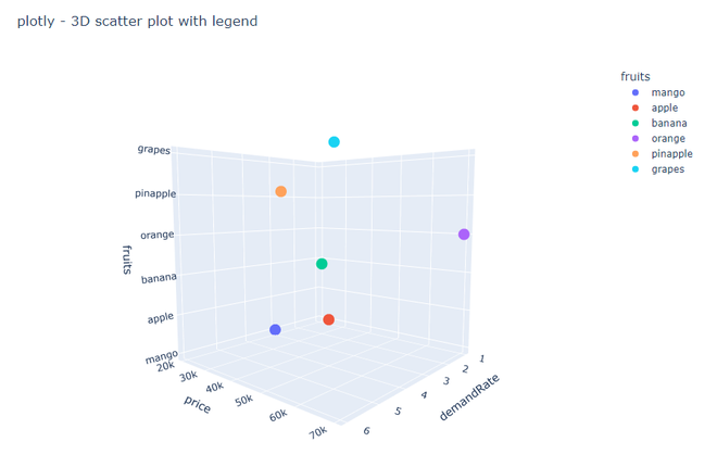
Legend
Label axes in 3D scatter plots
We’re utilising the scatter 3d function from the plotly.express package to produce a 3D scatter plot. The same information and axes as in Example 1 are being used. We utilise the labels argument of the scatter 3d function to label the axes by providing the names of the x, y, and z axes. The x-axis in this instance is labelled “Demand Rate,” the y-axis is “Price,” and the z-axis is “Fruits.”
Python3
import plotly.express as plotly_express
import pandas as pd
features = {
'fruits': ['mango', 'apple', 'banana',
'orange', 'pinapple', 'grapes'],
'demandRate': [3, 4, 2, 1, 6, 5],
'price': [20000, 50000, 30000, 70000,
55000, 60000]
}
dataframe = pd.DataFrame(features)
figure = plotly_express.scatter_3d
(dataframe, x='demandRate', y='price',
z='fruits', color="fruits",
title="plotly - 3D scatter plot with labeled axes",
labels={"demandRate": "Demand Rate",
"price": "Price", "fruits": "Fruits"})
figure.show()
|
Output:
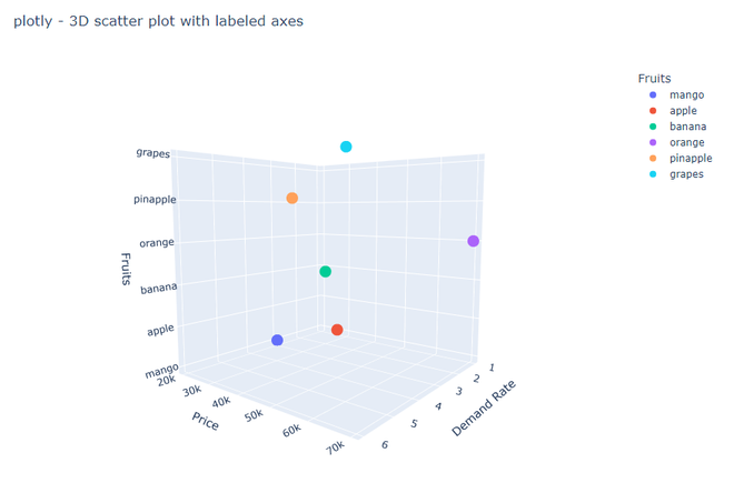
Label axis
The legend and label axes in 3D scatter plots
This will display a legend showing the different colors used for each fruit, and the x-axis will be labeled as “Demand Rate”, the y-axis as “Price”, and the z-axis as “Fruits”.
Python3
import plotly.express as plotly_express
import pandas as pd
features = {
'fruits': ['mango', 'apple', 'banana',
'orange', 'pinapple', 'grapes'],
'demandRate': [3, 4, 2, 1, 6, 5],
'price': [20000, 50000, 30000, 70000,
55000, 60000]
}
dataframe = pd.DataFrame(features)
figure = plotly_express.scatter_3d(dataframe,
x='demandRate', y='price', z='fruits',
color="fruits",
title="plotly - 3D scatter plot with legend and labeled axes",
labels={"demandRate": "Demand Rate", "price": "Price",
"fruits": "Fruits"})
figure.update_layout(showlegend=True)
figure.show()
|
Output:

Legend and label axis
Share your thoughts in the comments
Please Login to comment...