React Suite Placeholder Props
Last Updated :
29 Jun, 2022
React Suite is a popular front-end library with a set of React components that are designed for the middle platform and back-end products.
There are a lot of data that is rendered on a single page these days. Sometimes it takes time for the data to be loaded into the website. This is where Placeholder comes into play. Placeholder component allows the user to display the initial state before the component loaded.
The three types of placeholder available are:
- <Placeholder.Paragraph> Paragraph placeholder
- <Placeholder.Graph> Graph placeholder
- <Placeholder.Grid> Grid placeholder
The available properties of <Placeholder.Grid> are:
- rows: It is used to denote the number of rows. It is specified using a number.
- columns: It is used to denote the number of columns. It is specified using a number.
- rowHeight: It is used to denote the height of rows. It is specified using a number.
- rowMargin: It is used to denote the margin of rows. It is specified using a number.
- active: It is a boolean value. It is used to denote whether the animation is playing or not. It is true by default.
The available properties of <Placeholder.Paragraph> are:
- rows: It is used to denote the number of rows. It is specified using a number.
- graph: It is used to show graphs.
- rowHeight: It is used to denote the height of rows. It is specified using a number.
- rowMargin: It is used to denote the margin of rows. It is specified using a number.
- active: It is a boolean value. It is used to denote whether the animation is playing or not. It is true by default.
The three available properties of <Placeholder.Graph> are:
- width: It defines the width of the graph. It is specified using a string or a number.
- height: It defines the height of the graph. It is specified using a number.
- active: It is a boolean value. It is used to denote whether the animation is playing or not. It is true by default.
Approach: Let us create a React project and install React Suite module. Then we will create a UI that will showcase React Suite Placeholder Props.
Creating React Project:
Step 1: To create a react app, you need to install react modules through npx command. “npx” is used instead of “npm” because you will be needing this command in your app’s lifecycle only once.
npx create-react-app project_name
Step 2: After creating your react project, move into the folder to perform different operations.
cd project_name
Step 3: After creating the ReactJS application, Install the required module using the following command:
npm install rsuite
Project Structure: After running the commands mentioned in the above steps, if you open the project in an editor you can see a similar project structure as shown below. The new component user makes or the code changes, we will be performing will be done in the source folder.

Project Structure
Example 1: We are creating a UI that shows different React Suite Placeholder Grid with its props.
App.js
import React from "react";
import { Placeholder } from 'rsuite';
import '../node_modules/rsuite/dist/rsuite.min.css';
class App extends React.Component {
render() {
return (
<div>
<h4>React Suite Placeholder.Grid Props</h4><br /><br />
<Placeholder.Grid rows={5} columns={3} active />
</div>
);
}
}
export default App;
|
Step to Run Application: Run the application using the following command from the root directory of the project:
npm start
Output: Now open your browser and go to http://localhost:3000/, you will see the following output:
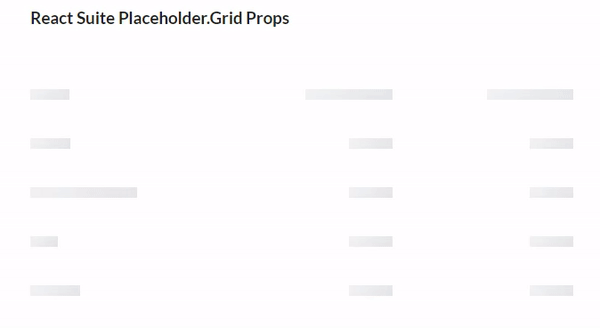
Placeholder Grid
Example 2: We are creating a UI that shows different React Suite Placeholder Paragraph with its props.
App.js
import React from "react";
import { Placeholder } from 'rsuite';
import '../node_modules/rsuite/dist/rsuite.min.css';
class App extends React.Component {
render() {
return (
<div>
<h4>React Suite Placeholder.Paragraph Props</h4><br />
<Placeholder.Paragraph style={{ marginTop: 10 }}
graph="circle" /><br />
<Placeholder.Paragraph style={{ marginTop: 10 }}
graph="square" /><br />
<Placeholder.Paragraph style={{ marginTop: 10 }}
graph="image" />
</div>
);
}
}
export default App;
|
Output: Now open your browser and go to http://localhost:3000/, you will see the following output:
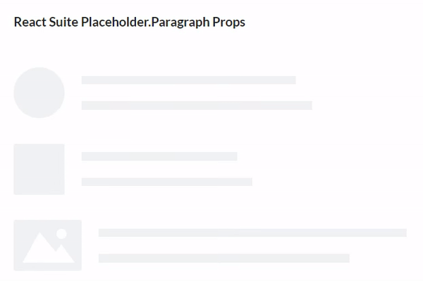
Placeholder Paragraph
Example 3: We are creating a UI that shows different React Suite Placeholder Graph with its props.
App.js
import React from "react";
import { Placeholder } from 'rsuite';
import '../node_modules/rsuite/dist/rsuite.min.css';
class App extends React.Component {
render() {
return (
<div style={{margin:100}}>
<h4>React Suite Placeholder.Graph
Props</h4><br />
<Placeholder.Graph width={200}
height={200}/>
</div>
);
}
}
export default App;
|
Output: Now open your browser and go to http://localhost:3000/, you will see the following output:
Reference: https://rsuitejs.com/components/placeholder/#props
Share your thoughts in the comments
Please Login to comment...