Python Plotly: How to set up a color palette?
Last Updated :
03 Mar, 2022
In this article, we will discuss how to explicitly set up a color sequence/color palette in plotly. Generally, we use built-in color sequences but if we want to create one it’s no difficult task. Let’s see a few approaches to how we can set up a color palette.
Method 1: Setting up the color palette for continuous data
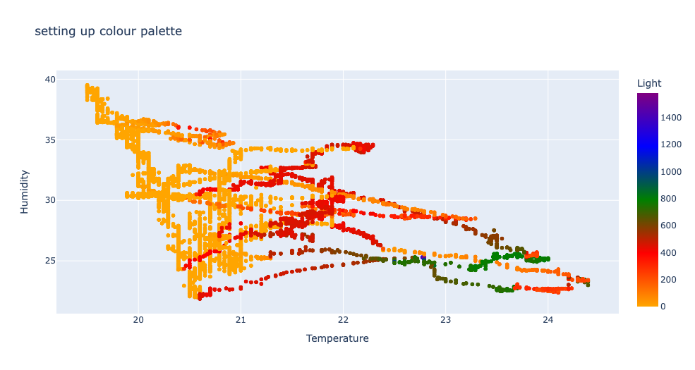
px. scatter() method is used to plot a scatterplot of the data we provide. We explicitly make a color palette by making a list of the colors. The list is passed to the colour_continuous_scale parameter of the px.scatter() method. as we’re working on continuous data in this example we use the colour_continuous_scale parameter.
Click here to read and download the CSV file.
Python3
import pandas as pd
import plotly.express as px
df = pd.read_csv('weather.csv', encoding='UTF-8')
fig = px.scatter(df, x="Temperature", y='Humidity', color='Light',
title="setting up colour palette",
color_continuous_scale=["orange", "red",
"green", "blue",
"purple"])
fig.show()
|
Output:
Method 2: Setting up the color palette for discrete data
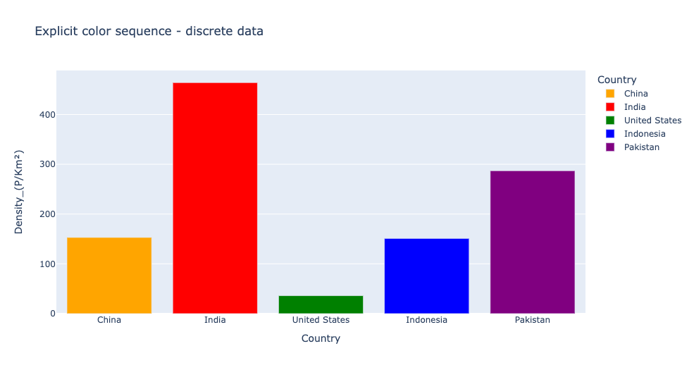
px. bar() method is used to plot a barplot of the data we provide. we explicitly make a color palette by making a list of the colors. The list is passed to the color_discrete_sequence parameter of the px.bar() method. as we’re working on discrete data in this example we use the color_discrete_sequence parameter.
Click here to download the used CSV file.
Python3
import pandas as pd
import plotly.express as px
df = pd.read_csv('country_density.csv', encoding='UTF-8')
df = df.iloc[:5, :]
fig = px.bar(df, x="Country", y="Density_(P/Km²)", color="Country",
orientation="v", hover_name="Country",
color_discrete_sequence=[
"orange", "red", "green", "blue", "purple"],
title="Explicit color sequence"
)
fig.show()
|
Output:
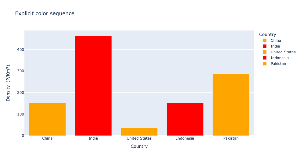
What if our color palette contains fewer colors than our groups or labels?. The colors repeat themselves.
Take a look at this example to visualize.
Python3
import pandas as pd
import plotly.express as px
df = pd.read_csv('country_density.csv', encoding='UTF-8')
df = df.iloc[:5, :]
fig = px.bar(df, x="Country", y="Density_(P/Km²)", color="Country",
orientation="v", hover_name="Country",
color_discrete_sequence=["orange", "red"],
title="Explicit color sequence"
)
fig.show()
|
Output:
Method 3: Setting up color palettes from already existing color palettes
px.colors.qualitative module contains built-in color sequences. to take a look at all the color sequences the px.colors.qualitative.swatches() method is used.
Python3
import pandas as pd
import plotly.express as px
df = pd.read_csv('country_density.csv', encoding='UTF-8')
df = df.iloc[:5, :]
fig = px.bar(df, x="Country", y="Density_(P/Km²)", color="Country",
orientation="v", hover_name="Country",
color_discrete_sequence=["orange", "red"],
title="Explicit color sequence"
)
fig = px.colors.qualitative.swatches()
fig.show()
|
Output:

In this example we index the colors from already existing color palettes and form a new color palette, instead of giving names in string format this can also be done. This method can be used if we want to pick colors from already existing palettes or if we don’t know the name of the color.
The format of indexing is:
px.colors.qualitative.colour_sequence_name[index]
example: px.colors.qualitative.Alphabet[11]
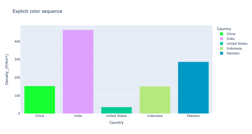
Python3
import pandas as pd
import plotly.express as px
df = pd.read_csv('country_density.csv', encoding='UTF-8')
df = df.iloc[:5, :]
fig = px.bar(df, x="Country", y="Density_(P/Km²)", color="Country",
orientation="v",
hover_name="Country", color_discrete_sequence=[
px.colors.qualitative.Alphabet[6],
px.colors.qualitative.Alphabet[11],
px.colors.qualitative.Plotly[2],
px.colors.qualitative.Plotly[7],
px.colors.qualitative.G10[5]],
title="Explicit color sequence"
)
fig.show()
|
Output:
Share your thoughts in the comments
Please Login to comment...