Change marker border color in Plotly – Python
Last Updated :
17 Dec, 2020
In this article, we are going to discuss how to change marker border color using plotly module in Python.
Plotly is definitely a must-know tool for visualization since it’s incredibly powerful easily used and has the big benefit of interactivity we are able to export visualization, being able to run on browsers, build with DASH which is web-based python interface which removes the need of javascript in this type of analytical web applications, and we can also run these plot offline as well. In this article we will use the module of plotly which is plotly.express, it is the high-level python visualization library, it exposes simple syntax to complex charts it is the wrapper for plotly.py.
Installation:
This module can be installed using the below command:
pip install plotly
In this article, we are going to change the maker border color with the help of plotly.express.scatter.update_traces() and plotly.express.scatter_3d.update_traces()() methods.
Step-by-step Approach:
- Import the plotly and pandas library.
- First, we have to load the dataset on which we are plotting our graph with the help of the pandas library.
- For plotting the graph we will use plotly.scatter() for scatter plot and put it in the variable let name as fig
- Then we use fig.update_traces function which is having marker property from which we can change the borders of the marker.
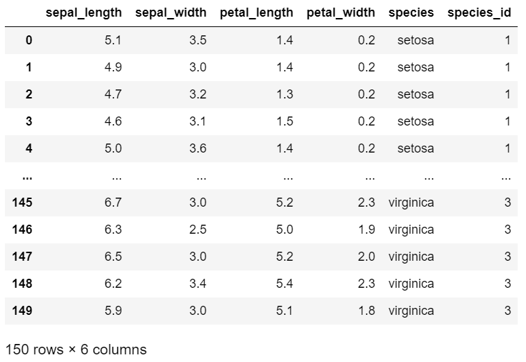
We are going to use the below iris dataset in various examples:
Python3
import plotly.express as px
df = px.data.iris()
df
|
Output:
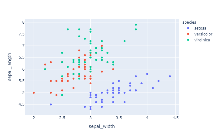
Example 1: Plotting default scatter plot on iris dataset.
Python
import plotly.express as px
df = px.data.iris()
fig = px.scatter(df, x='sepal_width',
y='sepal_length',
color='species')
fig.show()
|
Output:
Plotting scatter plot on iris dataset and changing marker border color.
Python
import plotly.express as px
df = px.data.iris()
fig = px.scatter(df, x='sepal_width',
y='sepal_length',
color='species')
fig.update_traces(marker=dict(size=10,
line=dict(width=3,
color='blue')))
fig.show()
|
Output:
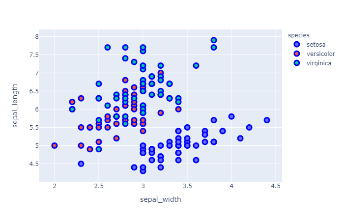
In the above code, we had used update_traces() function in that we had given marker attribute for creating the borders in that attribute we had passed the dictionary in which we had passes size=10 for giving the size to the circles, whereas in line we had passed the dictionary in which we had passes width and color, width refers to the width of the border and color refers to the color of the border.
Example 3: Plotting default scatter_3d plot on iris dataset.
Python
import plotly.express as px
df = px.data.iris()
fig = px.scatter_3d(df,x='petal_length',
y='petal_width',
z='sepal_length',
color='species')
fig.show()
|
Output:
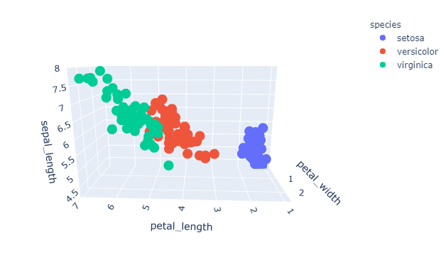
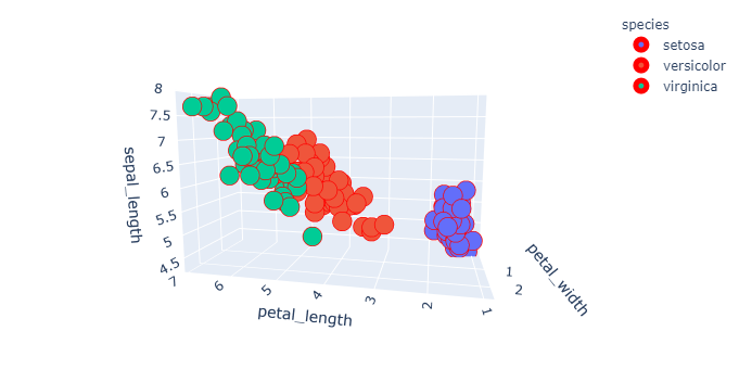
Example 4: Plotting scatter_3d plot on iris dataset with marker border color.
Python
import plotly.express as px
df = px.data.iris()
fig = px.scatter_3d(df,x='petal_length',
y='petal_width',
z='sepal_length',
color='species')
fig.update_traces(marker=dict(size=10,
line=dict(width=10,
color='red')))
fig.show()
|
Output:
Like Article
Suggest improvement
Share your thoughts in the comments
Please Login to comment...