Pygal Dot Chart
Last Updated :
16 Aug, 2023
Pygal library in Python is an open-source library used for data visualization. We can draw various interactive plots and charts using different datasets. For example, bar charts, line charts, pie charts, radar charts, etc.
Install Pygal in Python
To draw a dot chart using Pygal in Python. We need the Pygal library to be installed in Python so, install the Pygal library by executing the below command in the terminal or command prompt:
pip install pygal
What is Dot Chart in Pygal?
A dot chart, also known as a dot plot or strip plot is used to visualize the data points of a data set in a simple and effective way. It represents each data point as a dot along an axis. It is mostly used when we have to visualize small datasets.
Create Dot Chart using Pygal in Python
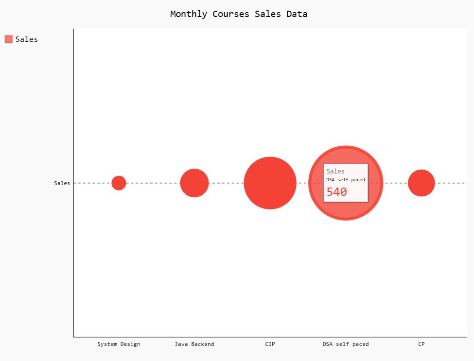
In this, we have drawn a basic dot chart of sample data “Monthly courses sales data“. We import the Pygal module and then create a dot chart object using pygal.Dot() method. Set the title to the dot chart and labels for the x-axis. After that add sales data to the dot chart using add() method by passing the label ‘Sales’ as the first argument and the list of data as the second argument. Finally, save the dot chart to an SVG file using the render_to_file() method of Pygal. In the output, we can see that dot chart and when we hover over any of the dots it shows the stats for that particular dot.
Python3
import pygal
dot_chart = pygal.Dot()
dot_chart.title = 'Monthly Courses Sales Data'
dot_chart.x_labels = ['System Design',
'Java Backend',
'CIP',
'DSA self paced', 'CP']
dot_chart.add('Sales', [105, 210, 390, 540, 198])
dot_chart.render_to_file('dotChart.svg')
|
Output:
Create a Dot Chart with Multiple Series using Pygal in Python
In this example, we will create a dot chart with multiple data series. Firstly we import the Pygal module using pygal.Dot() method with argument “x_label_rotation=30” that sets the rotation angle of the x-axis labels to 30 degrees to prevent overlapping if labels are too long. Set the title for the dot chart, x-axis, and y-axis, and then set the labels of the x-axis with a list of names. After that, we add the data of Aptitude, OOPs, and DSA using an add() method and finally, save the plot to dot_chart.svg file using render_to_file() function.
Python3
import pygal
dot_chart = pygal.Dot(x_label_rotation=30)
dot_chart.title = 'GeeksforGeeks Hackathon results'
dot_chart.x_title = 'Students names'
dot_chart.y_title = 'Section'
dot_chart.x_labels = ['Ramesh', 'Suresh',
'Carry', 'Tiger',
'Jonny', 'Lakhan',
'Sita', 'Krishna']
dot_chart.add('Aptitude', [69, 82, 75, 72, 64, 60, 21, 86])
dot_chart.add('OOPs', [74, 99, 77, 51, 61, 44, 97, 94])
dot_chart.add('DSA', [34, 29, 42, 59, 58, 28, 90, 69])
dot_chart.render_to_file('dot_chart.svg')
|
Output:

Create Dot Chart with Negatives using Pygal in Python
In this example, we draw a dot chart with negative values, Firstly, we create margin data of different courses stored in a Python dictionary. Create a dot chart object “dot_chart_margins” and then add data to the dot chart using add() method by traversing over the dictionary “margins”. Add a title to the dot chart, x-axis, and y-axis. Finally, save the dot chart to the ‘course_margins.svg’ file. The negative values are represented by holo circles in the dot chart.
Python3
import pygal
margins = {
'Java Backend': -10,
'System Design': 5,
'DSA Self Paced': 15,
'CP': -5,
'CIP': 8
}
dot_chart_margins = pygal.Dot()
for department, profit_margin in margins.items():
dot_chart_margins.add(department, profit_margin)
dot_chart_margins.title = 'Profit Margins of Courses'
dot_chart_margins.x_title = 'Courses'
dot_chart_margins.y_title = 'Profit Margin (%)'
dot_chart_margins.render_to_file('course_margins.svg')
|
Output:

Share your thoughts in the comments
Please Login to comment...