Power BI – Line Stacked Column Chart
Last Updated :
25 Sep, 2023
In this article, we will learn to implement decomposition charts using Power BI. This discusses some important concepts used to create the very common Line Stacked Column charts to make large business data analysis. We will be discussing their implementation in the Power BI desktop. Power BI has the capacity to incorporate AI and machine learning.
Pre-requisite: You can refer to Power BI interactive dashboards for easy implementation of the following charts. Learning Power platforms tools will be very useful for working quickly for business needs.
Line and Stacked column chart: These charts combine two visuals and make a quick comparison between two measures. It has one or two y-axes. A very common example is comparing total sales and profit % for all the months of a year. So total sales and profit parameters are in the vertical y-axis. The column values are stacked to divide the vertical bars. The line on the stacked column chart represents the line with numeric values representing the second y-axis values (an example is Profit %)
Let us see some of the Line Stacked Column Chart implementations.
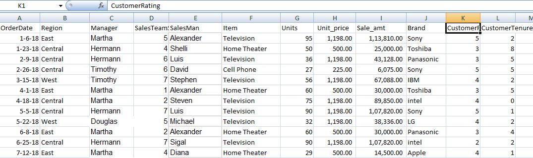
Dataset used: The dataset used is “SaleData“. Upload the dataset in Power BI and refer to the dataset to follow along with the below-given sections of the article.
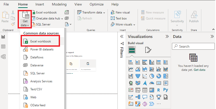
Load Data in Power BI Desktop:
Click the “Get Data” option and select “Excel” for data source selection and extraction.
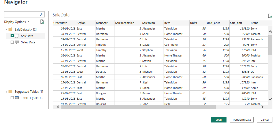
- Select the relevant desired file from the folder for data load. In this case, the file is “SaleData.xlsx”. Click the “Load” button once the preview is shown for the Excel data file.
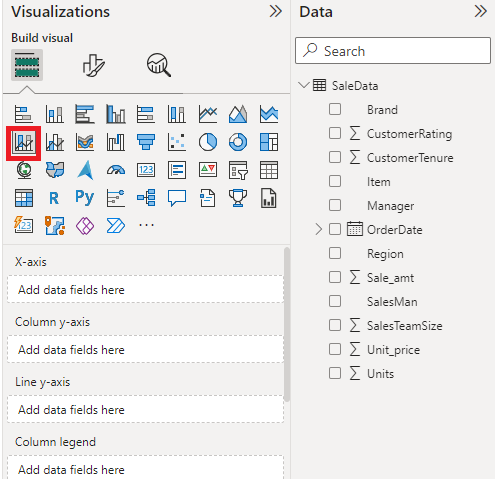
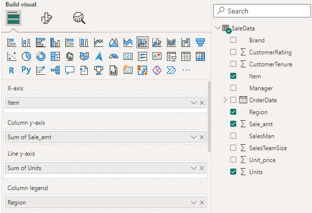
- The dashboard is seen once the file is loaded with the “Visualizations” Pane and “Data fields” Pane which stores the different variables of the data file. Drag the red-colored square box to the main canvas.
Initial Canvas: The initial canvas looks like the following.
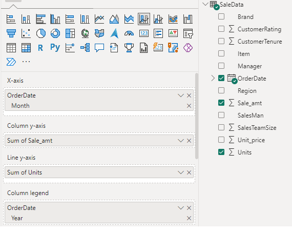
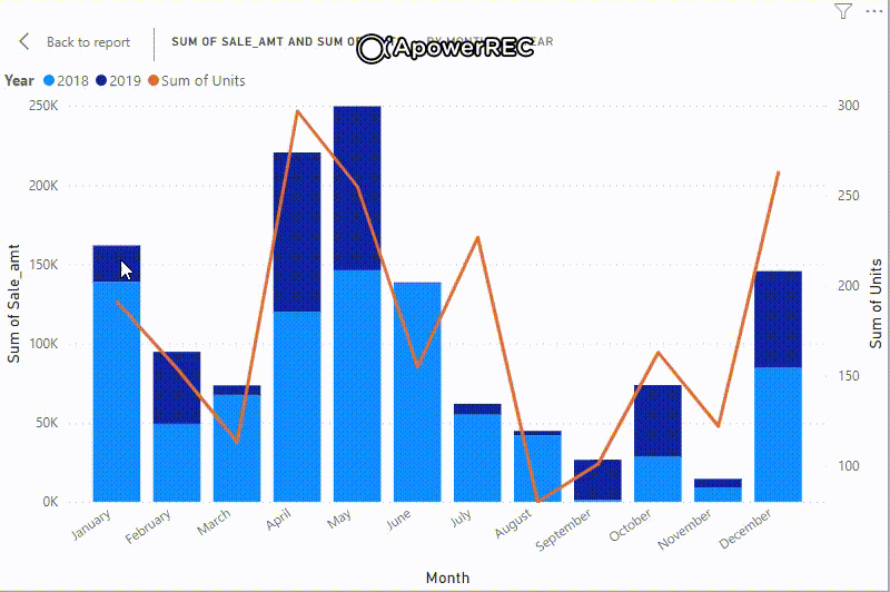
Example 1: Set the x-axis, column y-axis, line y-axis and column legends as shown in the visuals pane. We want to show data for total sales amount and total units (for items) for all the months of year 2018 and 2019.
The line stacked column chart will look like the following image. The column legends are 2018 and 2019 which are stacked one above the other in different colors shows total sale amount, Line chart and it’s values shows total units showing up for months.
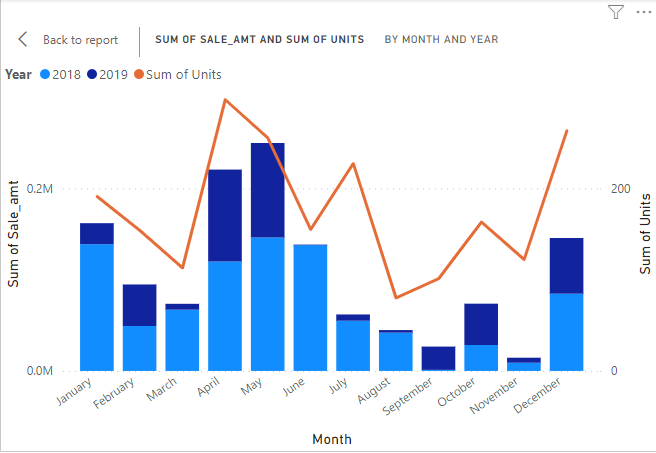
Output:
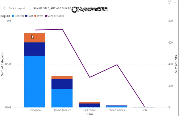
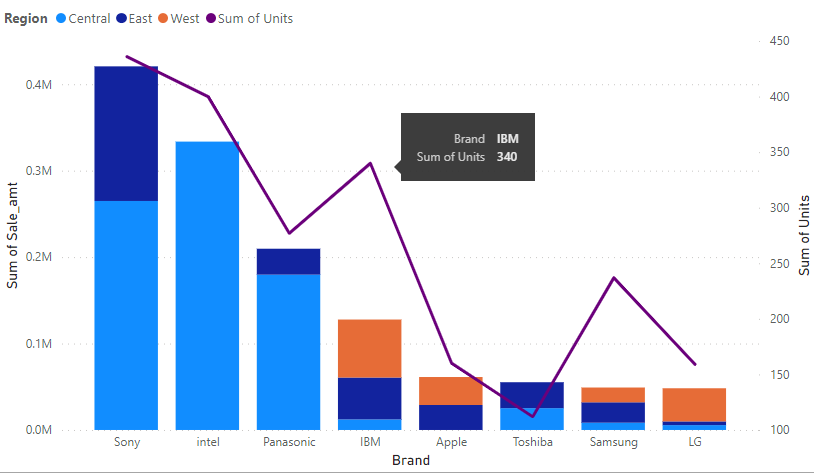
Example 2: This is another example of Line Stacked column chart with common or shared axis with items. It shows total sale amount and total units for different Regions namely “Central”, “East”, West” (column legends).
The following shows the line and stacked column chart according to the above settings.
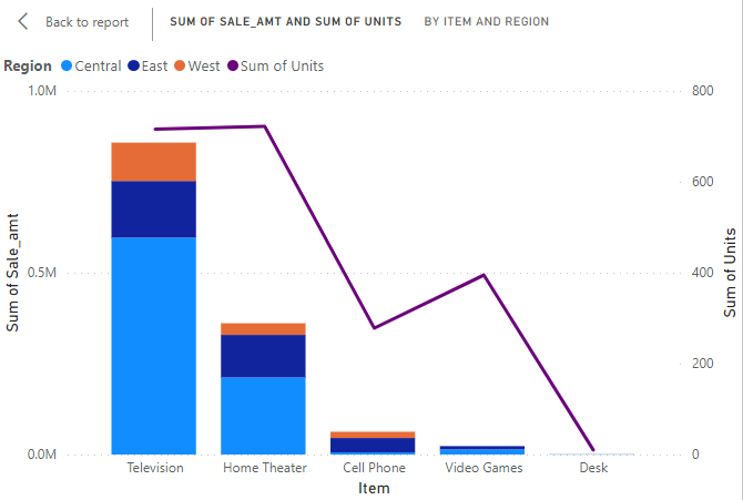
Output:
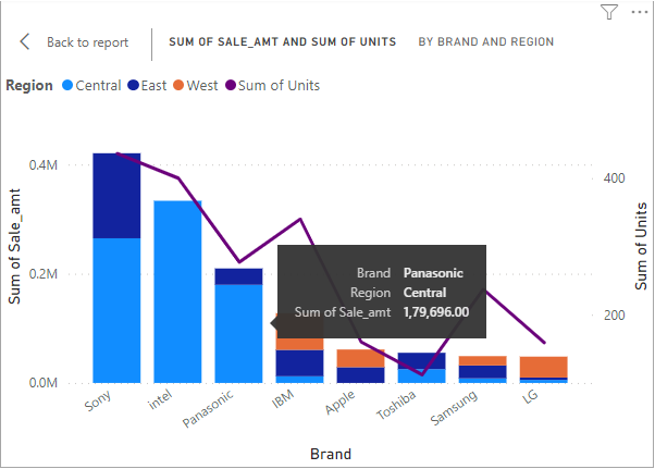
Example 3: The following example is very similar to the above one with a slight change of common x-axis as “Brand”. The total sales amount and total units is shown for all the months with different item brands. Set the Visualizations pane as shown below.
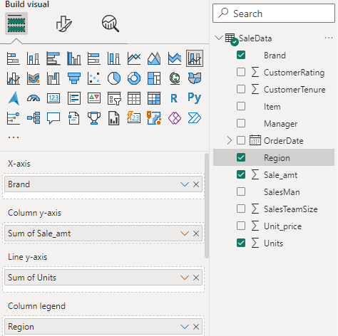
chart: “Sum of sale and sum of unit by Brand and Region” is shown below.
Another snapshot
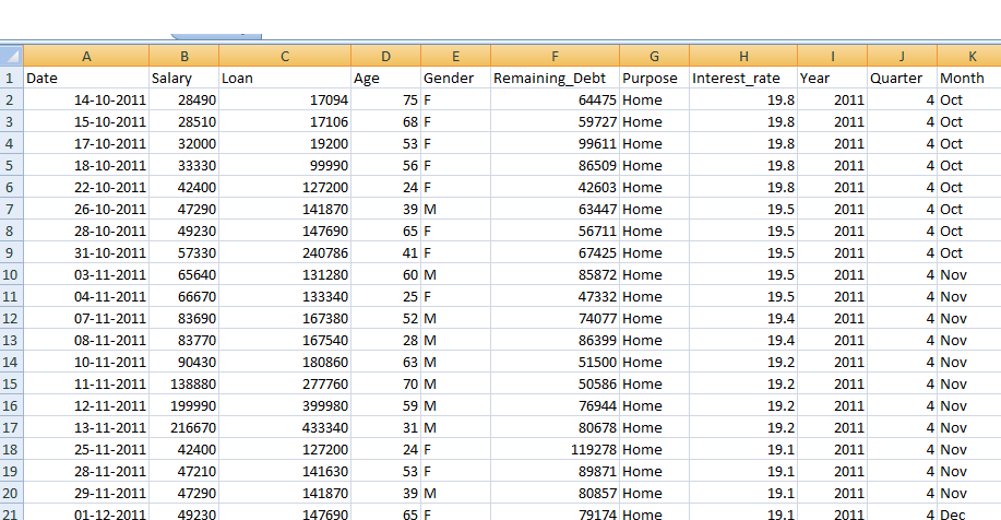
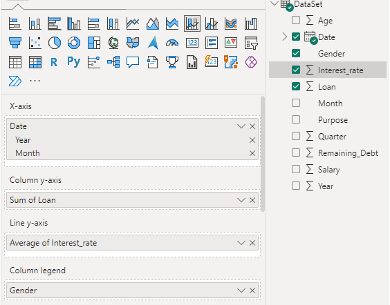
Example 4: The following also implements a Line Stacked Column Chart with another dataset “DataSet.xlsx”.
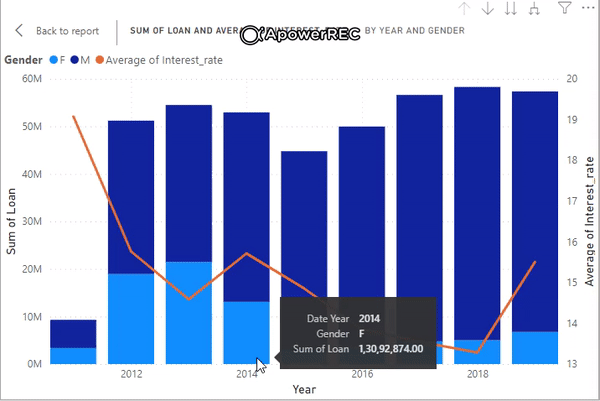
Visual Pane: The chart is created for showing Sum of loan and average interest rate for all the available years for both the genders.
The Line axis and its value shows average interest rates on loan for different years as shown below.
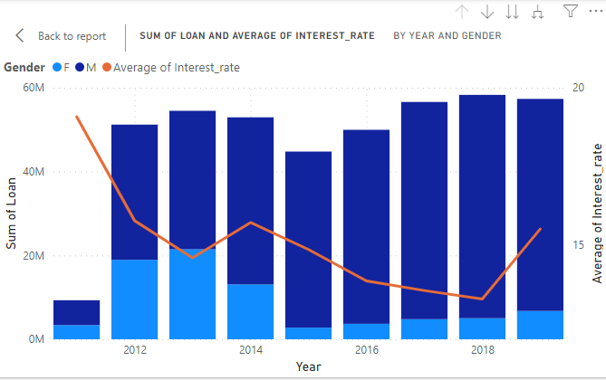
Output:
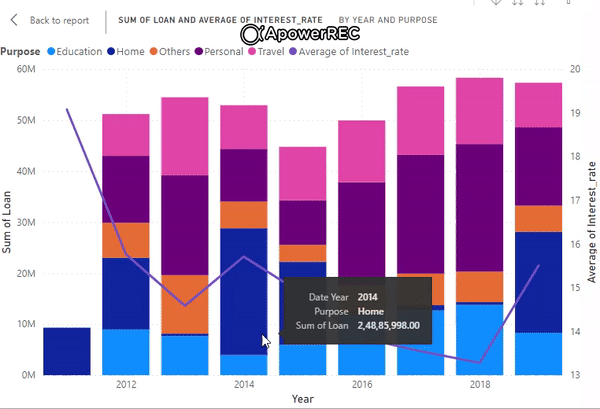
Example 5: The following also shows a similar chart like the previous one. Only the column legend is changed to “purpose” rather than “gender”. It shows Sum of loan and average of interest rate by year and purpose.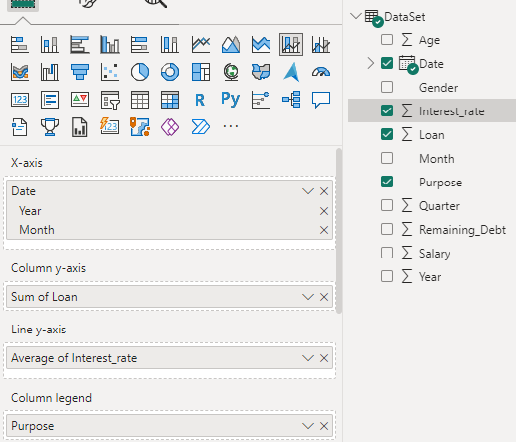
The different column legends are “Education”, “Home”, “Personal”, “Travel” and so on.
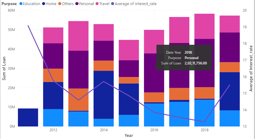
Output:
Other references: You can further extend to some different settings by following Power BI – Format Line and Stacked Column Chart
Conclusion: When we need to measure some parameters against one or two measures, use line and stacked column chart for a very quick comparison for data analysis. It makes life simpler by making a combination of two visuals or two charts.
Share your thoughts in the comments
Please Login to comment...