Navigation Bar using JavaScript
Last Updated :
08 Jan, 2024
A Navigation Bar is a user interface element commonly found in websites and applications. It typically appears at the top of a web page or screen and It’s an essential component of any website, allowing users to easily navigate and access different sections or pages. In this tutorial, we will make a responsive navigation bar using HTML, CSS, and JavaScript.
Approach
- Link the style.css and script.js files with the HTML code.
- First, we will add a header tag inside the body section and 3 more divs for the logo, side nav menu, and hamburger menu.
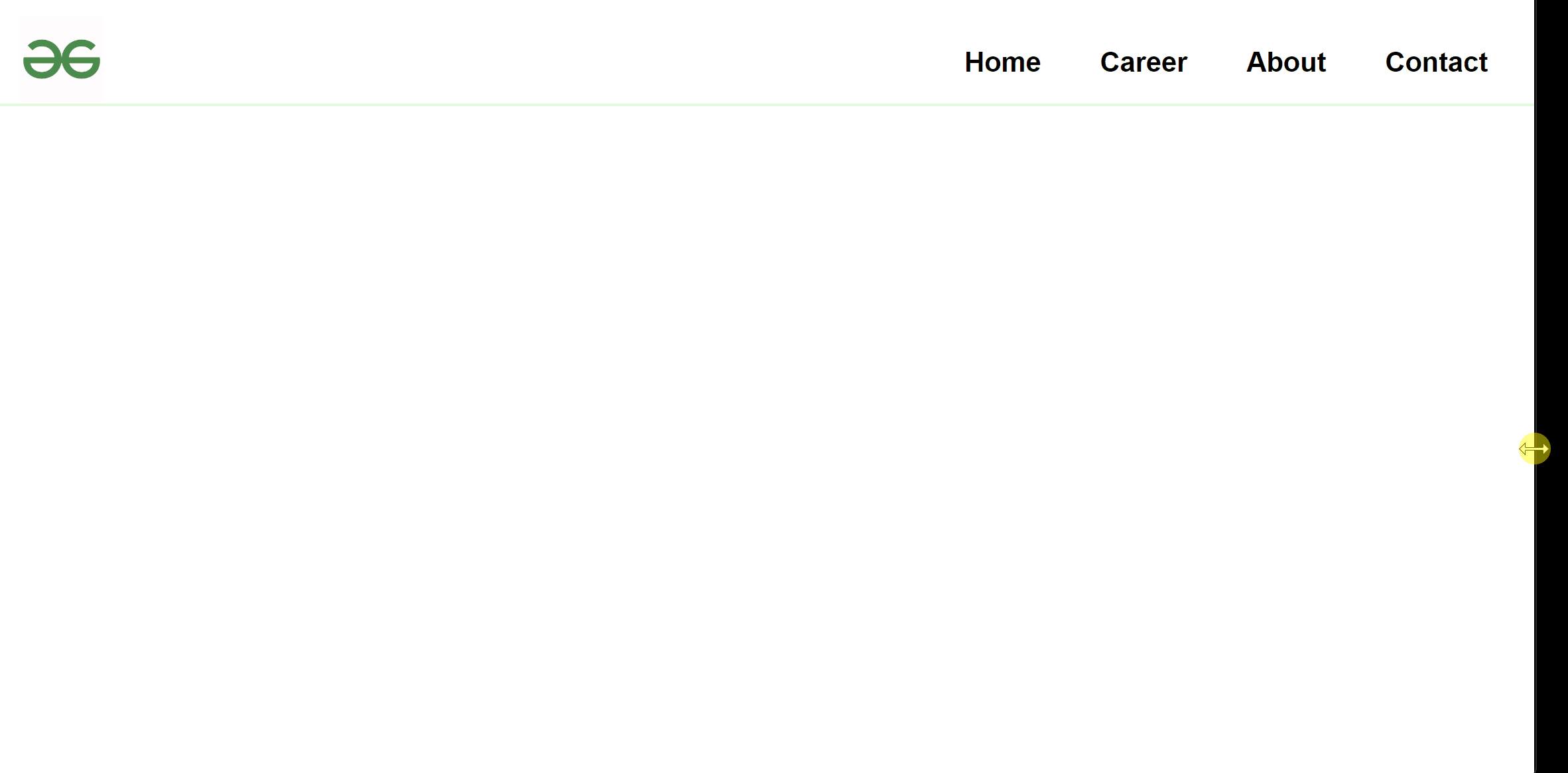
- The logo will be on the left side and the navigation links will be on the right side. The hamburger menu will only appear on a small display for a better user experience.
- After that, we will style the Navbar and add an EventListener on the Hamburger icon to only trigger when someone clicks on it.
Example: Below is the implementation of the above approach.
Javascript
const hamburger = document.querySelector('.hamburger-menu');
const navMenu = document.querySelector('.nav-menu');
hamburger.addEventListener('click', () => {
navMenu.classList.toggle('hide');
});
|
HTML
<!DOCTYPE html>
<html lang="en">
<head>
<meta charset="UTF-8">
<meta http-equiv="X-UA-Compatible" content="IE=edge">
<meta name="viewport" content="width=device-width, initial-scale=1.0">
<link rel="stylesheet" href="style.css">
<title>Responsive Navbar</title>
</head>
<body>
<header>
<nav class="navbar">
<div class="logo">
<a href="/">
<img src=
alt="gfg_logo">
</a>
</div>
<div class="hamburger-menu">
<span class="line"></span>
<span class="line"></span>
<span class="line"></span>
</div>
<div class="nav-menu hide">
<a href="#">Home</a>
<a href="#">Career</a>
<a href="#">About</a>
<a href="#">Contact</a>
</div>
</nav>
</header>
</body>
<script src="./script.js"></script>
</html>
|
CSS
*{
box-sizing: border-box;
margin: 0;
padding: 0;
transition: all 0.4s;
}
body{
font-family: sans-serif;
}
a{
text-decoration: none;
color: black;
font-size: 1.3rem;
font-weight: bold;
}
.navbar{
display: flex;
height: 5rem;
justify-content: space-between;
align-items: center;
padding-top: 1rem;
border-bottom: 2px solid rgb(223, 251, 219);
}
.logo img{
width: 4rem;
height: 4rem;
margin-left:1rem;
}
.hamburger-menu{
padding-right: 1.5rem;
cursor: pointer;
}
.hamburger-menu .line{
display: block;
width:2.5rem;
height: 2px;
margin-bottom: 10px;
background-color: black;
cursor: pointer;
}
.nav-menu{
position: fixed;
width: 94%;
top: 6rem;
left: 18px;
background-color: rgb(255, 255, 255);
font-weight: 600;
}
.nav-menu a{
display: block;
text-align: center;
padding: 5px 0;
}
.nav-menu a:hover{
background-color: rgb(223, 251, 219);
}
.hide{
display: none;
}
@media screen and (min-width:600px){
.navbar{
justify-content: space-around;
}
.nav-menu{
display: block;
position: static;
width: auto;
margin-right:20px;
background: none;
}
.nav-menu a{
display: inline-block;
padding: 15px 20px;
}
.nav-menu a:hover{
background-color: rgb(223, 251, 219);
border-radius: 5px;
}
.hamburger-menu{
display: none;
}
}
|
Navigation Bar using JavaScript
Share your thoughts in the comments
Please Login to comment...