Design a Navigation Bar with Toggle Dark Mode in HTML CSS & JavaScript
Last Updated :
26 Apr, 2024
One can create a navigation bar with a toggle switch for dark mode using HTML, CSS, and JavaScript. If we use the dark mode effect in our website then it can attract user attention and users can use our website in any situation. With the help of JavaScript, we’ll implement the functionality to toggle between light and dark modes.
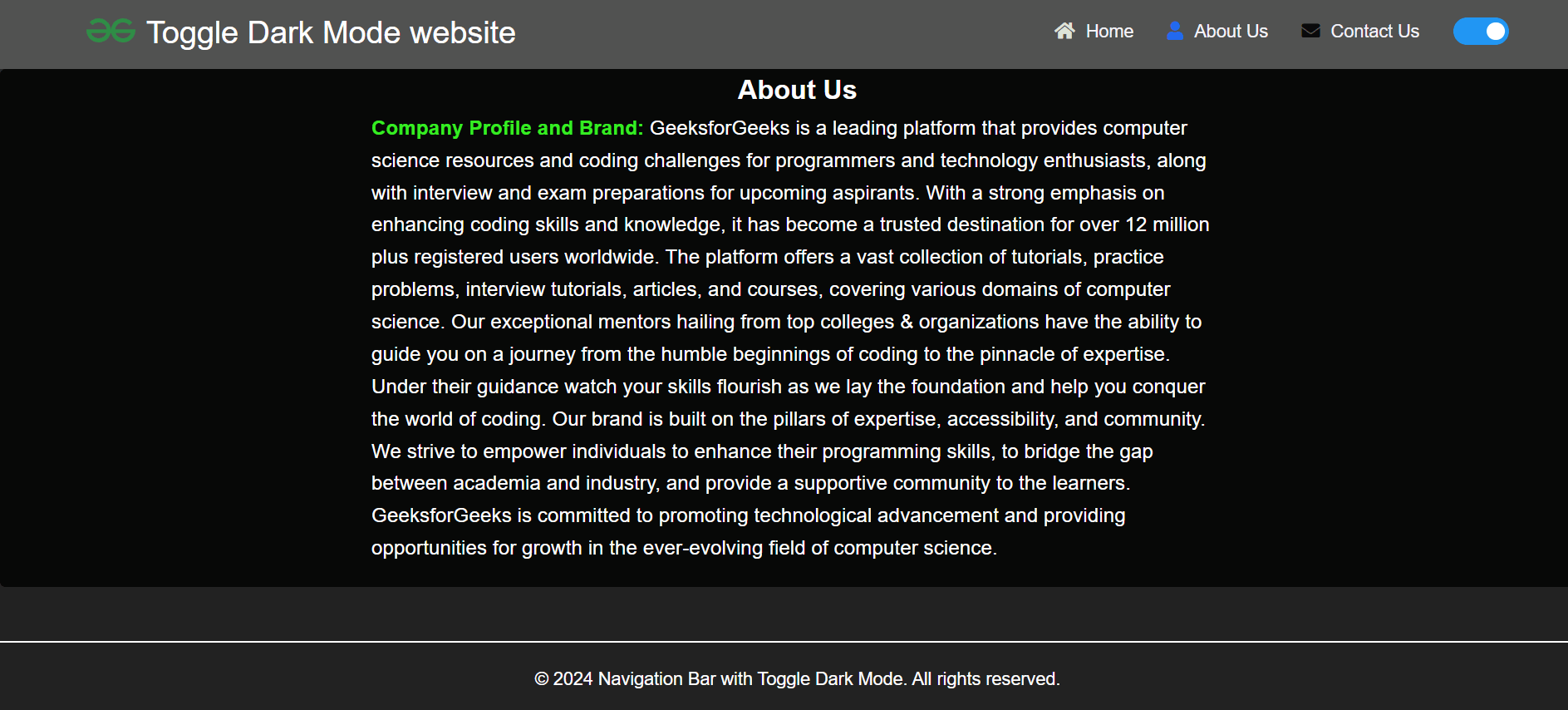
Output : In the dark mode
Approach:
- At first create a bascic html structure and then put the necessary elements like navbar links and the toggle switch.
- Then style the page including the navbar and footer using css, here you can define a css variables to change the colors for diffrent stage like light mode and dark mode. If you use the variable then it is easy to change the color else you need to write extra code for that.
- In the javascript part first get the reference for all needed tags . And then implement two function like enableDarkMode() and disableDarkMode(). Then handle the “click” event of the toggle button for change the color.
- And you can make the website responsive using css.
Example : This example shows the implementation of the above approach.
HTML
<!DOCTYPE html>
<html lang="en">
<head>
<meta charset="UTF-8">
<meta name="viewport" content="width=device-width, initial-scale=1.0">
<title>Navigation Bar with Dark Mode Toggle</title>
<link rel="stylesheet"
href=
"https://cdnjs.cloudflare.com/ajax/libs/font-awesome/5.15.4/css/all.min.css">
<link rel="stylesheet" href="style.css">
</head>
<body>
<header class="header">
<a href="/"><img src="https://media.geeksforgeeks.org/gfg-gg-logo.svg"
alt="Brand logo"> <span class="brand-logo-name">Toggle Dark Mode
website</span></a>
<nav class="navbar">
<ul class="navbar-lists" id="myTopnav">
<li><i class="fas fa-home"></i><a class="navbar-link home-link"
href="#">Home</a></li>
<li><i class="fas fa-user"></i><a class="navbar-link about-link"
href="#about-us-section">About Us</a>
</li>
<li><i class="fas fa-envelope"></i><a
class="navbar-link contact-link"
href="#contact-form">Contact
Us</a></li>
<li>
<label class="switch">
<input type="checkbox" id="darkModeToggle">
<span class="slider round"></span>
</label>
</li>
</ul>
<a href="javascript:void(0);" class="icon" onclick="myFunction()">
<i class="fa fa-bars"></i>
</a>
</nav>
</header>
<main>
<section id="about-us-section">
<div class="about-us-container">
<h2 class="aboutus-heading">About Us</h2>
<p>
<strong class="subheading"> Company Profile and Brand:
</strong>
GeeksforGeeks is a leading platform that provides computer
science resources and coding challenges
for
programmers and technology enthusiasts, along with interview
and exam preparations for upcoming
aspirants.
With a strong emphasis on enhancing coding skills and
knowledge, it has become a trusted destination
for over
12 million plus registered users worldwide. The platform
offers a vast collection of tutorials,
practice
problems, interview tutorials, articles, and courses,
covering various domains of computer science.
Our exceptional mentors hailing from top colleges &
organizations have the ability to guide you on a
journey
from the humble beginnings of coding to the pinnacle of
expertise. Under their guidance watch your
skills
flourish as we lay the foundation and help you conquer the
world of coding.
Our brand is built on the pillars of expertise,
accessibility, and community. We strive to empower
individuals
to enhance their programming skills, to bridge the gap
between academia and industry, and provide a
supportive
community to the learners. GeeksforGeeks is committed to
promoting technological advancement and
providing
opportunities for growth in the ever-evolving field of
computer science.
</p>
</div>
</section>
<footer>
<p>© 2024 Navigation Bar with Toggle Dark Mode. All rights
reserved.</p>
</footer>
<script src="script.js"></script>
</body>
</html>
* {
    margin: 0;
    padding: 0;
    box-sizing: border-box;
}

:root {
    --header-green-color: #36ed22;
    --aboutus-background-green-color: rgb(28, 225, 97);
    --heading-color: #000;
    --primary-color: #2162e3;
    --heading-a-tag-color: #fff;
    --heading-a-tag-hover-color: #212121;
    --all-h2-color: #000;
    --aboutus-strong-color: #000;
    --aboutus-p-tag-color: #201f1f;
    --aboutus-border-color: rgb(28, 225, 97);
}

.dark-mode {
    --header-green-color: #515251;
    --aboutus-background-green-color: rgb(7, 8, 7);
    --heading-color: #fff;
    --primary-color: #212121;
    --heading-a-tag-color: #f2f3f9;
    --heading-a-tag-hover-color: #36ed22;
    --all-h2-color: #fff;
    --aboutus-strong-color: #36ed22;
    --aboutus-p-tag-color: #fff;
    --aboutus-border-color: rgb(142, 144, 143);
}

body {
    font-family: Arial, sans-serif;
    background-color: var(--primary-color);
    line-height: 1.6;
    overflow-x: hidden;

}

.brand-logo-name {
    text-decoration: none;
    color: #fff;
    font-size: 1.75rem;
    padding: 5px;
}

a {
    text-decoration: none;
    color: var(--heading-a-tag-color);
    transition: color 0.3s ease;
}

a:hover {
    color: var(--heading-a-tag-hover-color);
}

.header {
    padding: 1.6rem 4.8rem;
    display: flex;
    justify-content: space-between;
    align-items: center;
    background-color: var(--header-green-color);
    box-shadow: 0px 0px 20px 0px rgba(132, 144, 255, 0.2);
    width: 100%;
    height: 10vh;
}

.header img {
    height: 30px;
    padding-top: 8px;
}

.navbar-lists {
    list-style-type: none;
    margin: 0;
    padding: 0;
    display: flex;
}

.navbar-lists li {
    margin-right: 20px;
}

.navbar-lists li:last-child {
    margin-right: 0;
}

.navbar-link {
    color: var(--heading-a-tag-color);
    padding: 10px;
    transition: background-color 0.3s;
}

.icon {
    display: none;
}

.navbar-lists li:nth-child(1) i {
    color: rgb(221, 228, 215);
}

.navbar-lists li:nth-child(2) i {
    color: rgb(33, 105, 239);
}

.navbar-lists li:nth-child(3) i {
    color: rgb(11, 12, 11);
}

.switch {
    position: relative;
    display: inline-block;
    width: 50px;
    height: 24px;
}

.switch input {
    opacity: 0;
    width: 0;
    height: 0;
}

.slider {
    position: absolute;
    cursor: pointer;
    top: 0;
    left: 0;
    right: 0;
    bottom: 0;
    background-color: #ccc;
    -webkit-transition: .4s;
    transition: .4s;
}

.slider:before {
    position: absolute;
    content: "";
    height: 16px;
    width: 16px;
    left: 4px;
    bottom: 4px;
    background-color: white;
    -webkit-transition: .4s;
    transition: .4s;
}

input:checked+.slider {
    background-color: #2196F3;
}

input:focus+.slider {
    box-shadow: 0 0 1px #2196F3;
}

input:checked+.slider:before {
    -webkit-transform: translateX(26px);
    -ms-transform: translateX(26px);
    transform: translateX(26px);
}

.slider.round {
    border-radius: 34px;
}

.slider.round:before {
    border-radius: 50%;
}

@media screen and (max-width: 768px) {
    .icon {
        display: flex;
        position: absolute;
        top: 20px;
        right: 20px;
        z-index: 999;
        color: #fff;
        font-size: 24px;
        cursor: pointer;
        flex-direction: row-reverse;
    }

    .navbar-lists {
        display: none;
        position: absolute;
        top: 60px;
        left: 0;
        background-color: #3beb2b;
        width: 100%;
        padding-top: 10px;
        z-index: 998;
    }

    .navbar-lists.responsive {
        display: flex;
        flex-direction: column;
        align-items: center;
    }

    .navbar-lists.responsive li {
        margin: 10px 0;
    }

    .navbar-link {
        padding: 10px 20px;
    }

    .navbar-link i {
        display: none;
    }
}

#about-us-section {
    background: var(--aboutus-background-green-color);
    text-align: center;
    width: 100%;
    margin: 0 auto;
    margin-bottom: 3rem;
    padding-bottom: 20px;
    border: 3px solid var(--aboutus-border-color);
    border-radius: 5px;

}

.dark-mode #about-us-section {
    border: none;
}

.about-us-container {
    max-width: 800px;
    margin: 0 auto;
    padding: 0 20px;
}

h2 {
    color: var(--all-h2-color);
}

.subheading {
    color: var(--aboutus-strong-color);
}

.about-us-container p {
    font-size: 1.125rem;
    line-height: 1.6;
    color: var(--aboutus-p-tag-color);
    text-align: left;
}

.about-us-container p:first-of-type {
    margin-top: 0;
}

.about-us-container p:last-of-type {
    margin-bottom: 0;
}

@media screen and (max-width: 768px) {
    .aboutus-heading {
        font-size: 2rem;
    }

    .about-us-container p {
        font-size: 1rem;
    }
}

footer {
    background-color: #333;
    color: #fff;
    text-align: center;
    padding: 20px 0;
    position: fixed;
    bottom: 0;
    width: 100%;
}

.dark-mode footer {
    background-color: #222;
    border-top: 2px solid #fff;
}
let darkModeToggle = document
.getElementById('darkModeToggle');
let body = document
.body;

darkModeToggle
.addEventListener('change', function ()
{
    if (darkModeToggle.checked)
    {
        enableDarkMode();
    } else {
        disableDarkMode();
    }
});

function enableDarkMode() {
    body
    .classList
    .add('dark-mode');
};

function disableDarkMode()
{
    body
    .classList
    .remove('dark-mode');
};


function myFunction()
 {
    var x = document
    .getElementById("myTopnav");
    if (x.className === "navbar-lists")
    {
        x.className += " responsive";
    } else {
        x.className = "navbar-lists";
    }
};
Output:
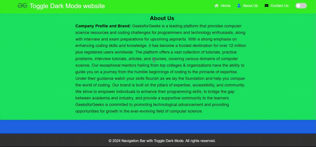
Output:Navigation Bar with Toggle Dark Mode
Share your thoughts in the comments
Please Login to comment...