Meaning of numbers in “col-md-4”,“ col-xs-1”, “col-lg-2” in Bootstrap
Last Updated :
26 Feb, 2019
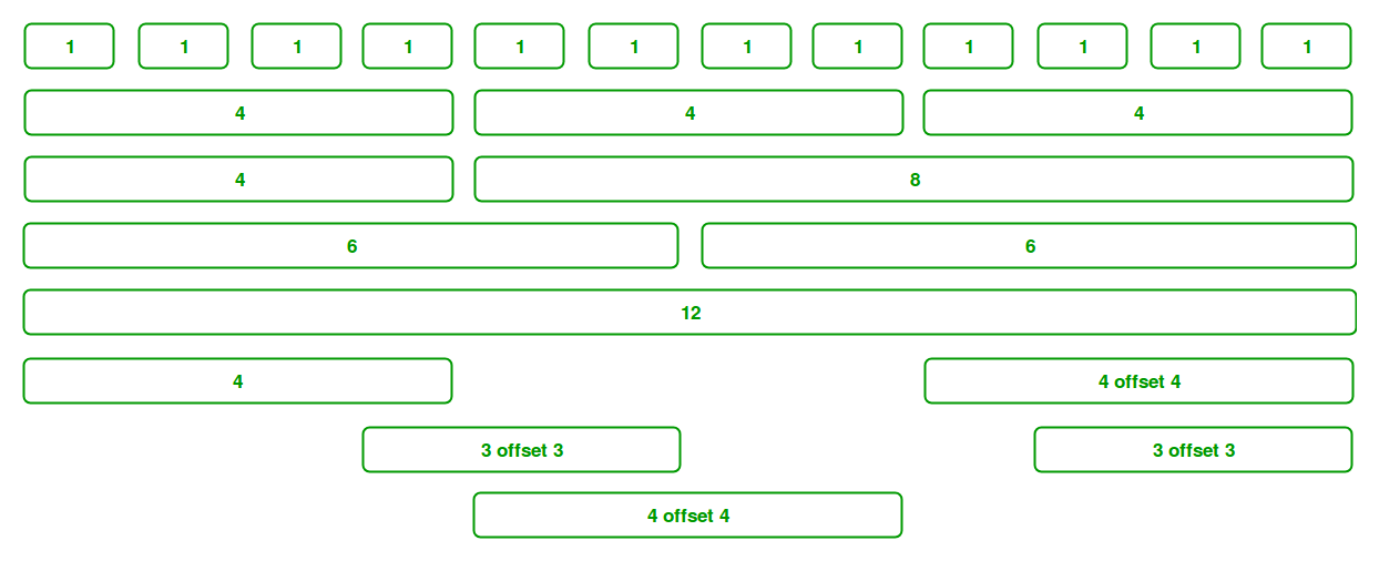
The grid system in Bootstrap helps you to align text side-by-side and uses a series of container, rows and column. The Grid system in Bootstrap uses ems and rems for defining most sizes whereas pxs are used for grid breakpoints and container widths. Bootstrap Grid System allows up to 12 columns across the page. You can use each of them individually or merge them together for wider columns. You can use all combinations of values summing up to 12. You can use 12 columns each of width 1, or use 4 columns each of width 3 or any other combination.
There are mainly five class in grid system which are listed below:
- .col- Extra Small ( < 576 px )
- .col-sm- Small ( >= 576 px )
- .col-md- Medium ( >= 768 px )
- .col-lg- Large ( >= 992 px )
- .col-xl- Extra Large ( >= 1200 px )
Bootstrap provides 12 columns per row which is made available in the Column class. So, you can control the width of column using specifying numbers in .col-*, where * means the width of the column in numbers.
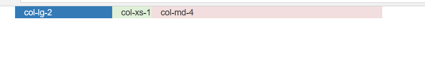
col-md-4: This class is used when the device size is medium or greater than 768px and the maximum width of container is 720px and you want the width equal to 4 columns.
col-xs-1: This class is used when the device size is extra small (mobile) and when you want the width to be equal to 1 column.
col-lg-2: This class is used when the device size is large or greater than 992px and the maximum width of container is 960px and when you want size equal to 2 columns.
Example:
<!DOCTYPE html>
<html>
<head>
<title>
Bootstrap numbers col-md-4, col-xs-1, col-lg-2
</title>
<link rel="stylesheet" href=
<script src=
</script>
<script src=
</script>
</head>
<body>
<div class="container">
<div class=" row bg-primary col-lg-2">col-lg-2</div>
<div class=" row bg-success col-xs-1">col-xs-1</div>
<div class=" row bg-danger col-md-4">col-md-4</div>
</div>
</body>
</html>
|
Output:
Share your thoughts in the comments
Please Login to comment...