Matplotlib.colors.LogNorm class in Python
Last Updated :
21 Apr, 2020
Matplotlib is an amazing visualization library in Python for 2D plots of arrays. Matplotlib is a multi-platform data visualization library built on NumPy arrays and designed to work with the broader SciPy stack.
matplotlib.colors.LogNorm()
The matplotlib.colors.LogNorm() class belongs to the matplotlib.colors module. The matplotlib.colors module is used for converting color or numbers arguments to RGBA or RGB.This module is used for mapping numbers to colors or color specification conversion in a 1-D array of colors also known as colormap.
The matplotlib.colors.LogNorm class is used to normalize a value to the range of 0-1 on a log scale. If vmax or vmin is not set, they are initialized from the maximum and minimum value of the first input processed respectively. This means __call__(A) calls autoscale_None(A). If the clip is set to True and the value given falls outside range, the value returned is 0 or 1, whichever is closest. If vmin==vmax than it returns 0. It works with arrays or scalars that also includes masked arrays. If the clip is set True the masked values are set to else they remain masked. The default of the clip is set to False.
Methods of the class:
- autoscale(self, A): It is used to set the vmax, vmin to maximum and minimum of A respectively.
- autoscale_None(self, A): It is used to autoscale only the none-valued vmin or vmax.
- inverse(self, value): It returns reversed value of the colormap.
Example 1:
import matplotlib.pyplot as plt
import numpy as np
from matplotlib import colors
from matplotlib.ticker import PercentFormatter
np.random.seed(19680801)
max_points = 100000
all_bins = 20
a = np.random.randn(max_points)
b = .4 * a + np.random.randn(100000) + 5
figure, axes = plt.subplots(3, 1,
figsize =(5, 15),
sharex = True,
sharey = True,
tight_layout = True)
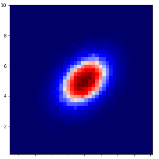
axes[0].hist2d(a, b, bins = 40)
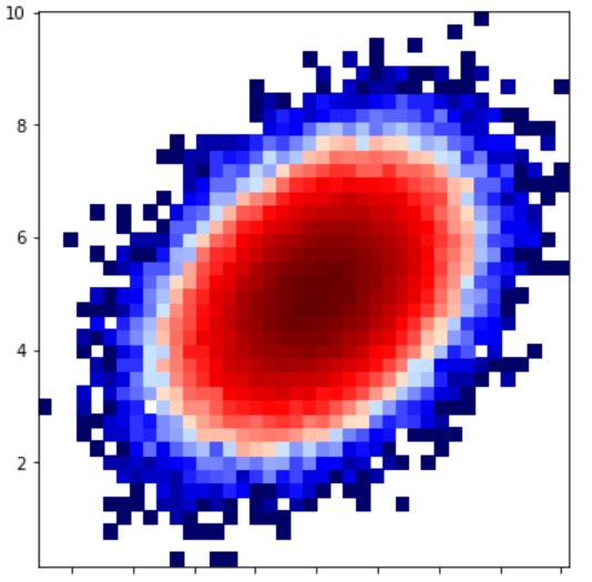
axes[1].hist2d(a, b, bins = 40,
norm = colors.LogNorm())
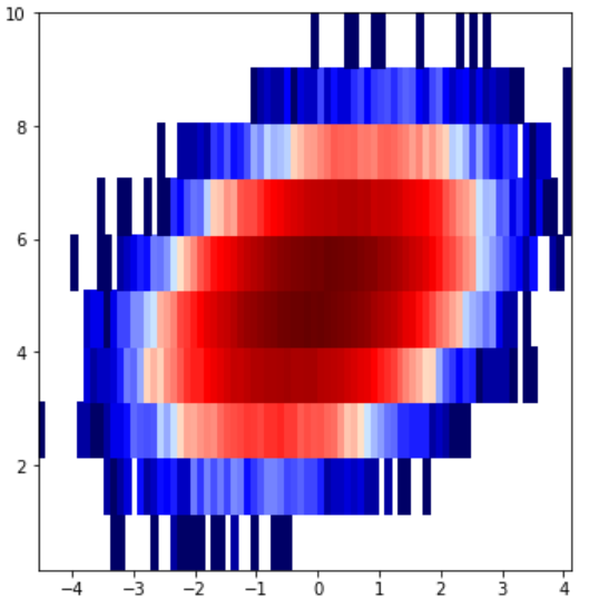
axes[2].hist2d(a, b, bins =(80, 10),
norm = colors.LogNorm())
plt.show()
|
Output:
Example 2:
import matplotlib.pyplot as plt
import numpy as np
from matplotlib.colors import LogNorm
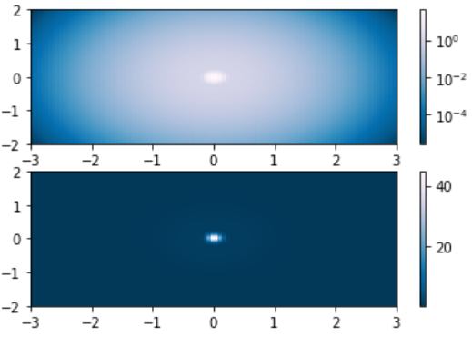
N = 100
A, B = np.mgrid[-3:3:complex(0, N),
-2:2:complex(0, N)]
X1 = np.exp(-(A)**2 - (B)**2)
X2 = np.exp(-(A * 10)**2 - (B * 10)**2)
X = X1 + 50 * X2
figure, (axes0, axes1) = plt.subplots(2, 1)
P = axes0.pcolor(A, B, X,
norm = LogNorm(vmin = X.min(),
vmax = X.max()),
cmap ='PuBu_r')
figure.colorbar(P, ax = axes0)
P = axes1.pcolor(A, B, X,
cmap ='PuBu_r')
figure.colorbar(P, ax = axes1)
plt.show()
|
Output:
Share your thoughts in the comments
Please Login to comment...