Matplotlib.colors.Colormap class in Python
Last Updated :
09 Jan, 2024
The matplotlib.colors.Colormap class belongs to the matplotlib.colors module. The matplotlib.colors module is used for converting color or numbers arguments to RGBA or RGB. This module is used for mapping numbers to colors or color specification conversion in a 1-D array of colors also known as Matplotlib Colormaps.
Matplotlib.colors.Colormap Class Syntax
Syntax: class matplotlib.colors.Colormap(name, N=256)
Parameters:
- name: It accepts a string that represents the name of the color.
- N: It is an integer value that represents the number of rgb quantization levels
Methods of Class:
- colorbar_extend = None : If the colormap exists on a scalar mappable and colorbar_extend is set to false, colorbar_extend is picked up by colorbar creation as the default value for the extend keyword in the constructor of matplotlib.colorbar.Colorbar.
- is_gray(self): Returns a boolean value to check if the plt is gray.
- reversed(self, name=None): It is used to make a reversed instance of Colormap. This function is not implemented for the base class. It has a single parameter ie, name that is optional and and accepts a string name for the reversed colormap. If set to None the becomes the name of the parent colormap + “r”.
- set_bad(self, color=’k’, alpha=None): It sets color that is to be used for masked values.
- set_over(self, color=’k’,, alpha=None): It is used to set color to be used for high out-of-range values. It requires norm.clip to be False.
- set_under(self, color=’k’,, alpha=None):It is used to set color to be used for low out-of-range values. It requires norm.clip to be False.
matplotlib.colors.Colormap in Python
The matplotlib.colors.Colormap class is a base class for all scalar to RGBA mappings. Generally colormap instance are used to transform data values (floats) from interval 0-1 to their respective RGBA color. Here the matplotlib.colors.Normalize class is used for scaling the data. The matplotlib.cm.ScalarMappable subclasses heavily use this for data->normalize->map-to-color processing chain.
Matplotlib Colormaps Examples
Below are some example by which we can create matplotlib colormaps in Python:
Matplotlib Colormaps with Multiple Masked Regions
In this example, a contour plot is generated from a 2D array X with multiple masked regions. The X array is created using mathematical operations on meshgrid arrays A and B. The plot visualizes the data using a bone colormap and overlays contour lines in red color. Three different masked regions are applied to the plot, effectively hiding certain areas from view.
Python3
import numpy as np
import matplotlib.pyplot as plt
start_point = 'lower'
diff = 0.025
a = b = np.arange(-3.0, 3.01, diff)
A, B = np.meshgrid(a, b)
X1 = np.exp(-A**2 - B**2)
X2 = np.exp(-(A - 1)**2 - (B - 1)**2)
X = (X1 - X2) * 2
RR, RC = X.shape
X[-RR // 6:, -RC // 6:] = np.nan
X[:RR // 6, :RC // 6] = np.ma.masked
INNER = np.sqrt(A**2 + B**2) < 0.5
X[INNER] = np.ma.masked
figure1, axes2 = plt.subplots(constrained_layout=True)
C = axes2.contourf(A, B, X, 10, cmap=plt.cm.bone, origin=start_point)
C2 = axes2.contour(C, levels=C.levels[::2], colors='r', origin=start_point)
axes2.set_title('3 masked regions')
axes2.set_xlabel('length of word anomaly')
axes2.set_ylabel('length of sentence anomaly')
cbar = figure1.colorbar(C)
cbar.ax.set_ylabel('coefficient of verbosity')
cbar.add_lines(C2)
plt.show()
|
Output:

Contour Plot with Listed Colors and Custom Levels
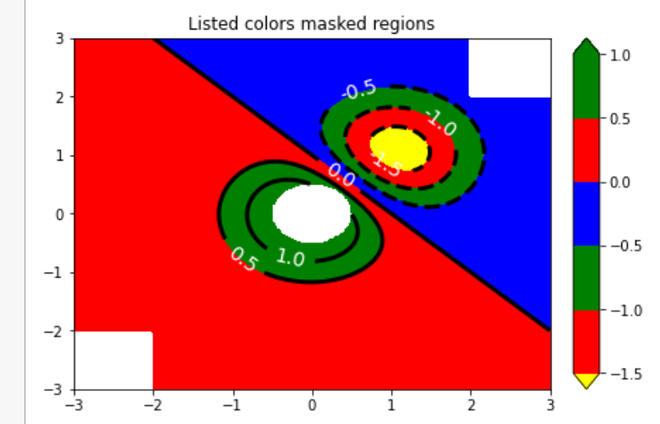
In this example, a contour plot is created with specific color levels and colors assigned to them. The X array is again used as the data source. The plot showcases six custom contour levels ranging from -1.5 to 1, with colors red, green, and blue assigned to different ranges. Additionally, contour labels are added to the plot, and the colormap is extended to show values below and above the specified levels in yellow and green, respectively.
Python3
figure2, axes2 = plt.subplots(constrained_layout=True)
levels = [-1.5, -1, -0.5, 0, 0.5, 1]
C3 = axes2.contourf(A, B, X, levels, colors=('r', 'g', 'b'), origin=start_point, extend='both')
C3.cmap.set_under('yellow')
C3.cmap.set_over('green')
C4 = axes2.contour(A, B, X, levels, colors=('k',), linewidths=(3,), origin=start_point)
axes2.set_title('Listed colors (3 masked regions)')
axes2.clabel(C4, fmt='% 2.1f', colors='w', fontsize=14)
figure2.colorbar(C3)
plt.show()
|
Output:
Contour Plot with Different ‘extend’ Settings
In this example, four separate contour plots are generated to illustrate different ‘extend’ settings of the colormap. The X array serves as the data for all plots. Each subplot represents a different ‘extend’ value: “neither,” “both,” “min,” and “max.” The color scale is adjusted to have green and red as the lower and upper boundary colors, respectively, providing a clear visual distinction for extended values.
Python3
extends = ["neither", "both", "min", "max"]
cmap = plt.cm.get_cmap("winter")
cmap.set_under("green")
cmap.set_over("red")
figure, axes = plt.subplots(2, 2, constrained_layout=True)
for ax, extend in zip(axes.ravel(), extends):
cs = ax.contourf(A, B, X, levels, cmap=cmap, extend=extend, origin=start_point)
figure.colorbar(cs, ax=ax, shrink=0.9)
ax.set_title("extend = % s" % extend)
ax.locator_params(nbins=4)
plt.show()
|
Output:

Share your thoughts in the comments
Please Login to comment...