How to Target Specific Screen Sizes or Devices with CSS ?
Last Updated :
12 Mar, 2024
In Responsive Web Design, it’s crucial to create websites that look great and function well on a variety of devices and screen sizes. CSS media queries are a powerful tool for achieving this. It allows you to apply different styles based on specific conditions such as screen size, resolution, or orientation. In this article, we will explore how to target specific screen sizes or devices with CSS.
Using Media Queries
Media queries are the cornerstone of responsive design, enabling you to create different layouts for different screen sizes.
Syntax
The basic syntax of a media query looks like this:
@media (condition) {
    /* CSS Styles */
}
Example: Targeting Screen Width
To apply styles for devices with a screen width of 768 pixels or less (e.g., tablets and mobile phones), you can use the following media query:
@media (max-width: 768px) {
    body {
        // CSS Styles
    }
}
Example: Targeting Screen Height
Similarly, you can target devices based on their screen height:
@media (max-height: 500px) {
    body {
        /* CSS Styles */
    }
}
Example: Combining Conditions
You can also combine multiple conditions using and to target devices that meet all specified criteria:
@media (max-width: 768px) and (orientation: portrait) {
    body {
        /* CSS Styles */
    }
}
Using Device Pixel Ratio
Device pixel ratio (DPR) is another factor you can target, especially for high-resolution displays like Retina screens. Here’s how you can apply styles for devices with a DPR of 2 or higher:
@media (-webkit-min-device-pixel-ratio: 2), (min-resolution: 192dpi) {
    /* High-resolution styles */
}
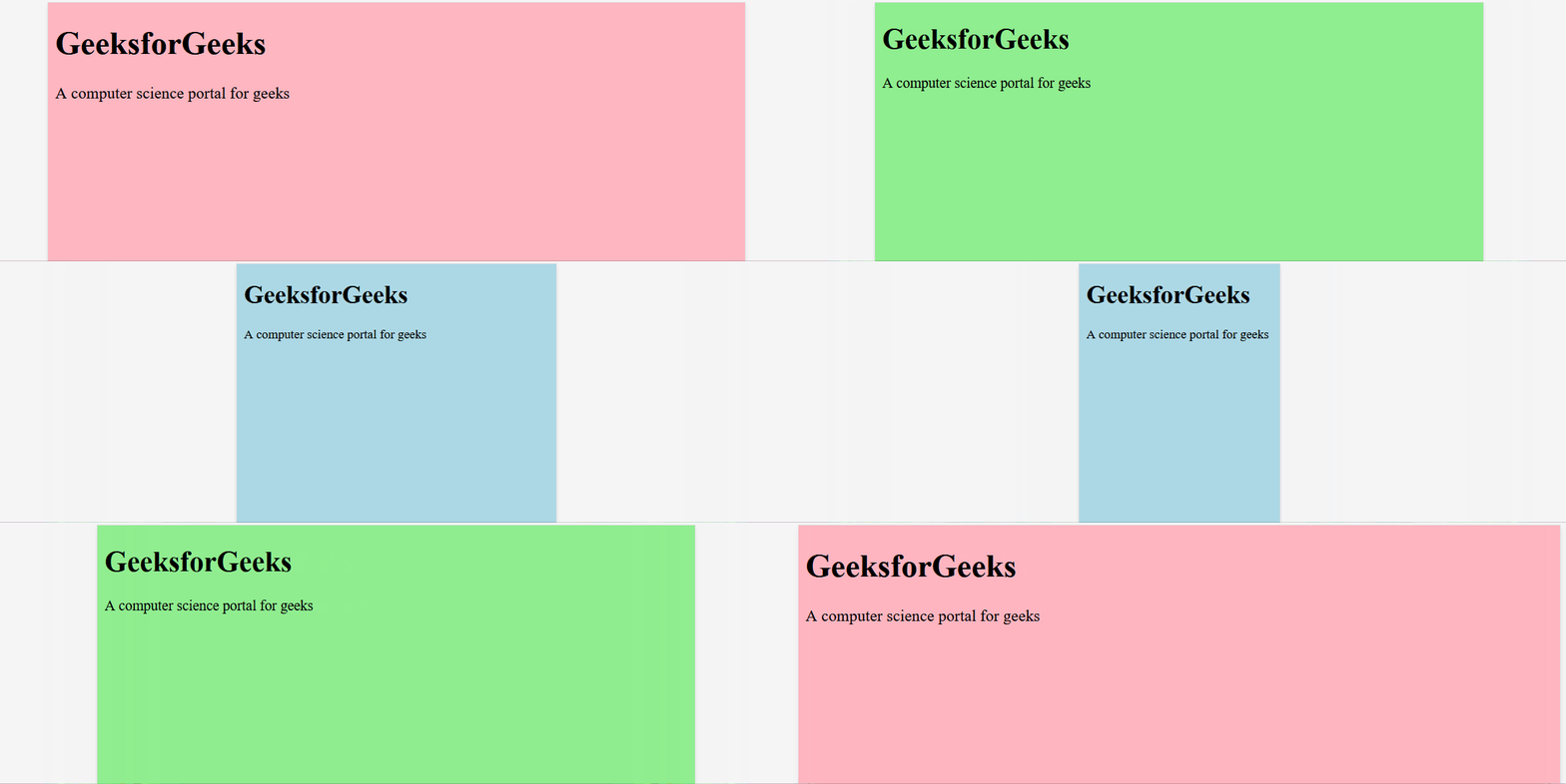
Example:
HTML<!DOCTYPE html>
<html lang="en">
<head>
<meta charset="UTF-8">
<meta name="viewport" content=
"width=device-width, initial-scale=1.0">
<title>Responsive Design Example</title>
<style>
body {
background-color: lightgray;
font-size: 16px;
}
/* Mobile styles */
@media (max-width: 480px) {
body {
background-color: lightblue;
font-size: 14px;
}
}
/* Tablet styles */
@media (min-width: 481px) and (max-width: 768px) {
body {
background-color: lightgreen;
font-size: 16px;
}
}
/* Desktop styles */
@media (min-width: 769px) {
body {
background-color: lightpink;
font-size: 18px;
}
}
/* High-resolution display styles */
@media (-webkit-min-device-pixel-ratio: 2),
(min-resolution: 192dpi) {
body {
background-color: lavender;
}
}
</style>
</head>
<body>
<h1>GeeksforGeeks</h1>
<p>
A computer science portal for geeks
</p>
</body>
</html>
Output

Share your thoughts in the comments
Please Login to comment...