How to style round buttons using CSS ?
Last Updated :
10 Jan, 2024
This article will explore how to style round buttons using CSS. Round buttons give a more visually pleasing design and attract user attention compared to default rectangular buttons. We can achieve the rounded button effect by applying CSS property. Rounded buttons are responsible for enhancing the overall user experience.
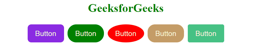
Preview

Approach
- Make a basic structure of the web page using <h1> and <button> elements. Link the external stylesheet to the HTML file.
- Create the five-button element and give them different colors. Set box shadow property when the user hover over it.
- For giving the round button effect to the buttons we use the border-radius property.
- The button element having a class named “mybtn1” sets the border-radius to 10px. similarly for “mybtn2”, “mybtn3”, “mybtn4”, and “mybtn5” set the border-radius property to 1.5rem, 50%, 20px, and 5px repectively.
Example: The example illustrates how to make round buttons using CSS.
HTML
<!DOCTYPE html>
<html lang="en">
<head>
<meta charset="UTF-8">
<meta name="viewport" content="width=device-width,
initial-scale=1.0">
<title>Buttons</title>
<link rel="stylesheet" href="style.css">
</head>
<body>
<h1>GeeksforGeeks</h1>
<div class="btnbox">
<button class="mybtn mybtn1">
Button
</button>
<button class="mybtn mybtn2">
Button
</button>
<button class="mybtn mybtn3">
Button
</button>
<button class="mybtn mybtn4">
Button
</button>
<button class="mybtn mybtn5">
Button
</button>
</div>
</body>
</html>
|
CSS
h1 {
text-align: center;
color: green;
}
.mybtn {
color: beige;
height: 50px;
font-size: 20px;
margin: 5px;
border: none;
width: 100px;
}
.btnbox {
display: flex;
justify-content: center;
}
.mybtn:hover {
background-color: rgb(184, 224, 219);
color: rgb(82, 82, 74);
box-shadow: rgba(32, 31, 31, 0.35) 0px 7px 10px;
font-weight: 900;
}
.mybtn3 {
border-radius: 50%;
background-color: red;
}
.mybtn1 {
border-radius: 10px;
background-color: blueviolet;
}
.mybtn2 {
border-radius: 1.5rem;
background-color: green;
}
.mybtn4 {
border-radius: 20px;
background-color: rgb(196, 156, 103);
}
.mybtn5 {
border-radius: 5px;
background-color: rgb(70, 194, 132);
}
|
Output:
Share your thoughts in the comments
Please Login to comment...