CSS Rounded Corners
Last Updated :
30 Nov, 2023
CSS Rounded Corner facilitates the border-radius Property to create corners round for the element. The border-radius Property in CSS is used to define the radius and make corners round from the outer border edge of a specific element. This article will cover all the related aspects of the border-radius Property & understand them with the help of suitable examples.
CSS border-radius Property
CSS border-radius is a shorthand property used to give values from one to four to make corners round to an element, which is described below:
- border-radius with one value: Only one value is used for every corner equally.
- border-radius with two values: The first value is used for the top-left corner and the bottom-right corner, and the second value is used for the top-right corner and the bottom-left corner
- border-radius with three values: The first value is used for the top-left corner, The second value is for top-right corner and bottom-left corner, and the third value is for bottom-right corner.
- border-radius with four values: The first value is applied to the top-left corner, The second value is applied to the top-right corner, the third value is used to the bottom-right corner, and the fourth value is used to the bottom-left corner.
We will explore all those values of border-radius Property & understand them with the help of examples.
border-radius with One Value
border-radius with one value is a CSS property that applies the same rounded corner radius to all four corners of an element, simplifying the syntax by specifying a single value for curvature.
Example: In this example, we are giving One value to the border-radius property will be applied to every corner equally.
HTML
<!DOCTYPE html>
<html lang="en">
<head>
<meta charset="UTF-8">
<meta name="viewport"
content="width=device-width,
initial-scale=1.0">
<link rel="stylesheet"
href="styles.css">
<title>CSS border radius</title>
</head>
<body>
<div class="container flex-utility">
<div class="gfg-heading">GeeksforGeeks</div>
<p class="text">
One value for all corners makes equally rounded
</p>
<div class="flex-utility box-items">
<div class="box box1 one-px-unit flex-utility">
Using px unit
</div>
<div class="box box2 one-p-unit flex-utility">
Using % unit
</div>
<div class="box box3 one-em-unit flex-utility">
Using em unit
</div>
<div class="box box4 one-rem-unit flex-utility">
Using rem unit
</div>
</div>
</div>
</body>
</html>
|
CSS
@import url(
.flex-utility {
display: flex;
align-items: center;
justify-content: center;
}
.container {
height: 100vh;
flex-direction: column;
gap: 30px;
font-family: 'Poppins', sans-serif;
}
.box {
height: 100px;
width: 200px;
font-size: 20px;
}
.box-items {
gap: 40px;
flex-wrap: wrap;
}
.gfg-heading {
color: rgb(17, 85, 17);
font-size: 50px;
}
.one-px-unit {
border-radius: 15px;
background-color: rgb(60, 145, 79);
color: beige;
border: 2px solid black;
}
.one-em-unit {
border-radius: 2em;
background-color: rgb(60, 145, 79);
border: 2px solid black;
color: beige;
}
.one-rem-unit {
border-radius: 3rem;
border: 10px;
background-color: rgb(60, 145, 79);
border: 2px solid black;
color: beige;
}
.one-p-unit {
border-radius: 25%;
background-color: rgb(60, 145, 79);
border: 2px solid black;
color: beige;
}
.text {
font-size: 25px;
}
|
Output:
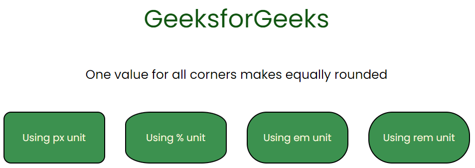
border-radius with one value
border-radius with Two Values
border-radius with two values is a CSS property allowing customization for the top-left and top-right, or bottom-left and bottom-right corners of an element independently.
Example: In this example, we are giving two values to the border-radius property. The first value is for the top-left corner and bottom-right corner whereas the second value is for the top-right corner and bottom-left corner.
HTML
<!DOCTYPE html>
<html lang="en">
<head>
<meta charset="UTF-8">
<meta name="viewport"
content="width=device-width,
initial-scale=1.0">
<link rel="stylesheet"
href="index2.css">
<title>CSS border radius</title>
</head>
<body>
<div class="container flex-utility">
<div class="gfg-heading">GeeksforGeeks</div>
<div>
<p class="text">
First value (top-left and bottom-right corners)
</p>
<p class="text">
Second value (top-right and bottom-left corners)
</p>
</div>
<div class="flex-utility box-items">
<div class="box box1 two-px-unit flex-utility">
Using px unit
</div>
<div class="box box2 two-p-unit flex-utility">
Using % unit
</div>
<div class="box box3 two-em-unit flex-utility">
Using em unit
</div>
<div class="box box4 two-rem-unit flex-utility">
Using rem unit
</div>
</div>
</div>
</body>
</html>
|
CSS
@import
.flex-utility {
display: flex;
align-items: center;
justify-content: center;
}
.container {
height: 100vh;
flex-direction: column;
gap: 20px;
font-family: 'Poppins', sans-serif;
}
.box {
height: 100px;
width: 200px;
font-size: 20px;
}
.box-items {
gap: 40px;
flex-wrap: wrap;
}
.gfg-heading {
color: rgb(17, 85, 17);
font-size: 50px;
}
.two-px-unit {
border-radius: 15px 50px;
background-color: rgb(60, 145, 79);
color: beige;
border: 2px solid black;
}
.two-em-unit {
border-radius: 2em 8em;
background-color: rgb(60, 145, 79);
border: 2px solid black;
color: beige;
}
.two-rem-unit {
border-radius: 3rem 5rem;
border: 10px;
background-color: rgb(60, 145, 79);
border: 2px solid black;
color: beige;
}
.two-p-unit {
border-radius: 25% 55%;
background-color: rgb(60, 145, 79);
border: 2px solid black;
color: beige;
}
.text {
font-size: 25px;
}
|
Output:
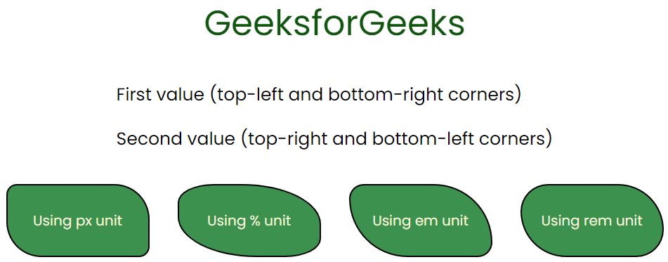
border-radius with two values
border-radius with Three Values
border-radius with three values in CSS allows customization of the curvature of the top-left, top-right, and bottom-left corners of an element while keeping the bottom-right corner square.
Example: In this example, we are giving three values to the border-radius property. The first value is for the top-left corner, The second value is for the top-right corner and bottom-left corner, and the third value is for the bottom-right corner.
HTML
<!DOCTYPE html>
<html lang="en">
<head>
<meta charset="UTF-8">
<meta name="viewport"
content="width=device-width,
initial-scale=1.0">
<link rel="stylesheet"
href="index2.css">
<title>CSS border radius</title>
</head>
<body>
<div class="container flex-utility">
<div class="gfg-heading">
GeeksforGeeks
</div>
<p class="text">
First value (top-left corner)
</p>
<p class="text">
Second value (top-right and bottom-left corners)
</p>
<p class="text">
Third value ( bottom-right corners)
</p>
<div class="flex-utility box-items">
<div class="box box1 three-px-unit flex-utility">
Using px unit
</div>
<div class="box box2 three-p-unit flex-utility">
Using % unit
</div>
<div class="box box3 three-em-unit flex-utility">
Using em unit
</div>
<div class="box box4 three-rem-unit flex-utility">
Using rem unit
</div>
</div>
</div>
</body>
</html>
|
CSS
.flex-utility {
display: flex;
align-items: center;
justify-content: center;
}
.container {
height: 100vh;
flex-direction: column;
gap: 50px;
font-family: 'Poppins', sans-serif;
}
.box {
height: 100px;
width: 200px;
font-size: 20px;
}
.box-items {
gap: 50px;
flex-wrap: wrap;
}
.gfg-heading {
color: rgb(17, 85, 17);
font-size: 50px;
}
.three-px-unit {
border-radius: 15px 10px 5px;
background-color: rgb(60, 145, 79);
color: beige;
border: 2px solid black;
}
.three-em-unit {
border-radius: 2em 4em 8em;
background-color: rgb(60, 145, 79);
border: 2px solid black;
color: beige;
}
.three-rem-unit {
border-radius: 3rem 6rem 9rem;
border: 10px;
background-color: rgb(60, 145, 79);
border: 2px solid black;
color: beige;
}
.three-p-unit {
border-radius: 25% 50% 38%;
background-color: rgb(60, 145, 79);
border: 2px solid black;
color: beige;
}
.text {
font-size: 25px;
}
|
Output:
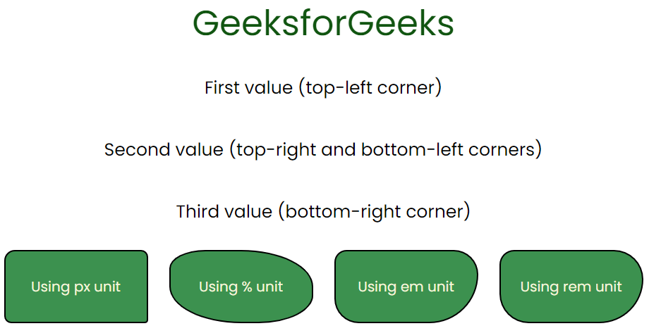
border-radius with three values
border-radius Four Values
border-radius with four values defines the radii for the top-left, top-right, bottom-right, and bottom-left corners individually.
Example: In this example, we are giving four values to the border-radius property. The first value is for the top-left corner, the second value is for the top-right corner, the third value is for the bottom-right corner, and the fourth value is for the bottom-left corner.
HTML
<!DOCTYPE html>
<html lang="en">
<head>
<meta charset="UTF-8">
<meta name="viewport"
content="width=device-width,
initial-scale=1.0">
<link rel="stylesheet"
href="val4.css">
<title>CSS border radius</title>
</head>
<body>
<div class="container flex-utility">
<div class="gfg-heading">
GeeksforGeeks
</div>
<div class="flex-utility valuediv">
<p class="text">
First value (top-left corner)
and Second value (top-right corner)
</p>
<p class="text">
Third value (bottom-left corner)
and Fourth value (bottom-right corner)
</p>
</div>
<div class="flex-utility box-items">
<div class="box box1 four-px-unit flex-utility">
Using px unit
</div>
<div class="box box2 four-p-unit flex-utility">
Using % unit
</div>
<div class="box box3 four-em-unit flex-utility">
Using em unit
</div>
<div class="box box4 four-rem-unit flex-utility">
Using rem unit
</div>
</div>
</div>
</body>
</html>
|
CSS
@import url(
.flex-utility {
display: flex;
align-items: center;
justify-content: center;
}
.container {
height: 100vh;
flex-direction: column;
gap: 10px;
font-family: 'Poppins', sans-serif;
}
.box {
height: 100px;
width: 200px;
font-size: 20px;
}
.box-items {
gap: 40px;
flex-wrap: wrap;
}
.gfg-heading {
color: rgb(17, 85, 17);
font-size: 50px;
}
.four-px-unit {
border-radius: 15px 5px 10px 0;
background-color: rgb(60, 145, 79);
color: beige;
border: 2px solid black;
}
.four-em-unit {
border-radius: 2em 4em 6em 8em;
background-color: rgb(60, 145, 79);
border: 2px solid black;
color: beige;
}
.four-rem-unit {
border-radius: 3rem 6rem 9rem 12rem;
border: 10px;
background-color: rgb(60, 145, 79);
border: 2px solid black;
color: beige;
}
.four-p-unit {
border-radius: 25% 50% 75% 0;
background-color: rgb(60, 145, 79);
border: 2px solid black;
color: beige;
}
.text {
font-size: 25px;
}
.valuediv {
flex-direction: column;
}
|
Output:
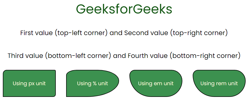
border-radius four values
Other CSS border Property
There are few other shorthand property for the border Properties, which can be used as a combination of these four properties i.e., border-top-left-radius, border-top-right-radius, border-bottom-right-radius, and border-bottom-left-radius, which are described below:
- border-top-left-radius: It rounds the top left corner of the element.
- border-top-right-radius: It rounds the top right of the element.
- border-bottom-right-radius: It rounds the bottom right corner of the element.
- border-bottom-left-radius: It rounds the bottom left corner of the element.
We will understand each of them with the help of suitable examples.
border-top-left-radius
border-top-left-radius is a CSS property used to define the curvature of the top-left corner of an element’s border. It creates a visually rounded effect, enhancing the visual appearance.
Example: The below example shows border-top-left-radius on the element.
HTML
<!DOCTYPE html>
<html lang="en">
<head>
<meta charset="UTF-8">
<meta name="viewport"
content="width=device-width,
initial-scale=1.0">
<style>
#dive {
height: 30px;
width: 500px;
font-size: 20px;
background-color: aquamarine;
text-align: center;
padding: 5px;
border: 3px solid blue;
}
</style>
</head>
<body>
<div id="dive"
style="border-top-left-radius: 55px;">
This is the example of border-top-left-radius
</div>
</body>
</html>
|
Output:
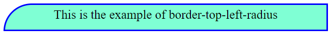
border-top-left radius
border-top-right-radius
border-top-right-radius is a CSS property used to define the curvature of the top-right corner of an element’s border. It creates a visually rounded effect, enhancing the visual appearance.
Example: The below example shows the border-top-right-radius on the element.
HTML
<!DOCTYPE html>
<html lang="en">
<head>
<meta charset="UTF-8">
<meta name="viewport"
content="width=device-width,
initial-scale=1.0">
<style>
#dive {
height: 30px;
width: 500px;
font-size: 20px;
background-color: aquamarine;
text-align: center;
padding: 5px;
border: 3px solid blue;
}
</style>
</head>
<body>
<div id="dive" style="border-top-right-radius: 55px;">
This is the example of border-top-right-radius
</div>
</body>
</html>
|
Output:
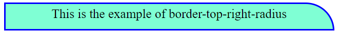
border-top-right-radius
border-bottom-right-radius
border-bottom-right-radius is a CSS property used to define the curvature of the bottom-right corner of an element’s border. It creates a visually rounded effect, enhancing the visual appearance.
Example: The below example shows border-bottom-right-radius on the element.
HTML
<!DOCTYPE html>
<html lang="en">
<head>
<meta charset="UTF-8">
<meta name="viewport"
content="width=device-width,
initial-scale=1.0">
<style>
#dive {
height: 30px;
width: 500px;
font-size: 20px;
background-color: aquamarine;
text-align: center;
padding: 5px;
border: 3px solid blue;
}
</style>
</head>
<body>
<div id="dive"
style="border-bottom-right-radius: 55px;">
This is the example of border-bottom-right-radius
</div>
</body>
</html>
|
Output:
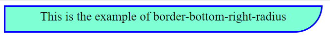
border-bottom-right-radius
border-bottom-left- radius
border-bottom-left-radius is a CSS property used to define the curvature of the bottom-left corner of an element’s border. It creates a visually rounded effect, enhancing the visual appearance.
Example: The below example shows border-bottom-left-radius on the element.
HTML
<!DOCTYPE html>
<html lang="en">
<head>
<meta charset="UTF-8">
<meta name="viewport"
content="width=device-width,
initial-scale=1.0">
<style>
#dive {
height: 30px;
width: 500px;
font-size: 20px;
background-color: aquamarine;
text-align: center;
padding: 5px;
border: 3px solid blue;
}
</style>
</head>
<body>
<div id="dive"
style="border-bottom-left-radius: 55px;">
This is the example of border-bottom-left-radius
</div>
</body>
</html>
|
Output:
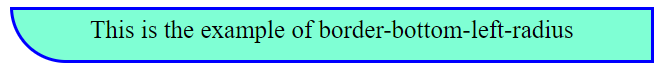
border-bottom-left-radius
Share your thoughts in the comments
Please Login to comment...