How to Customize Button Styles in Bootstrap ?
Last Updated :
18 Mar, 2024
Customizing button styles in Bootstrap may be required to ensure that buttons align with your brand’s visual identity, differentiate your design from standard Bootstrap styles, maintain a consistent design across your project.
We can customize button styles in Bootstrap using different approaches as listed below:
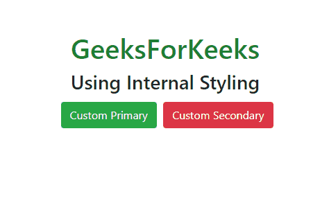
Using internal styling
Customizing button styles using internal styling involves defining CSS styles within the <style> tag in the <head> section of your HTML file. This allows you to override the default Bootstrap button styles and create your own custom look for buttons.
Example: Below is the example of customizing button styles using internal styling in HTML.
HTML
<!DOCTYPE html>
<html lang="en">

<head>
    <link rel="stylesheet"
          href=
"https://stackpath.bootstrapcdn.com/bootstrap/4.2.1/css/bootstrap.min.css"
        integrity=
"sha384-GJzZqFGwb1QTTN6wy59ffF1BuGJpLSa9DkKMp0DgiMDm4iYMj70gZWKYbI706tWS"
          crossorigin="anonymous">
    <title>Customize Bootstrap Buttons</title>
    <style>
        .container {
            margin-top: 10%;
            text-align: center;
        }
        .heading {
            color: #1e7e34;
        }
        .custom-primary {
            background-color: #28a745;
            border-color: #28a745;
            margin: 5px;
        }
        .custom-primary:hover {
            background-color: #218838;
            border-color: #1e7e34;
        }
        .custom-secondary {
            background-color: #dc3545;
            border-color: #dc3545;
        }
        .custom-secondary:hover {
            background-color: #c82333;
            border-color: #bd2130;
        }
    </style>
</head>

<body>
    <div class="container">
        <h1 class="heading">GeeksForKeeks</h1>
        <h3>Using Internal Styling</h3>
        <div class="one">
            <button type="button"
                    class="btn btn-primary custom-primary">
                Custom Primary</button>
            <button type="button"
                    class="btn btn-secondary custom-secondary">
                Custom Secondary</button>
        </div>
    </div>
    <script src="https://code.jquery.com/jquery-3.3.1.slim.min.js"
        integrity=
"sha384-q8i/X+965DzO0rT7abK41JStQIAqVgRVzpbzo5smXKp4YfRvH+8abtTE1Pi6jizo"
        crossorigin="anonymous">
      </script>
    <script src=
"https://cdnjs.cloudflare.com/ajax/libs/popper.js/1.14.6/umd/popper.min.js"
        integrity=
"sha384-wHAiFfRlMFy6i5SRaxvfOCifBUQy1xHdJ/yoi7FRNXMRBu5WHdZYu1hA6ZOblgut"
        crossorigin="anonymous">
      </script>
    <script src=
"https://stackpath.bootstrapcdn.com/bootstrap/4.2.1/js/bootstrap.min.js"
        integrity=
"sha384-B0UglyR+jN6CkvvICOB2joaf5I4l3gm9GU6Hc1og6Ls7i6U/mkkaduKaBhlAXv9k"
        crossorigin="anonymous">
      </script>
</body>

</html>
Output:
Using Bootstrap Utility classes
In this approach, we will use Bootstrap utility classes to customize button styles. These classes are a set of predefined CSS classes provided by the Bootstrap framework. These classes allow us to quickly apply styles to elements without having to write custom CSS.
Example: This example shows the use of utility classes to customize the buttons style.
HTML
<!DOCTYPE html>
<html lang="en">

<head>
    <title>
          Customize Button Styles with Bootstrap Utility Classes
      </title>
    <!-- Link Bootstrap CSS -->
    <link rel="stylesheet"
          href=
"https://stackpath.bootstrapcdn.com/bootstrap/4.2.1/css/bootstrap.min.css"
          integrity=
"sha384-GJzZqFGwb1QTTN6wy59ffF1BuGJpLSa9DkKMp0DgiMDm4iYMj70gZWKYbI706tWS"
          crossorigin="anonymous">
</head>

<body>
    <div style="text-align: center; " class="container">
        <h1 style="color: green;">GeeksForGeeks</h1>
        <h2>Using Utility Classes</h2>
        <button class="btn btn-primary btn-lg">
              Large Primary Button
          </button>
        <button class="btn btn-primary btn-sm">
              Small Primary Button
          </button>
        <button class="btn btn-secondary btn-lg">
              Large Secondary Button
          </button>
        <button class="btn btn-secondary btn-sm">
              Small Secondary Button
          </button>
        <button class="btn btn-success">
              Success Button
          </button>
        <button class="btn btn-danger">
              Danger Button
          </button>
        <button class="btn btn-warning">
              Warning Button
          </button>
    </div>

    <!-- Link Bootstrap JavaScript (optional) -->
    <script
        src="https://code.jquery.com/jquery-3.3.1.slim.min.js"
        integrity=
"sha384-q8i/X+965DzO0rT7abK41JStQIAqVgRVzpbzo5smXKp4YfRvH+8abtTE1Pi6jizo"
        crossorigin="anonymous">
      </script>
    <script
        src=
"https://cdnjs.cloudflare.com/ajax/libs/popper.js/1.14.6/umd/popper.min.js"
        integrity=
"sha384-wHAiFfRlMFy6i5SRaxvfOCifBUQy1xHdJ/yoi7FRNXMRBu5WHdZYu1hA6ZOblgut"
        crossorigin="anonymous">
      </script>
    <script
        src=
"https://stackpath.bootstrapcdn.com/bootstrap/4.2.1/js/bootstrap.min.js"
        integrity=
"sha384-B0UglyR+jN6CkvvICOB2joaf5I4l3gm9GU6Hc1og6Ls7i6U/mkkaduKaBhlAXv9k"
        crossorigin="anonymous">
      </script>
</body>

</html>
Output:

Share your thoughts in the comments
Please Login to comment...