How to generate thumbnails and customize using bootstrap ?
Last Updated :
09 Sep, 2021
Bootstrap helps web developers to create thumbnails that are used to show linked images in grids with the pre-defined classes which help to reduce codes length. Thumbnails are created to provide a quick preview of images with small images.
Thumbnail Image: A thumbnail is a small image that represents a larger image. Bootstrap has an easy way to do this with thumbnails. Bootstrap’s .thumbnail class is used to show linked images in grids (grid system), a thumbnail is created using class .thumbnail within the element <a>. The class .col-sm-* and .col-md-* (where * represent number ), it is used to create grids of the images.
Step by step guide for the implementation:
Step 1: Include Bootstrap and jQuery CDN into the <head> tag before all other stylesheets to load our CSS.
<link rel=”stylesheet” href=”http://maxcdn.bootstrapcdn.com/bootstrap/3.3.6/css/bootstrap.min.css”>
<script src=”https://ajax.googleapis.com/ajax/libs/jquery/1.12.0/jquery.min.js”></script>
<script src=”http://maxcdn.bootstrapcdn.com/bootstrap/3.3.6/js/bootstrap.min.js”></script>
Step 2: Add <div> tag in the HTML body with class row. In that <div> create four div sections to create four images.
Step 3: Add “col-sm-6” and “col-md-3” to four div sections which creates webpage responsive.
Step 4: Add <a> tag with class value thumbnail to define the link of the image in the next line.
<a href="#" class="thumbnail">
Example 1: The following example shows the creation of thumbnails images.
HTML
<!DOCTYPE html>
<html lang="en">
<head>
<title>Thumbnail images</title>
<link
rel="stylesheet"
href=
<script src=
</script>
<script src=
</script>
</head>
<body>
<h3 style="color: green">Bootstrap thumbnails</h3>
<div class="row">
<div class="col-sm-6 col-md-3">
<a href="#" class="thumbnail">
<img
src=
style="height: 100px; width: 100px"
/>
</a>
</div>
<div class="col-sm-6 col-md-3">
<a href="#" class="thumbnail">
<img
src=
style="height: 100px; width: 100px"
/>
</a>
</div>
<div class="col-sm-6 col-md-3">
<a href="#" class="thumbnail">
<img
src=
style="height: 100px; width: 100px"
/>
</a>
</div>
<div class="col-sm-6 col-md-3">
<a href="#" class="thumbnail">
<img
src=
style="height: 100px; width: 100px"
/>
</a>
</div>
</div>
</body>
</html>
|
Output: As in the below output image we can see thumbnail images. These are also responsive to different screen sizes.
responsive thumbnails
Adding captions and buttons to the thumbnails :
Step 1: We created div with class value as thumbnail and inserted image, after that add div with class .caption to define the description of the images <p>.
Step 2: Create buttons using <a> tag with class . btn .btn-success.
Example: The following example demonstrates adding of caption and button to the thumbnails.
HTML
<!DOCTYPE html>
<html lang="en">
<head>
<link
rel="stylesheet"
href=
<script src=
</script>
<script src=
</script>
</head>
<body>
<h3 style="color: green">
<b>Bootstrap Thumbnails with Captions and Button</b>
</h3>
<div class="row">
<div class="col-sm-6 col-md-3">
<a href="#" class="thumbnail">
<img
src=
style="height: 100px; width: 100px"
/>
</a>
<div class="caption">
<h3 style="color: green">GfG Web-Development</h3>
<p>
Web development refers to the building,
creating, maintaining of
websites.
</p>
<p>
<a href="#" class="btn btn-success">
Learn More
</a>
</p>
</div>
</div>
<div class="col-sm-6 col-md-3">
<a href="#" class="thumbnail">
<img
src=
style="height: 100px; width: 100px"
/>
</a>
<div class="caption">
<h3 style="color: green">GfG Machine Learning</h3>
<p>
Machine Learning is the study to
learn without being explicitly
programmed.
</p>
<p>
<a href="#" class="btn btn-success">
Learn More
</a>
</p>
</div>
</div>
<div class="col-sm-6 col-md-3">
<a href="#" class="thumbnail">
<img
src=
style="height: 100px; width: 100px"
/>
</a>
<div class="caption">
<h3 style="color: green">GfG Programming</h3>
<p>
Competitive Programming enables you
to code a given problem under
provided constraints.
</p>
<p>
<a href="#" class="btn btn-success">
Learn More
</a>
</p>
</div>
</div>
<div class="col-sm-6 col-md-3">
<a href="#" class="thumbnail">
<img
src=
style="height: 100px; width: 100px"
/>
</a>
<div class="caption">
<h3 style="color: green">GfG Java</h3>
<p>
Java is one of the most popular
and widely used programming
language.
</p>
<p>
<a href="#" class="btn btn-success">
Learn More
</a>
</p>
</div>
</div>
</div>
</body>
</html>
|
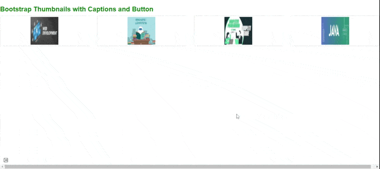
Output: As in the below output image, we can see that images with captions and buttons. These are also responsive to different screen sizes.

Supported Browser:
- Google Chrome
- Firefox
- Internet Explorer
- Safari
- Opera
Like Article
Suggest improvement
Share your thoughts in the comments
Please Login to comment...