Bulma Button Styles
Last Updated :
15 Feb, 2022
Bulma Button style class is used to set the style of the button. There are four pre-defined button styles in Bulma: Outlined, Inverted, Outlined Inverted, and Rounded. You can set the button style with the help of three CSS classes provided by Bulma.
Bulma Button Styles Classes:
- is-outlined: This class is used to set the button style to outlined.
- is-inverted: This class swaps the text color with the background color.
- is-rounded: This class is used to make the corners of the button rounded.
Syntax:
<button class="button is-outlined">
   Button
</button>
Note: The is-outlined and is-inverted classes can be used together to make Outlined Inverted Buttons.
Example: The example below shows the use of Bulma button-style classes.
HTML
<!DOCTYPE html>
<html>
<head>
<title>Bulma Button Styles</title>
<link rel='stylesheet'
href=
</head>
<body class="has-text-centered">
<h1 class="is-size-2 has-text-success">
GeeksforGeeks
</h1>
<b>Bulma Button Styles</b>
<br><br>
<div class="container">
<div class="buttons is-centered">
<strong>Outlined:
<button class="button is-primary is-outlined">
Button 1
</button>
</strong>
<strong>Inverted:
<button class="button is-info is-inverted">
Button 2
</button>
</strong>
<strong>Rounded:
<button class="button is-danger is-rounded">
Button 3
</button>
</strong>
</div>
</div>
</body>
</html>
|
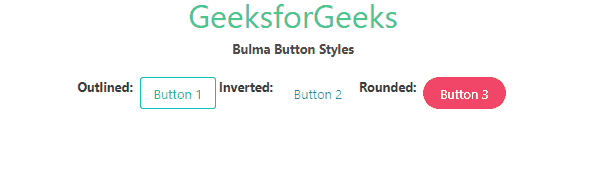
Output:
Reference: https://bulma.io/documentation/elements/button/#styles
Like Article
Suggest improvement
Share your thoughts in the comments
Please Login to comment...