How to Create Smaller `Input` in React-Bootstrap ?
Last Updated :
30 Oct, 2023
ReactJS is one of the most favorite libraries for building attractive applications. Combining Bootstrap with ReactJS is a powerful tool for making the application more interactive. A Smaller Input in React-Bootstrap refers to reducing the size of an input field component, typically achieved by applying custom styles, using Bootstrap’s predefined classes, or React-Bootstrap’s size prop, resulting in a more compact and visually smaller input element.
Prerequisites:
Steps to Create React Application and Installing Bootstrap:
Step 1: Create a React application using the following command.
npx create-react-app input
Step 2: After creating your project folder(i.e. project), move to it by using the following command.
cd input
Step 3: Now install react-bootstrap in your working directory i.e. input by executing the below command in the VScode terminal.
npm install react-bootstrap bootstrap
Step 4: Now we need to Add Bootstrap CSS to the index.js file.
import 'bootstrap/dist/css/bootstrap.min.css';
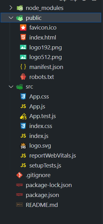
Project Structure:
It will look like the following.
Example 1: In this example, we are using the inbuilt small input class that is provided by react-bootstrap. We are not applying any external styling to the input field. Also, we have taken a default input field. From the output, you can see that the size of the small input field and default input field varies. We have used the react-bootstrap class (form-control-sm) that is designed to reduce the size of the form control elements.
Javascript
import React, { useState } from 'react';
import { Button } from 'react-bootstrap';
const App = () => {
const [smInput, setsmInput] = useState('');
const [dInput, setdInput] = useState('');
const [smGreet, setsmGreet] = useState('');
const [dGreet, setdGreet] = useState('');
const smInputChnage = (e) => {
setsmInput(e.target.value);
};
const defaultInput = (e) => {
setdInput(e.target.value);
};
const smGreetHandle = () => {
setsmGreet(`Hello, ${smInput}! (Small Input)`);
};
const dGreetHandle = () => {
setdGreet(`Hello, ${dInput}! (Default Input)`);
};
return (
<div className="text-center">
<h1 style={{ color: 'green' }}>
GeeksforGeeks
</h1>
<div className="my-3">
<input
className="form-control form-control-sm"
size="sm"
type="text"
placeholder="Small input"
value={smInput}
onChange={smInputChnage}/>
<Button variant="primary"
onClick={smGreetHandle}>
Greet (Small Input)
</Button>
{smGreet && <p>{smGreet}</p>}
</div>
<div className="my-3">
<input
className="form-control"
type="text"
placeholder="Default input"
value={dInput}
onChange={defaultInput}
/>
<Button variant="primary"
onClick={dGreetHandle}>
Greet (Default Input)
</Button>
{dGreet && <p>{dGreet}</p>}
</div>
</div>
);
};
export default App;
|
Step to Run Application: Run the application using the following command from the root directory of the project:
npm start
Output: Now open your browser and go to http://localhost:3000/, you will see the following output:

Example 2: In this example, we have used the “input-group-sm” class in which there ae different types of feilds. In this we have specified the input feild with the smaller input and there is one more input feild with the big input size. We can see the sixe of each of the input feild. The smaller input feild as the width smaller then the big sized input feild.
Javascript
import React, { useState } from 'react';
import { Container,
Row, Col,
Form,
InputGroup } from 'react-bootstrap';
const App = () => {
const [sInput, setsInput] = useState('');
const [bInput, setbInput] = useState('');
const smallInput = (e) => {
setsInput(e.target.value);
};
const bigInput = (e) => {
setbInput(e.target.value);
};
return (
<Container>
<Row>
<Col>
<h1 style={{ color: '#0B8457' }}>
GeeksforGeeks
</h1>
</Col>
</Row>
<Row>
<Col md={6}>
<Form.Group>
<Form.Label>
Enter Text Small Input:
</Form.Label>
<InputGroup className="input-group-sm">
<Form.Control
type="text"
placeholder="Small input"
className="form-control-sm"
value={sInput}
onChange={smallInput}
/>
</InputGroup>
</Form.Group>
<p>Entered Text: {sInput}</p>
</Col>
<Col md={6}>
<Form.Group>
<Form.Label>
Enter Text Big Input:
</Form.Label>
<InputGroup className="input-group-lg">
<Form.Control
type="text"
placeholder="Big input"
className="form-control-lg"
value={bInput}
onChange={bigInput}
/>
</InputGroup>
</Form.Group>
<p>
Entered Text:
{bInput}
</p>
</Col>
</Row>
</Container>
);
};
export default App;
|
Step to Run Application: Run the application using the following command from the root directory of the project:
npm start
Output: Now open your browser and go to http://localhost:3000/, you will see the following output:

Share your thoughts in the comments
Please Login to comment...