How to decrease input height with floating labels in React-Bootstrap?
Last Updated :
23 Nov, 2023
React-Bootstrap is a front-end framework that was designed keeping React in mind. Let’s learn a little bit about floating labels. Floating labels are the form labels that float over the input fields. For creating floating labels, we wrap <Form.Control> element inside <FloatingLabel>.
In this article, we are going to see different ways through which we can decrease the input height of form elements with floating labels in React-Bootstrap. Below are some approaches to do it.
Steps to create React Application and Installing Module:
Step 1: Create a React application using the following command:
npx create-react-app foldername
Step 2: After creating your project folder i.e. foldername, move to it using the following command:
cd foldername
Step 3: After creating the ReactJS application, Install the required module using the following command:
npm install react-bootstrap
npm install bootstrap
Project Structure:
.png)
Approach 1: Using “size” prop
In this approach, we will use the “size” prop of the <Form. Control>. We can pass two different values:
- “sm”: When the size prop has sm as a value, it decreases the size of the input fields.
- “lg”: When the size prop has lg as a value, it increases the size of the input fields.
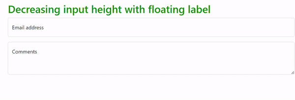
Example: In this example, we will decrease input height using a size prop. We have used size prop in the email field only to see the difference between the input height of textarea and input.
Javascript
import FloatingLabel from "react-bootstrap/FloatingLabel";
import { Container, Form } from "react-bootstrap";
function App() {
return (
<>
<Container className=" m-3">
<h2 style={{ color: "green" }}>
Decreasing input height with floating label
</h2>
<FloatingLabel controlId="floatingInput"
label="Email address">
<Form.Control
type="email"
placeholder="name@example.com"
className="mb-3"
size="sm"
/>
</FloatingLabel>
<FloatingLabel controlId="floatingTextarea2" label="Comments">
<Form.Control
as="textarea"
placeholder="Leave a comment here"
style={{ height: "100px" }}
/>
</FloatingLabel>
</Container>
</>
);
}
export default App;
|
Output:
Approach 2: Using custom CSS
In this approach, we will decrease input height by using traditional CSS classes. Below is the examples for the same.
Example: In this example, we have given className namely “smaller-input” to textarea. Add this code to App.js and index.css file respectively.
Javascript
import FloatingLabel from 'react-bootstrap/FloatingLabel';
import { Container, Form } from "react-bootstrap";
import './index.css';
function App() {
return (
<>
<Container className=" m-3">
<h2 style={{color:"green"}}>Decreasing input height with floating label</h2>
<FloatingLabel
controlId="floatingInput"
label="Email address"
>
<Form.Control type="email" placeholder="name@example.com" className=' mb-3' />
</FloatingLabel>
<FloatingLabel controlId="floatingTextarea2" label="Comments" >
<Form.Control as="textarea"
placeholder="Leave a comment here"
className='smaller-input '
style={{ height: '100px' }}
/>
</FloatingLabel>
</Container>
</>
);
}
export default App;
|
CSS
.smaller-input {
font-size: 12px;
padding: 2px 5px;
}
|
Output:
.gif)
Share your thoughts in the comments
Please Login to comment...