How to Create Responsive Sidebar using HTML & CSS ?
Last Updated :
19 Mar, 2024
We will create a responsive sidebar which is created using HTML and CSS. The responsive sidebar will be interactive for small devices also.

Preview
Approach
- Create HTML and CSS files.
- After getting the boiler plate code title has been changed as Responsive sidebar.
- CSS File has been linked to HTML using link tag within head tag.
- Create a div with the class name sidebar and added anchor tags inside div element.
- Inside the anchor tag added href attribute and provided the value.
- Added text like Home, About, Players, Teams. when we click on these texts we can navigate to other page, if and only if we add the page links to href attribute.
- Created another class named content where inside it i have added some lines of contents.
- To remove all the default padding and margin provided by the browser, I have set styles for body tag, properties padding and margin to 0.
- Added the styles to all the elements and inorder to make responsive sidebar i have used media queries.
- lastly, @media screens and(max-width:400px), this will set the different values for properties of the HTML elements in different screens.
Example: The example shows the implementation of the above-explained approach.
HTML
<!DOCTYPE html>
<html lang="en">

<head>
    <meta charset="UTF-8">
    <meta name="viewport" content="width=device-width,
                                   initial-scale=1.0">
    <!--link the css file using link tag-->
    <link rel="stylesheet"
          href="style.css">
</head>

<body>
    <div class="container">
        <!--container class will contain the links-->
        <a href="#" class="active">Home</a>
        <a href="#">Tutorials</a>
        <a href="#">Competations</a>
        <a href="#">Achievements</a>
    </div>
    <div class="content">
        <!--write the content you want inside.-->
        <h1>Responsive Sidebar</h1>
        <p>write the content here</p>
    </div>
</body>

</html>
* {
    border: 0;
    padding: 0;
    box-sizing: border-box;
    font-family: "Lato", sans-serif;
}

body {
    background: linear-gradient(to left, rgb(238, 91, 91), rgb(8, 8, 44));
}

.container {
    margin: 0;
    padding: 0;
    height: 100vh;
    width: 250px;
    position: fixed;
    background-color: #000011;

    overflow: auto;
}

/*adding styles to links */
.container a {
    text-decoration: none;
    display: block;
    padding: 18px;
    color: #fff
}

.container a.active {
    background-color: #14a093;
}

.container>a:hover:not(.active) {
    background-color: #403b3b;
}

div.content {
    margin-left: 230px;
    padding: 40px 40px;
    height: 100vh;
}

@media screen and (max-width:500px) {
    .container {
        width: 100%;
        height: auto;
        position: relative;
    }

    .container a {
        float: left;
    }

    div.content {
        margin-left: 0;
        background-color: rgb(242, 242, 110);
    }
}

@media screen and (max-width:300px) {
    .container a {
        text-align: center;
        float: none;
    }
}
Output:
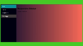
Responsive Sidebar
Share your thoughts in the comments
Please Login to comment...