How to create a Menu Icon using CSS ?
Last Updated :
29 Dec, 2023
The Menu Icon is mostly used on smaller screens, there’s limited space to display a full navigation menu. A menu icon helps in hiding the navigation items initially and revealing them when the user needs them. In this article, we will see how To Create a Menu Icon using CSS.
There are many ways to create a Menu Icon using CSS. The article contains two ways including a simple menu icon and an animated menu icon.
In this approach, we will design a simple menu icon with the help of CSS properties by incorporating three horizontal lines and designing it most simply and attractively.
Approach
- First create the basic structure of the project using different elements including <div>, <h1>, and <h3>.
- For creating a simple menu icon with three horizontal bars there are three <div> elements defined in the HTML file.
- Give them styling with different CSS properties like height, margin, width, and background color.
- At last use other CSS properties like box-shadow and flexbox properties to give a pleasing effect to the menu icon.
Example: The example shows how To Create a Menu Icon using different flexbox properties.
HTML
<!DOCTYPE html>
<html lang="en">
<head>
<meta charset="UTF-8">
<meta name="viewport"
content="width=device-width,
initial-scale=1.0">
<title>Menu Icon using CSS</title>
<link rel="stylesheet"
href="index.css">
</head>
<body>
<div class="box1">
<h1>GeeksforGeeks</h1>
<h3>How To Create a
Menu Icon using CSS
</h3>
<div class="box">
<div class="div1 menu"></div>
<div class="div2 menu"></div>
<div class="div3 menu"></div>
</div>
</div>
</body>
</html>
|
CSS
@import url(
.menu {
height: 7px;
margin: 3px;
width: 50px;
background-color: green;
border-radius: 10px;
}
.box {
display: flex;
flex-direction: column;
justify-content: center;
align-items: center;
height: 70px;
width: 80px;
border: 2px solid black;
border-radius: 20px;
box-shadow: rgba(74, 62, 62, 0.45) 0px 7px 19px;
}
.box1 {
display: flex;
flex-direction: column;
justify-content: center;
align-items: center;
height: 100vh;
font-family: 'Poppins', sans-serif;
}
h1 {
color: green;
}
|
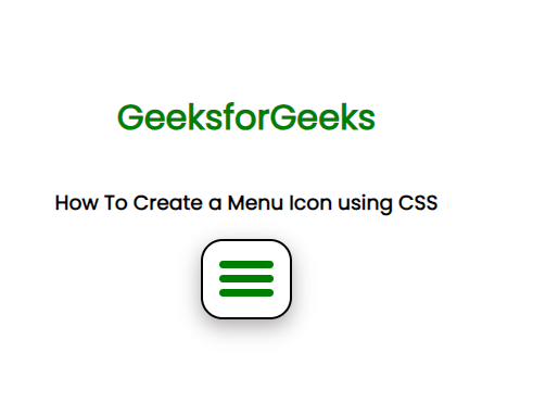
Output:
In this approach, we will design a animated menu icon with the help of CSS properties by incorporating three horizontal lines and adding animation in such way that whenever user hover on menu icon it changes to cross icon smoothly via transform property.
Approach
- First create the basic structure of the project using different elements including <div>, <h1>, and <h3>.
- For creating a simple menu icon with three horizontal bars there are three <div> elements defined in the HTML file. Give them styling with different CSS properties like height, margin, width, and background color.
- There are other CSS properties are used as well like box-shadow, flexbox properties for giving a pleasing effect to the menu icon.
- For animation transform property is defined for class menubar1 and class menubar3. Set opacity to 0 for class menubar2.
Example: The example shows how To Create a Menu Icon with animation.
HTML
<!DOCTYPE html>
<html lang="en">
<head>
<meta charset="UTF-8">
<meta name="viewport"
content="width=device-width,initial-scale=1.0">
<link rel="stylesheet"
href="index.css">
</head>
<body>
<div class="box1">
<h1>GeeksforGeeks</h1>
<h3>
How To Create a Menu
Icon using CSS
</h3>
<div class="box">
<div class="menubar menubar1"></div>
<div class="menubar menubar2"></div>
<div class="menubar menubar3"></div>
</div>
</div>
</body>
</html>
|
CSS
@import url(
.menubar {
height: 7px;
width: 50px;
background-color: green;
border-radius: 10px;
margin: 7px;
transition: 0.7s;
}
.box:hover>.menubar1 {
transform: translate(0, 14px) rotate(40deg);
background-color: red;
}
.box:hover>.menubar2 {
opacity: 0;
}
.box:hover>.menubar3 {
transform: translate(0, -14px) rotate(-40deg);
background-color: red;
}
.box {
height: 60px;
width: 60px;
border: 2px solid black;
border-radius: 20px;
padding-top: 5px;
box-shadow: rgba(74, 62, 62, 0.45) 0px 7px 19px;
}
.box1 {
display: flex;
align-items: center;
height: 100vh;
justify-content: center;
flex-direction: column;
font-family: 'Poppins', sans-serif;
}
h1 {
color: green;
}
|
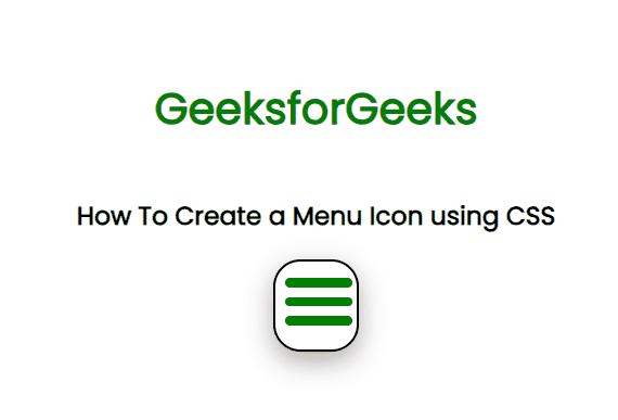
Output:
Share your thoughts in the comments
Please Login to comment...