How To Create Dot Plots In Excel?
Last Updated :
31 Mar, 2021
A Dot plot is a type of chart used in statistics for representing relatively small data sets where the values are uniquely categorized. A dot plot is also known as dot chart or strip chart. A dot plot and a bar graph are similar in the sense that the height of each “bar” of dots is equal to the number of items in that specific category. These are usually drawn by counting the number of data points that fall in each respective bins and draw along the stacked dots in ascending order.
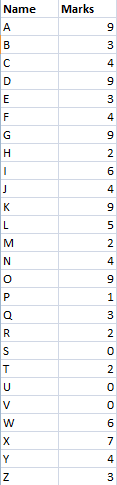
In this article we will look into the process of implementing a Dot plot in Excel. For that let us consider the following table :
Implementation:
Follow the below steps to implement a dot plot for the above given table:
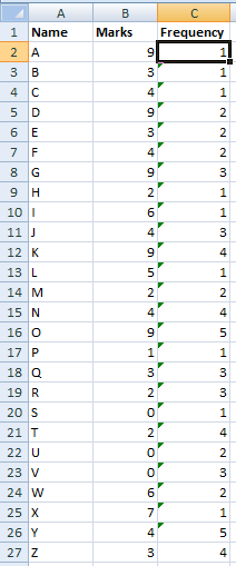
Step 1: Select a cell and type the below commands
=COUNTIF($"Column Name"$"Row Number:$"Cell Address", "Cell Address")
And drag it through other cells to determine the frequency of desired marks. Here, we typed =COUNTIF($B$2:$B2, B2) and drag it through other cells to get the frequency of all marks available
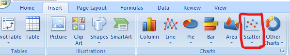
Step 2: Then Go to the Insert Tab and click on the Scatter Chart icon. ( Microsoft Excel 2007 )
Step 3: Then a Dot Plot will appear on the Excel Sheet as shown below:
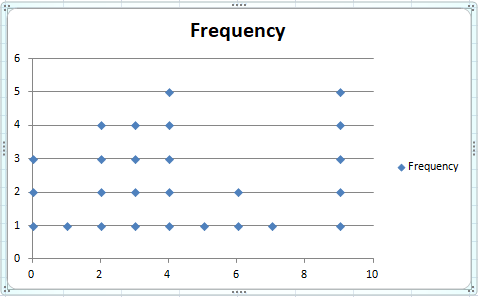
At this stage you have successfully created a dot plot for the above table successfully.
Share your thoughts in the comments
Please Login to comment...