Creating Box Plots in Excel
Last Updated :
29 Jun, 2021
Box plot is a statistical plot that helps in data visualization. It is used to show the distribution of numerical data using various quartiles. They are as follows :
- Lower Extreme: It is the minimum value in the data set which is at the end of the whisker.
- First Quartile: It is also known as lower quartile where 25% of the scores fall below it.
- Median: It is basically the mid-point which divides the box into two equal halves. It is also known as Second Quartile.
- Third Quartile: It is also known as the Upper quartile in which 25% of the data is above it and the rest 75% falls below it.
- Interquartile Range: It is showing the middle part of the box plot which is 50% of the scores. It is abbreviated as IQR.
- Upper Extreme: It is the maximum value in the dataset which is at the end of the whisker.
- Whisker: The two whiskers at upper and lower basically denote the value outside the IQR range or 50% of the scores.
- Outliers: The points in the box plot which lie outside the whiskers.
Some important links to get more insights about box plots :
- Box Plot
- Box Plot using Python
- Box Plot in R
- What is Box plot and the condition of outliers?
- Understanding different Box Plot with visualization
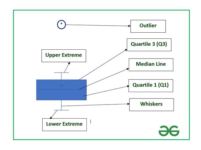
Structure of Box Plot
In this article, we are going to see how to create box plots and also how to find the important parameters associated with box plots in Excel using a suitable example.
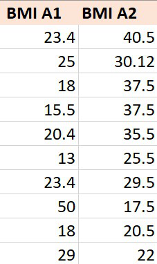
Example: Consider the BMI of ten students from section A-1 and that of section A-2. BMI stands for Body Mass Index which is an important parameter to judge the body fat and health of a person on the basis of height and weight of a person.
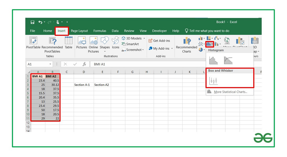
The steps to create a box plot :
- Insert the data in the cells as shown above.
- Select the data and go to the Insert tab at the top of the Excel window.
- Now click on the Statistical Chart menu. A drop-down will occur.
- Now select Box and Whisker chart.
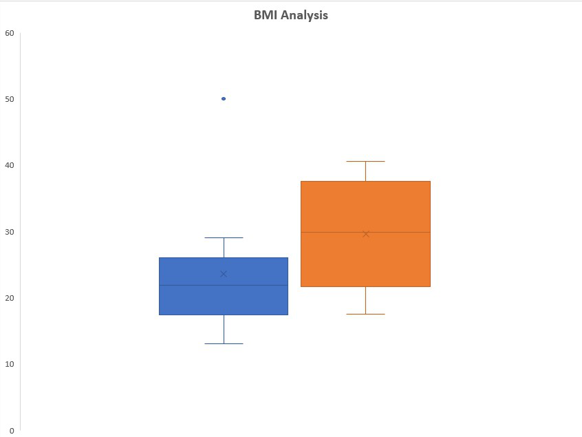
Box Plot
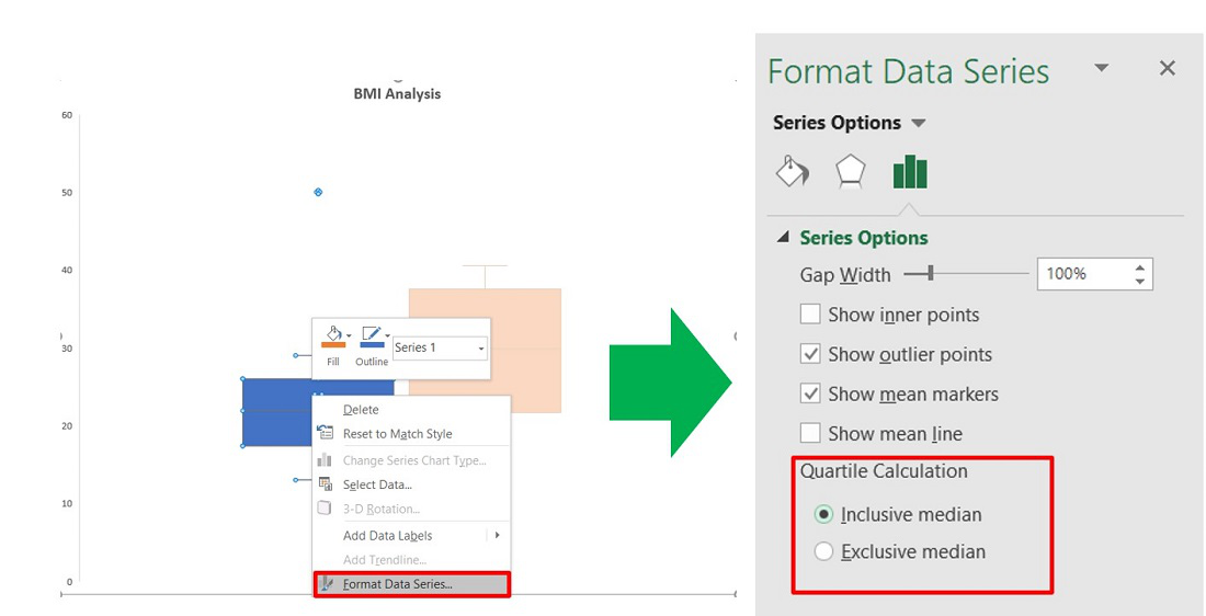
The box plot by default will be exclusive of the mean value. In order to make it inclusive of mean :
- Select the box plot.
- Right-Click and select Format Data Series.
- In the Format Data Series dialog box check “Inclusive Mean” in Quartile Calculation.
To format a box plot use the + symbol in the top right corner of the chart as shown below :
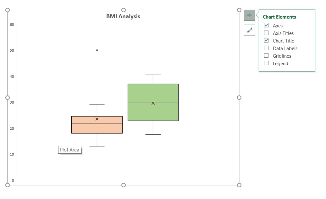
Check the Data Labels option to add data labels in the box plots and make the plot more insightful.
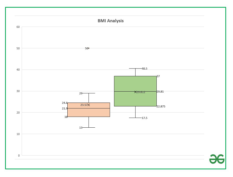
You can examine the data labels values using the following section where we are going to discuss how to calculate these parameters using Excel formulas.
Formula to calculate parameters associated with the box plot:
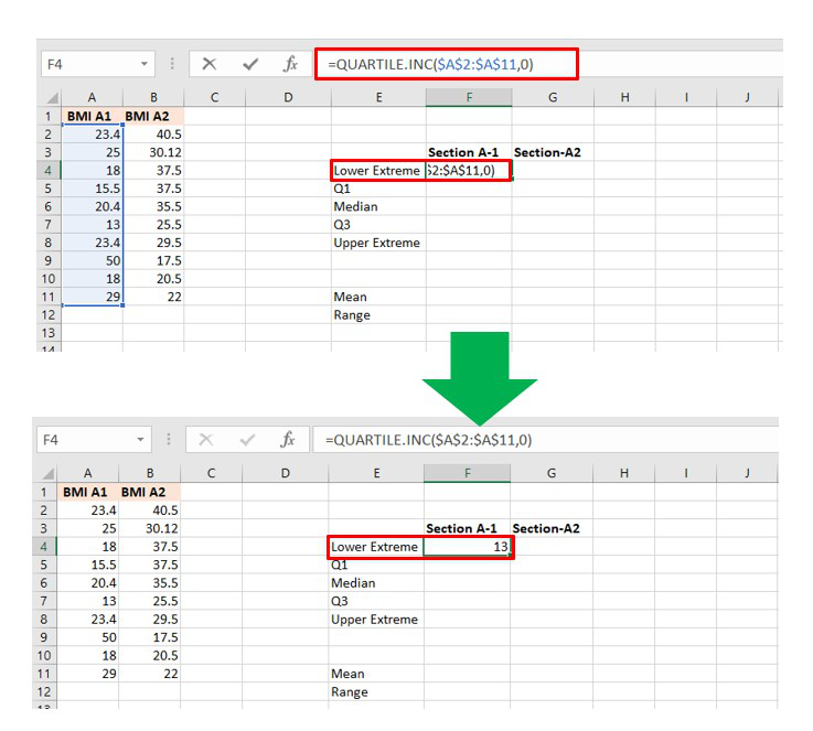
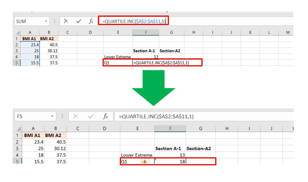
In order to calculate the different quartile values use the formula :
= QUARTILE.INC(Cell_Range, integer)
Here,
- Cell range: Range of cells. In our case, it is A2 to A11 for section A-1 and B2 to B11 for section A-2
- integer : [0,4]
| Quartile Values |
Formula |
| Lower Extreme |
=QUARTILE.INC(Cell_Range, 0) |
| Q1 |
=QUARTILE.INC(Cell_Range, 1) |
| Median |
=QUARTILE.INC(Cell_Range, 2) |
| Q3 |
=QUARTILE.INC(Cell_Range, 3) |
| Upper Extreme |
=QUARTILE.INC(Cell_Range, 4) |
Make a helper table in Excel to calculate the above formulas. The helper table can be used to interpret our box plot and the values.
Lower Limit Calculation
Quartile 1 calculation
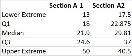
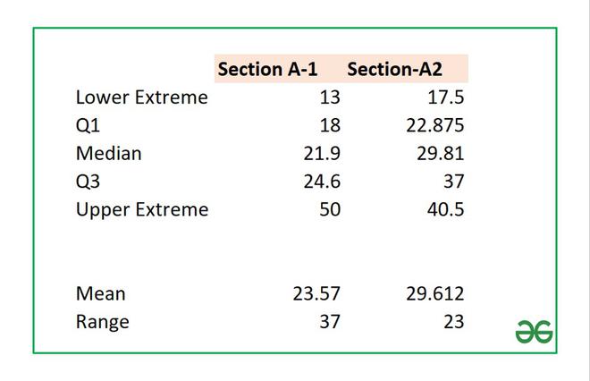
Similarly, you can calculate all the other parameters for both sections. The final table will look like this:
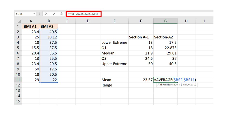
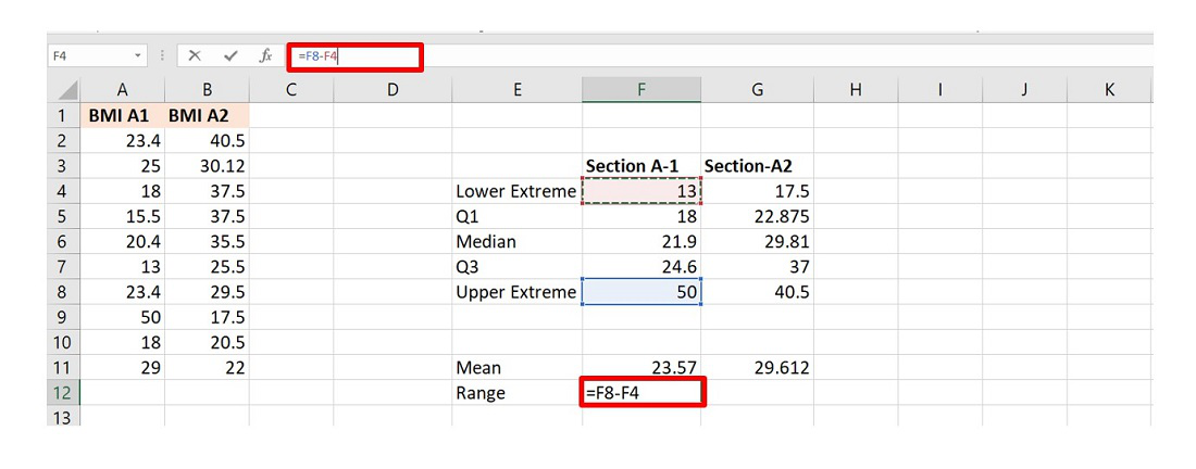
Some other important parameters in a box plot are (1) Mean (2) Range. The formulas are :
 = AVERAGE(Cell_Range)
= (Upper Extreme - Lower Extreme)
Helper Table
Another important parameter in a box plot is an outlier which depends on the value of Interquartile Range (IQR). The formula for IQR is :
IQR = Quartile_3 - Quartile_1
In our example, the value of IQR is 6.6 which you can calculate from the helper table. Now, a point is an outlier if the value is :
below (Quartile_1 - IQR*1.5) and
above (Quartile_3 + IQR*1.5)
In the given example for section A-1 we have an outlier at value 50 which is the maximum value of BMI. After calculation the value will be :
IQR * 1.5=9.9
Q3 + IQR * 1.5 = 34.5

Since, 50 > 34.5 so it is in the outlier of the box plot.
Similarly, you can calculate the above parameters for the second box plot, and you can observe that all the five parameters are within the range and hence there are no outliers.
In order to remove the outlier in Box plot-1, you have to modify the maximum value from 50 to any value less or equal to 34.5.
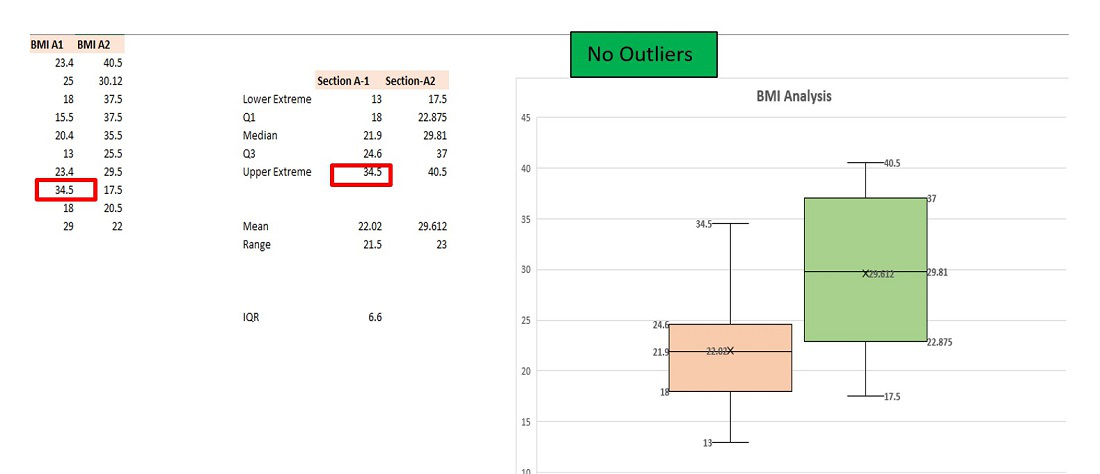
Outlier Removed
Like Article
Suggest improvement
Share your thoughts in the comments
Please Login to comment...