How to Create Circle Loading Animation Effect using CSS ?
Last Updated :
11 Apr, 2023
In this article, we will see how to create a circle-loading animation using HTML and CSS, along with understanding its basic implementation through the example. Generally, Loading Animation is utilized to wait for the content to be fully loaded on the webpage. If some pages don’t contain the loader, then the user may think that the webpage is not responding at all. By adding the loader may distract or wait for a few seconds until the page is fully loaded.
Approach: The below approach will be utilized to create the simple circle-loading animation:
Step 1: Adding HTML
First, we create a div element with the class “loader”. This div element contains another div element with the class “loader-inner”. Once we have the container element in place, we can begin creating the actual animation.
HTML
<div class="loader">
<div class="loader-inner"></div>
</div>
|
Step 2: Adding CSS
- The “.loader” class is a CSS class that is used to style a loading animation container on a web page. The “position” property is set to “fixed”, which means that the container will be positioned relative to the browser window, rather than to its parent element. This is important for the loading animation to be visible no matter where the user has scrolled on the page.
- The “top” and “left” properties are both set to 50%. This means that the container will be centered horizontally and vertically within the browser window. When the top and left properties are set to 50%, it positions the element in the center of the screen.
- The “transform” property is used to move the container back up and to the left by 50% of its own size. This is done to ensure that the container is precisely centered. When an element is positioned at 50% from the top or left, it is calculated based on its top-left corner. By using the “transform” property, the container is moved back up and to the left by 50% of its own size, so that it is centered precisely.
- The “width” and “height” properties are both set to 80 pixels. This defines the size of the container. The size of the container is also used for the inner circle element, which is positioned and animated relative to the container. By defining the size of the container, the size of the inner circle element can also be defined proportionally.
CSS
.loader {
position: fixed;
top: 50%;
left: 50%;
transform: translate(-50%, -50%);
width: 80px;
height: 80px;
}
|
- The animation consists of two main components, i.e. the outer circle and the inner circle.
- The outer circle is created using CSS by setting the width, height, and border properties of the loader-inner class. In the above code, we set the width and height of the outer circle to 80px and gave it a border of 4px, with a color of rgba(0, 0, 0, 0.1). We also set the border-top-color property to #5CDB95, which is a light green color.
CSS
.loader-inner {
position: absolute;
top: 0;
left: 0;
width: 80px;
height: 80px;
border-radius: 50%;
border: 4px solid rgba(0, 0, 0, 0.1);
border-top-color: #5CDB95;
}
|
- The inner circle is created using a pseudo-element (::before) and setting its background to an image or color of your choice. In the above code, we set the background of the inner circle to an image using the background-image property and set its size to 100% using background-size.
CSS
.loader-inner::before {
content: "";
position: absolute;
top: 12px;
left: 12px;
width: 56px;
height: 56px;
border-radius: 50%;
background: url(
no-repeat center center;
background-size: 100%;
}
|
- After creating the outer and inner circles using CSS, the next step is to create the animation using keyframes. In the given code snippet, two keyframe animations are created: loader-animation and loader-spin.
- The first animation, loader-animation, is used to rotate the inner circle continuously. This animation is defined using the @keyframes rule in CSS, which specifies the animation’s name, duration, and keyframe percentage values.
- In this animation, the transform property is used to rotate the inner circle. The animation is set to run for 2 seconds and repeat infinitely using the infinite keyword. The animation is defined with two keyframes: at 0% the circle is rotated by 0 degrees, and at 100% it is rotated by 360 degrees. This causes the circle to complete one full rotation every 2 seconds.
- The second animation, loader-spin, is used to rotate the entire loader, including both the inner and outer circles. This animation is also defined using the @keyframes rule in CSS.
- Like the first animation, the transform property is used to rotate the loader. This time, however, the animation is set to run for 1.5 seconds and repeat infinitely using the infinite keyword. The animation is defined with two keyframes: at 0% the loader is rotated by 0 degrees, and at 100% it is rotated by 360 degrees. This causes the entire loader to complete one full rotation every 1.5 seconds.
- Together, these two keyframe animations create a loading animation that rotates the inner circle continuously, while also rotating the entire loader, giving the impression that the system is busy processing data or content. By using keyframes to define the animation, the developer has fine-grained control over the timing and behavior of the animation, allowing for customization and flexibility.
CSS
@keyframes loader-animation {
0% {
transform: rotate(0deg);
}
100% {
transform: rotate(360deg);
}
}
.loader-inner::before {
animation: loader-animation 2s infinite ease-in-out;
}
@keyframes loader-spin {
to {
transform: rotate(360deg);
}
}
.loader-inner {
animation: loader-spin 1.5s linear infinite;
}
|
Example: This example describes the creation of a circle-loading animation using HTML and CSS.
HTML
<!DOCTYPE html>
<html>
<head>
<meta charset="utf-8">
<meta name="viewport"
content="width=device-width">
<style>
.loader {
position: fixed;
top: 50%;
left: 50%;
transform: translate(-50%, -50%);
width: 80px;
height: 80px;
}
.loader-inner {
position: absolute;
top: 0;
left: 0;
width: 80px;
height: 80px;
border-radius: 50%;
border: 4px solid rgba(0, 0, 0, 0.1);
border-top-color: #5CDB95;
background-image:
linear-gradient(to right, #5CDB95, #8EE4AF, #ADD5A7);
animation: loader-spin 1.5s linear infinite;
}
.loader-inner::before {
content: "";
position: absolute;
top: 12px;
left: 12px;
width: 56px;
height: 56px;
border-radius: 50%;
background: url(
no-repeat center center;
background-size: 100%;
animation: loader-animation 2s infinite ease-in-out;
}
@keyframes loader-animation {
0% {
transform: rotate(0deg);
}
100% {
transform: rotate(360deg);
}
}
@keyframes loader-spin {
to {
transform: rotate(360deg);
}
}
</style>
</head>
<body>
<div class="loader">
<div class="loader-inner"></div>
</div>
</body>
</html>
|
Output:
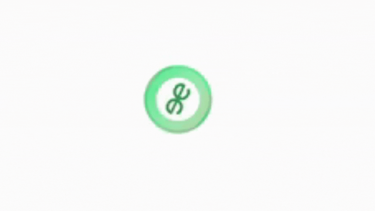
circle-loading animation
Share your thoughts in the comments
Please Login to comment...