How to Create Animated Navigation Bar with Hover Effect using HTML and CSS ?
Last Updated :
11 May, 2020
The Navigation bar or navbar or menu-bar is the most important component of any web or mobile application. The user can only navigate from one page to another page through this menu. It is usually provided at the top of the website to provide a better UX (user experience).
Approach: The approach is to create a navbar first and then animate a line below on each item using before and hover selectors.
HTML Code: In this section, we have created a simple navigation bar menu using unordered-list(ul).
<!DOCTYPE html>
<html lang="en">
<head>
<meta charset="UTF-8">
<meta name="viewport" content=
"width=device-width, initial-scale=1.0">
<title>Animated Navbar </title>
</head>
<body>
<h1>GeeksforGeeks</h1>
<h3>Animated Navigation Bar Design</h3>
<ul>
<li><a href="#">Home</a></li>
<li><a href="#">Contribute</a></li>
<li><a href="#">Careers</a></li>
<li><a href="#">About Us</a></li>
<li><a href="#">Contact</a></li>
</ul>
</body>
</html>
|
CSS Code: In this section, we have used some CSS property to make attractive animated navigation bar.
- Step 1: First, we have used flex property to align our list in a horizontal way.
- Step 2: Then remove all the text decoration and provide required margin and paddings.
- Step 3: Then we have used before selector to align a line below each element keeping it’s width at 0.
- Step 4: Now, use hover with before selector to provide width to the line and transform it on x-axis to get the desired effect.
<style>
body {
margin: 0;
padding: 0;
font-family: Arial, Helvetica, sans-serif;
}
h1 {
color: green;
}
h1,
h3 {
text-align: center;
}
ul {
margin: 0 10%;
padding: 10px 0px 10px 100px;
display: flex;
background: green;
}
ul li {
list-style: none;
padding: 10px 20px;
}
ul li a {
text-decoration: none;
font-size: 24px;
font-weight: bold;
color: black;
position: relative;
}
ul li a::before {
content: "";
width: 0px;
height: 10px;
background: black;
position: absolute;
top: 100%;
left: 0;
transition: .5s;
}
ul li a:hover::before {
width: 50%;
transform: translateX(100%);
}
</style>
|
Complete Code: In this section, we will combine the above two sections to create an animated navigation bar.
<!DOCTYPE html>
<html lang="en">
<head>
<meta charset="UTF-8">
<meta name="viewport" content=
"width=device-width, initial-scale=1.0">
<title>Animated Navbar </title>
<style>
body {
margin: 0;
padding: 0;
font-family: Arial, Helvetica, sans-serif;
}
h1 {
color: green;
}
h1,
h3 {
text-align: center;
}
ul {
margin: 0 10%;
padding: 10px 0px 10px 100px;
display: flex;
background: green;
}
ul li {
list-style: none;
padding: 10px 20px;
}
ul li a {
text-decoration: none;
font-size: 24px;
font-weight: bold;
color: black;
position: relative;
}
ul li a::before {
content: "";
width: 0px;
height: 10px;
background: black;
position: absolute;
top: 100%;
left: 0;
transition: .5s;
}
ul li a:hover::before {
width: 50%;
transform: translateX(100%);
}
</style>
</head>
<body>
<h1>GeeksforGeeks</h1>
<h3>Animated Navigation Bar Design</h3>
<ul>
<li><a href="#">Home</a></li>
<li><a href="#">Contribute</a></li>
<li><a href="#">Careers</a></li>
<li><a href="#">About Us</a></li>
<li><a href="#">Contact</a></li>
</ul>
</body>
</html>
|
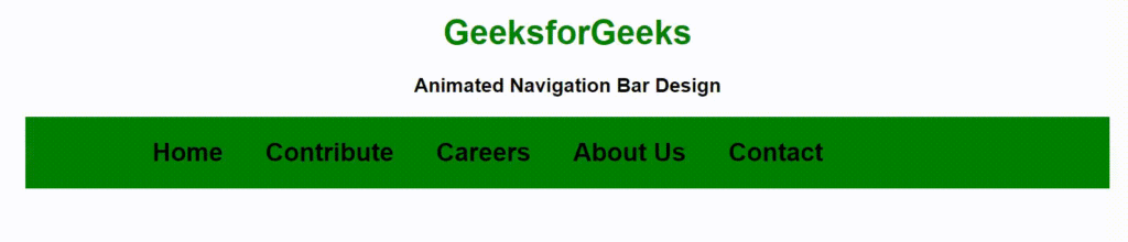
Output:
Share your thoughts in the comments
Please Login to comment...